• Our booking engine at tickets.railforums.co.uk (powered by TrainSplit) helps support the running of the forum with every ticket purchase! Find out more and ask any questions/give us feedback in this thread!

Art with a capital F

Status
Not open for further replies.
Sponsor Post - registered members do not see these adverts; click here to register, or click here to log in
R

RailUK Forums

SS4

Established Member
Joined
30 Jan 2011
Messages
8,589
Location
Birmingham
Welcome to modern art. Taxpayers' money spent on stuff the kids at the local primary school can do better
 

Minilad

Established Member
Joined
26 Feb 2011
Messages
4,343
Location
Anywhere B link goes
The pictures are bad enough but the thing I find laughable is the pretentious waffle the "experts" come out with when describing them
 

Dennis

Established Member
Joined
8 Aug 2005
Messages
2,676
Location
Trowbridge
Got to laugh at the Bridget Riley stripey one; the caption reads ".....Riley...began to experiment with colour in 1967, the same year she began painting stripes."

Is that woman some kind of retard? 40 plus years on and she's still painting stripes!

I began painting stripes in 1972 (when I was 3), I can now just about paint a flower. Never realised I was so gifted and advanced.
 

Peter Mugridge

Veteran Member
Joined
8 Apr 2010
Messages
14,817
Location
Epsom
I have often thought that if I simply painted a load of random shapes, colours and lines onto a canvas then made up some meaningful sounding nonsense about it I might actually make more money...
 

Matt-the-mutt

Member
Joined
1 Oct 2011
Messages
53
You know its just the same as when the logo was first shown "give a child some sunny D and a puzzle, that would be better" or somthing like that... I think that this is the childs games really.
 

gg1

Established Member
Joined
2 Jun 2011
Messages
1,904
Location
Birmingham
I have often thought that if I simply painted a load of random shapes, colours and lines onto a canvas then made up some meaningful sounding nonsense about it I might actually make more money...

I wouldn't be at all surprised if there are a few modern artists who think exactly that, i.e. they're fully aware their work is a load of crap and are quietly laughing at the mugs who buy it.

As for the BBC article, does anyone else think image number 8 looks like a piece of Microsoft clip art?
 

Bungle73

On Moderation
Joined
19 Aug 2011
Messages
3,040
Location
Kent
Ah, the old "modern art is rubbish" line. Thousands of visitors to Tate Modern (including myself; I'm am member in fact) would disagree with you.
 

Minilad

Established Member
Joined
26 Feb 2011
Messages
4,343
Location
Anywhere B link goes
Ah, the old "modern art is rubbish" line. Thousands of visitors to Tate Modern (including myself; I'm am member in fact) would disagree with you.

OK then. Picture 2 by Martin Creed. Please explain to this philistine where exactly is the talent there. And please try to do it without heading into Pseuds Corner ;)
 

newbie babs

Member
Joined
16 Jul 2011
Messages
633
Location
Sheffield
It does nothing for me but leave me questioning the validity of using such rubbish to promote the Olympics, and how that is going to happen is beyond me.

"The fluidity of the brushstrokes" in the blue one, I thought they had knocked over the brush water, they can`t be serious !!!
 

AlterEgo

Veteran Member
Joined
30 Dec 2008
Messages
20,167
Location
No longer here
I quite like modern art, and abstracts. But this selection of crap is quite astonishing. I haven't seen anything as bad. The worst one was the one about the wheelchair and the tennis ball.

Tripe.
 

bb21

Emeritus Moderator
Joined
4 Feb 2010
Messages
24,151
It's not what you see, but how you interpret it.

I interpret the second picture as a series of badly-drawn rectangles, and the third one something muttered up in 2 minutes in a state of panic when the artist realised that the deadline is due.

And some people wonder why artists get such a hard time sometimes.
 

Bungle73

On Moderation
Joined
19 Aug 2011
Messages
3,040
Location
Kent
OK then. Picture 2 by Martin Creed. Please explain to this philistine where exactly is the talent there. And please try to do it without heading into Pseuds Corner ;)

That particular one isn't my thing, but I like some of them.

It does nothing for me but leave me questioning the validity of using such rubbish to promote the Olympics, and how that is going to happen is beyond me.

"The fluidity of the brushstrokes" in the blue one, I thought they had knocked over the brush water, they can't be serious !!!

I know I'm going to be blasted for this but the more I look at that one the more I like it.

Not all art has to be an exact copy of real life.
 

trentside

Established Member
Fares Advisor
Joined
14 Aug 2010
Messages
3,337
Location
Messroom
I'm not one to write off all modern art, and there are some amongst that collection that I like.

I do think 2 (the stack of blocks) and 3 (the blue thing) are just ridiculous. I've actually seen Primary school children produce better paintings than these - I actually have something similar to 3 that I painted when I was 2...
 

Hydro

Established Member
Joined
5 Mar 2007
Messages
2,204
They all look like an AS-level art project from the most pretentious group of hipster art kiddies imaginable.
 

43021HST

Established Member
Joined
11 Sep 2008
Messages
1,564
Location
Aldershot, Hampshire
All creative design, graphics artwork and mascots thats centred around the 2012 olympics all look crap.

article-1279736-09A7F9E8000005DC-924_634x366.jpg

The Mascots

olympic-logo-296x300.gif

The Logo

08_OlympicTorch_620%20copy.jpg

The Torch

51676962_011527393-1.jpg

The Clock, (which stopped)

olympics_2012.gif

Umm something to do with the olympics, but I have no idea
 

Oswyntail

Established Member
Joined
23 May 2009
Messages
4,183
Location
Yorkshire
Some of the posters are actually very good - and I think #3 grows on you (There is skill in the gradations of colour and density of the blue top to bottom, and the varying proportions of the strokes do, for me, create a feel of various water sports). Some are not good at all. But that is surely what you must expect with creative work. If everybody liked everything life would be horribly bland. (And no, I think the logo is appalling, and Wenlock and Mandeville are absurd!)
 

Schnellzug

Established Member
Joined
22 Aug 2011
Messages
2,926
Location
Evercreech Junction
I'm sure some of those artists* have designed one or two TOCs' liveries.


*sorry, i forgot the inverted commas


To be fair though, one that I think is actually quite good is that blue swirly one. I forget how it was described by the Experts, but blue swirly thing'll do just as well.
--- old post above --- --- new post below ---
I also like the one that looks like a pile of Licorice Allsorts in gradually reducing sizes. It represents an extended podium, with places beyond first, second and third, you know.
 

blackfive460

Member
Joined
23 Jun 2010
Messages
827
To be fair, you can't tar all modern art with the same brush!
There are some works that I'd quite like on my walls but in some cases I'd like to think that the 'artist', while appearing serious about his or her work, is really just having a good laugh.
Take this example in the Tate Modern...
Yes, it really is just a plain, ordinary, common or garden mirror screwed to the wall. I have one just like it in my bathroom but without any explanatory BS alongside.
Far from 'questioning a long-held notion of painting transcending reality' I'd be questioning the sanity of the person or persons who thought this nonsense should go on public display.
 

Xenophon PCDGS

Veteran Member
Joined
17 Apr 2011
Messages
32,369
Location
A semi-rural part of north-west England
I quite like modern art, and abstracts. But this selection of crap is quite astonishing....Tripe.
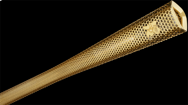
An interesting observation from someone who likes Modern Art. I think the symbol for the logo for the games is quite similar to that used in a postage stamp many years ago that was issued in Pakistan, which was about a physical deformity, which the current logo also seems to convey.
 

bb21

Emeritus Moderator
Joined
4 Feb 2010
Messages
24,151
08_OlympicTorch_620%20copy.jpg

The Torch

I can understand the holes in the torch. Given that we're effectively broke as a country, any saving in material thereby protecting as much as our gold reserve must be welcome.
 

Bungle73

On Moderation
Joined
19 Aug 2011
Messages
3,040
Location
Kent
I don't see what's wrong with the Olympic torch?

To be fair, you can't tar all modern art with the same brush!
There are some works that I'd quite like on my walls but in some cases I'd like to think that the 'artist', while appearing serious about his or her work, is really just having a good laugh.
Take this example in the Tate Modern...
Yes, it really is just a plain, ordinary, common or garden mirror screwed to the wall. I have one just like it in my bathroom but without any explanatory BS alongside.
Far from 'questioning a long-held notion of painting transcending reality' I'd be questioning the sanity of the person or persons who thought this nonsense should go on public display.
I quite like that one too. I think it's an interesting idea behind it. I have seen some very odd things at Tate Modern though.
 

AlterEgo

Veteran Member
Joined
30 Dec 2008
Messages
20,167
Location
No longer here
An interesting observation from someone who likes Modern Art. I think the symbol for the logo for the games is quite similar to that used in a postage stamp many years ago that was issued in Pakistan, which was about a physical deformity, which the current logo also seems to convey.

I do enjoy the Tate Modern and like modern art. I don't "get" 50% of modern art, but the rest of it really engages me. I'm afraid none of the Olympic pieces really captured my imagination at all. The blue swirly thing is the only piece I remotely like.

The pretentious captions with the pictures are quite insulting, unless they're meant to be tongue-in-cheek. A big circle representing a wheelchair and a small one representing a tennis ball? Give over.
 

bb21

Emeritus Moderator
Joined
4 Feb 2010
Messages
24,151
Unfortunately the term "modern art" has been dumbed down these days by the work of some of the most untalented, or are we not allowed to use such a term simply because we're seen as too thick to understand the intrinsic meaning of those works?
 

Schnellzug

Established Member
Joined
22 Aug 2011
Messages
2,926
Location
Evercreech Junction
Unfortunately the term "modern art" has been dumbed down these days by the work of some of the most untalented, or are we not allowed to use such a term simply because we're seen as too thick to understand the intrinsic meaning of those works?

That's it, isn't it. If you don't get it, then you're just not Sophisticated or Urban or Post-Modern enough.
 

Tracked

Established Member
Joined
30 May 2011
Messages
1,245
Location
53.5440°N 1.1510°W
Got to laugh at the Bridget Riley stripey one; the caption reads ".....Riley...began to experiment with colour in 1967, the same year she began painting stripes."

Is that woman some kind of retard? 40 plus years on and she's still painting stripes!

I began painting stripes in 1972 (when I was 3), I can now just about paint a flower. Never realised I was so gifted and advanced.

:lol:

a few years ago I saw an exhibition of some of her work in Glasgow's Gallery of Modern Art, all variations of the one on here with slightly different colours.


More recently she's had an exhibition in B&Q's wallpaper section ... ;)

edit: Having said that, I like the Sarah Morris one
 
Status
Not open for further replies.

Top