Eagle
Established Member
It looks like the just got people to shout out random colours when designing that livery and cared little as to whether or not they looked any good.
Just realized what it reminds me of.
It looks like the just got people to shout out random colours when designing that livery and cared little as to whether or not they looked any good.
Amazed no-one's mentioned the "Darling of NXEA's fleet" - 321446.
Badly vinyled in "one" livery that didn't quite cover the fGE paintwork, then had its rainbow stripes covered up in completely the wrong shade when the "one" brand was thankfully retired.
The addition of NX white stripes along the side, along with a new valance in the wrong colour did nothing to help its appearance..
http://www.flickr.com/photos/50750205@N07/6266577735/ (Not my photo)
Very much so, as seen in the following photo while testing at York prior to delivery: http://www.therailwaycentre.com/Pages EMU/Recognition EMU/IllusEMU_456.html
Referring to the 455s perhaps?
I'm waiting for a train that looks like Neapolitan ice cream.....
I'm waiting for a train that looks like Neapolitan ice cream.....
Jesus, that really is appalling!
I can never see what all the fuss is about over it - there are worse ones there (as this thread has proven). I wonder maybe if the untoward hatred of it is a lot down to the bad choice of name... (which was stupid).Am I the only 'one' that liked the One livery?
I have to second that. Its appalling. I have to say I like FGW fag packet, mind I dont like the HP power cars they arent the best and they must be a pig to keep clean.
I liked the ONE colour scheme very much, and even though the name was confusing it was at least memorable.Am I the only 'one' that liked the One livery?
Amazed no-one's mentioned the "Darling of NXEA's fleet" - 321446.
Badly vinyled in "one" livery that didn't quite cover the fGE paintwork, then had its rainbow stripes covered up in completely the wrong shade when the "one" brand was thankfully retired.
The addition of NX white stripes along the side, along with a new valance in the wrong colour did nothing to help its appearance..
http://www.flickr.com/photos/50750205@N07/6266577735/ (Not my photo)
I'm with you on that. I know the 'fag packet' livery was a first group cover up of the original Merlin livery (on the HSTs) but when you had a complete rake it didn't half look smart, especially along the Dawlish sea wall. Whereas the 'Merlin' livery was nice, but give those white power car ends a chance to get dirty and avoid the washer for a week and it just didn't look so smart.
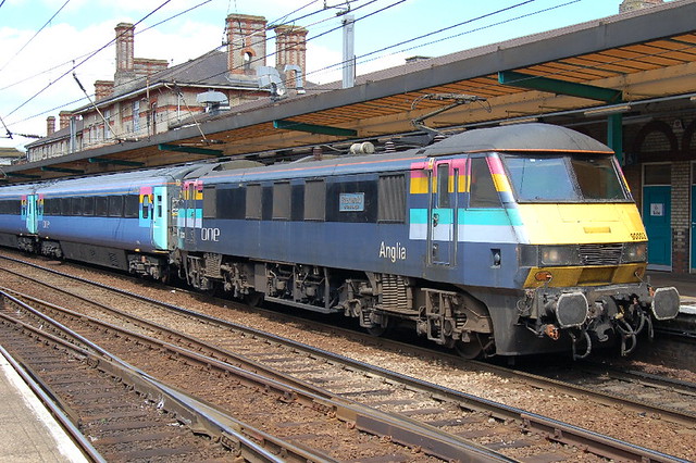
I think one of the reasons why the 'ONE' brand was so bad was the variation in it. Looking at a phot of a rake of Mk3s and a 90 that I took in Norwich a few years back seems to show the variation in the blue - from the metallic silver colour to the drab shade of blue they later used. And then you had the 'Refresher' stripe removal scheme carried out by Nat Ex which just literally ruined a already rather bad livery. Heck, even graffiti improved it better than NX did with their 'just get rid of those stripes by any means possible - blue paint / black paint / odds and sods of vinyl'. I think however it would have just about worked if 'ONE' kept the branding to the routes - ie Orange was Stansted, Pink I think may have meant to have covered the old FGE routes, Turquoise for the ex Anglia routes but they didn't, and so it just looked messy.
Central trains green especially on the 150s
Guess I'm the only person who actually liked ONE livery then!
....Thameslink has always been a failure. The revised (more white) NSE livery suited the 319/1, more so than dark grey of 319/0. Then it went downhill: pre-privatisation graffiti livery with silhouettes of St Paul's; the awful dark blue with diagonal stripe; Go-Ahead's silver and blue was ok but nothing special, then the ghastly (and usually dirty) First livery. I'll admit Southern's scheme works on the 319s.
Not forgetting the 'Transforming Thameslink' livery!
http://www.flickr.com/photos/64033965@N03/6704259135
")
The awful Intalink livery. Wagn started with a really slick livery (but awful logo) and then it all went downhill: Interlink, all-over, dirty white and all-over purple.
Despite the fact I already said that I liked it")

One livery I really don't like is the GMPTE livery that was on some of the 323s, 142s and 150s:
