-
Our booking engine at tickets.railforums.co.uk (powered by TrainSplit) helps support the running of the forum with every ticket purchase! Find out more and ask any questions/give us feedback in this thread!
You are using an out of date browser. It may not display this or other websites correctly.
You should upgrade or use an alternative browser.
You should upgrade or use an alternative browser.
Midland Metro Rolling Stock
- Thread starter bb21
- Start date
- Status
- Not open for further replies.
Sponsor Post - registered members do not see these adverts; click here to register, or click here to log in
R
RailUK Forums
atsf_fT
Member
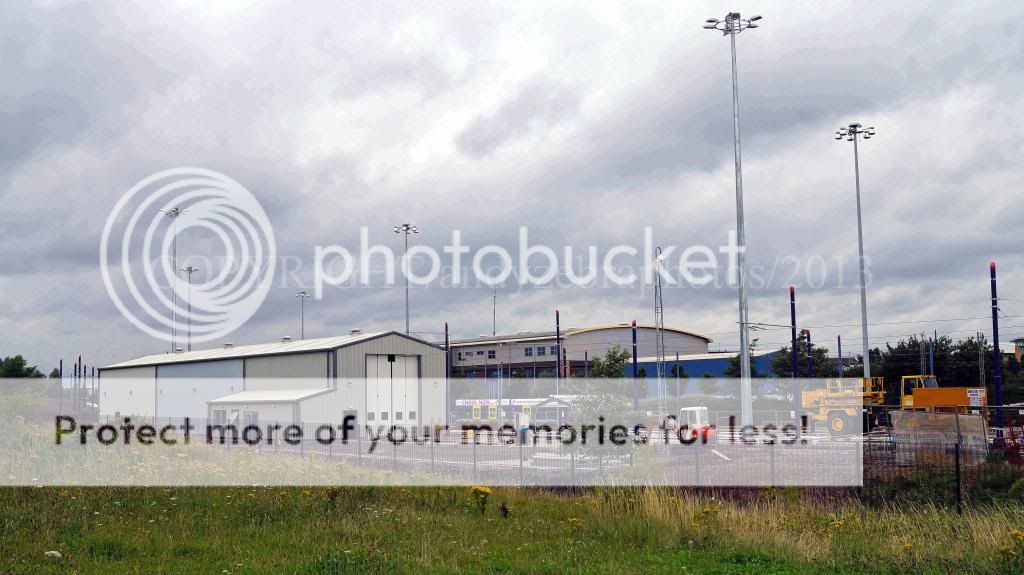
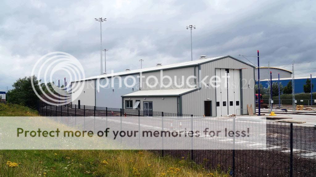
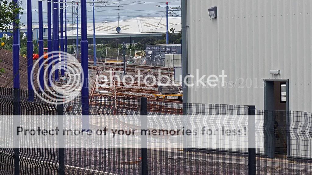
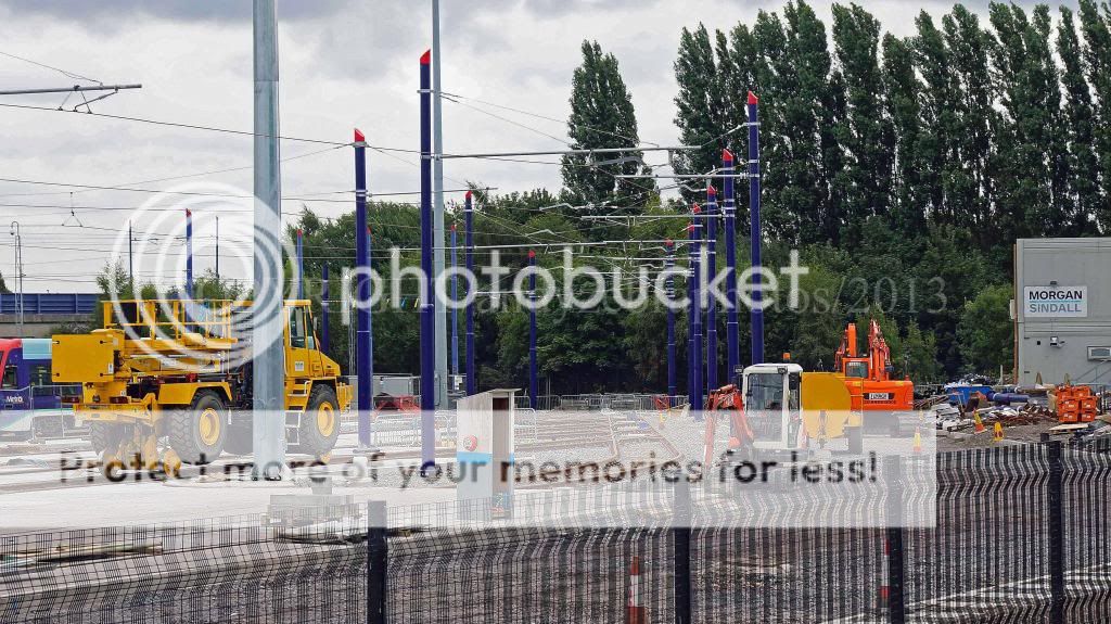
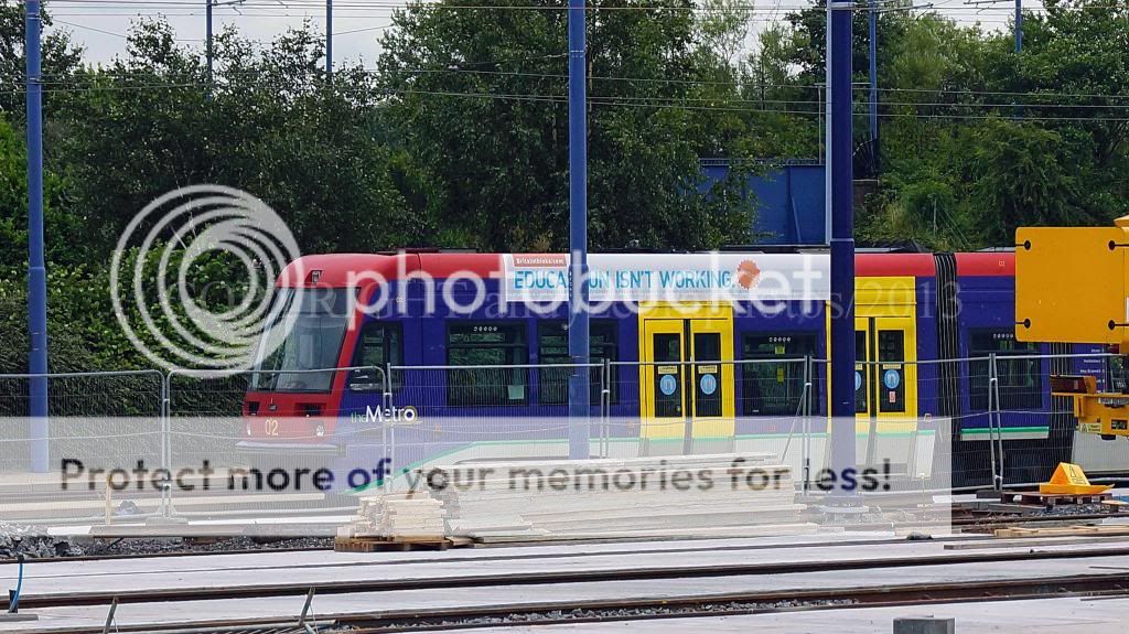
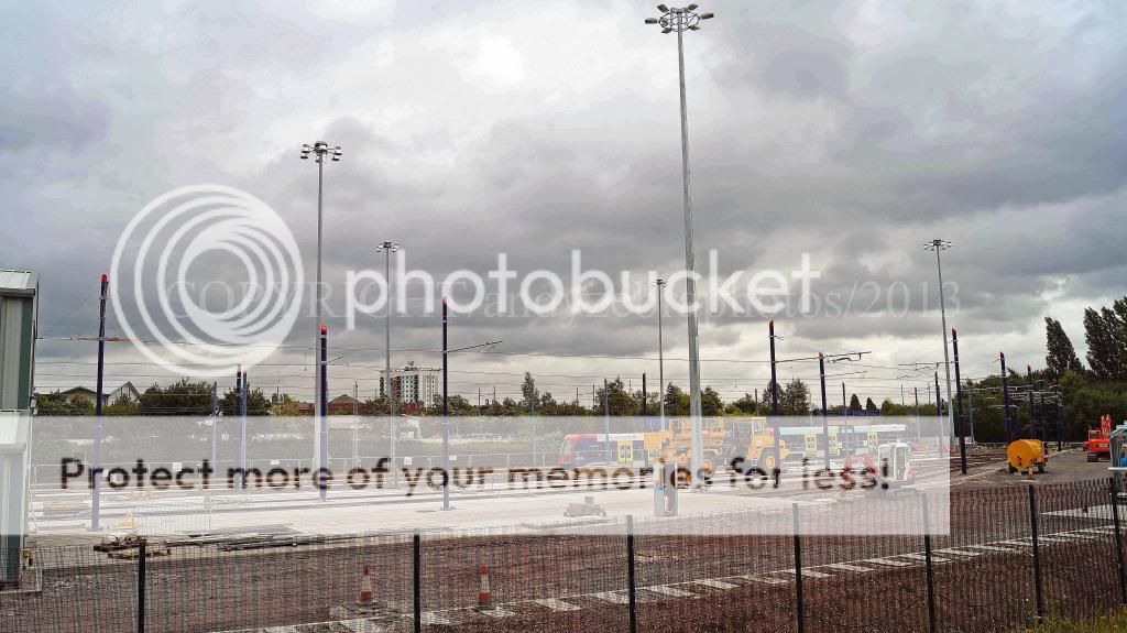
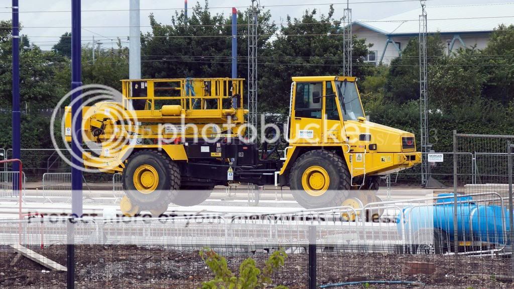
current state of the new tram depot and sideings being built for the new trams on order .


Peter Mugridge
Veteran Member
The Christmas Tree 02 is the only one I haven't got a picture of; is there anywhere public that overlooks that siding and which does not require a zoom lens ( as I haven't got one! )?
anthony263
Established Member
I will keep an eye out tommorow when I am in Birmingham
atsf_fT
Member
The Christmas Tree 02 is the only one I haven't got a picture of; is there anywhere public that overlooks that siding and which does not require a zoom lens ( as I haven't got one! )?
no you need a zoom lens to get a photo of 01/02 and the only public place to get a photo is were i took the photos above .
MetroDriver
Member
The Christmas Tree 02 is the only one I haven't got a picture of; is there anywhere public that overlooks that siding and which does not require a zoom lens ( as I haven't got one! )?
The view of Tram 02 in the previous photos is as close as you're going to get without trespass I'm afraid. The site security are always watching that fence line shown above, which is about 100m from the those trams.
Last edited:
MetroDriver
Member
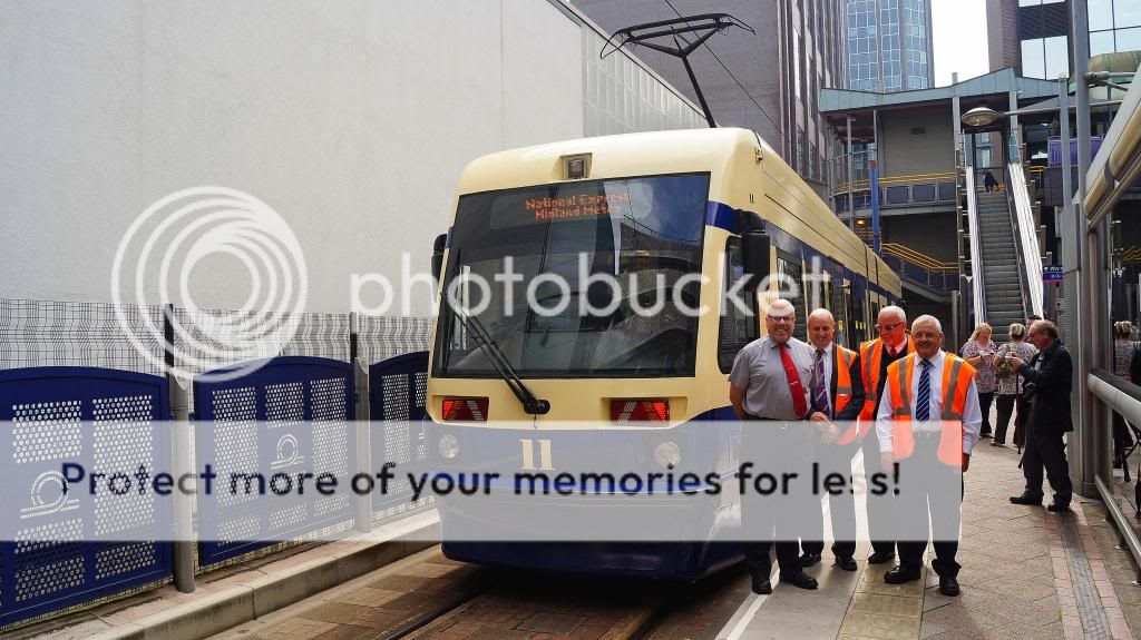
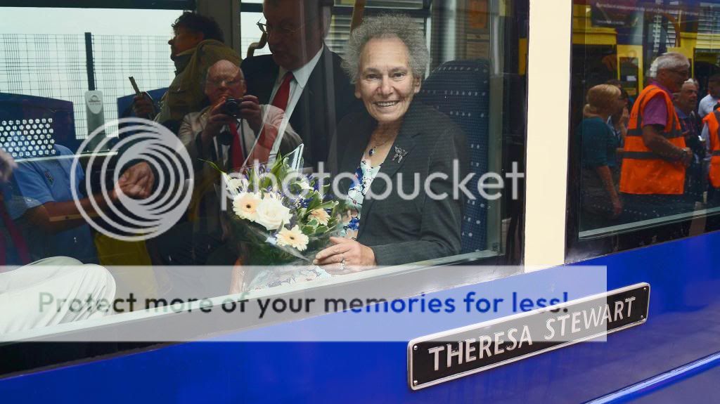
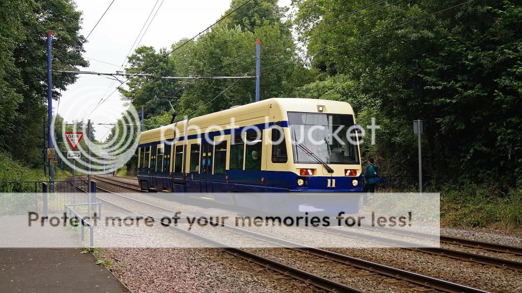
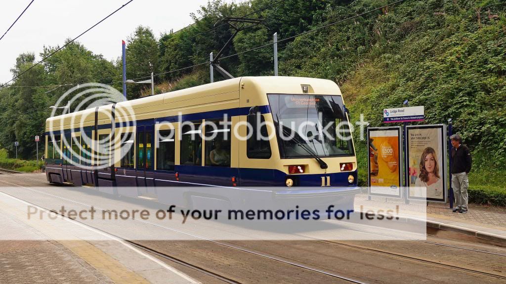
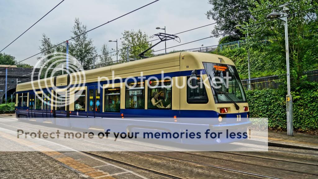
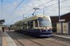
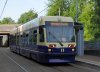
Today saw the official unveiling ceremony take place at Birmingham Snow Hill of Tram 11 in it's commemorative old Birmingham City Transport (BCT) colours...
Not seen Snow Hill so busy for a naming ceremony to be honest, so it was a great event to be part of as the Tram's driver.
Theresa Stewart was given the honour of naming her own tram for the second time - and with me as the same driver both times too!
I managed to grab some photos during the morning on my decent camera which captured the true colours much better than my previous camera phone attempts, and I'm sure other forum members will have more to add to this thread as I saw how many photographers were there")
Here's a few of mine anyway (unedited)

DSCF1356 by hunterxf382, on Flickr
All prepped at the depot and ready to leave!

DSCF1357 by hunterxf382, on Flickr
At Birmingham Snow Hill awaiting the VIP arrivals.

DSCF1371 by hunterxf382, on Flickr
At Wednesbury Parkway and straight into public service!

DSCF1372 by hunterxf382, on Flickr
The colours can now be seen to be much darker than my original camera phone ones - much to the relief of many I'm sure!
Not seen Snow Hill so busy for a naming ceremony to be honest, so it was a great event to be part of as the Tram's driver.
Theresa Stewart was given the honour of naming her own tram for the second time - and with me as the same driver both times too!
I managed to grab some photos during the morning on my decent camera which captured the true colours much better than my previous camera phone attempts, and I'm sure other forum members will have more to add to this thread as I saw how many photographers were there
Here's a few of mine anyway (unedited)
DSCF1356 by hunterxf382, on Flickr
All prepped at the depot and ready to leave!
DSCF1357 by hunterxf382, on Flickr
At Birmingham Snow Hill awaiting the VIP arrivals.
DSCF1371 by hunterxf382, on Flickr
At Wednesbury Parkway and straight into public service!
DSCF1372 by hunterxf382, on Flickr
The colours can now be seen to be much darker than my original camera phone ones - much to the relief of many I'm sure!
Last edited:
61653 HTAFC
Veteran Member
They ought to use this livery for the new trams when they arrive. The current standard livery makes them look like oversized toys :roll:
gordonthemoron
Established Member
it looks very old fashioned
MetroDriver
Member
I'm not sure whether you had realised why the new colours had been applied on this tram or not - it is a one-off to commemorate the 60th anniversary of the original closure of the last tram system in Birmingham in 1953. So yes - the colours you see here are indeed "old fashioned" because that's exactly what was intended....
gordonthemoron
Established Member
that was a reply to 61653
Searle
Established Member
Love the new livery, very smart! Thanks for sharing the photos 
61653 HTAFC
Veteran Member
it looks very old fashioned
It looks far classier than the current 'toybox' livery, that's for sure!
Peter Mugridge
Veteran Member
That is by far the best, smartest livery on any tram in the UK at the present time.
MetroDriver
Member
Manchester77
Established Member
Snazzy
Makes me laugh how a livery from years and years ago suites the trams better than their standard one
Makes me laugh how a livery from years and years ago suites the trams better than their standard one
atsf_fT
Member
a big thanks to all the staff at the midland metro depot for making this happen and to the metro management for allowing this one off repaint and thanks also to the driver on the day thanks
tram 11 is now a head turner , wow

a couple inHDR


tram 11 is now a head turner , wow
a couple inHDR
furgus2
Member
This retro livery looks more 'classy' that the current effort. If only senior management would admit this and have a rethink about the current pink outrage of a colour scheme.
anthony263
Established Member
I agree this livery looks the best on the trams.
I visited Wolverhampton on tuesday and spent the afternoon traveling the route. I confess I am not a fan of the pink and silver livery.
I visited Wolverhampton on tuesday and spent the afternoon traveling the route. I confess I am not a fan of the pink and silver livery.
MetroDriver
Member
This retro livery looks more 'classy' that the current effort. If only senior management would admit this and have a rethink about the current pink outrage of a colour scheme.
I must clarify that the choice of pink is NOT a Metro management decision, it came from the branded "Network West Midlands" which is basically the public face of Centro. Some years ago the colours for each mode of transport were decided upon to distinguish each one on signage and literature.
http://www.networkwestmidlands.com/web/MultimediaFiles/3MODES-NETWORK.PNG
The bus network gets orange, trains got green, and we got pink....
No idea why or on what basis, but if you've seen the signage you'll see how it works to clearly indicate directions and what stops where, and was a major rebranding exercise coupled with the blue "Network" part which brings them all together as an integrated transport system...
(Sounds good in theory but we still got pink...lol)
Maybe other integrated systems around the country got it right - I can't answer that; but personally I think the new CAF trams colours look rather better than our existing ones that were changed to pink & silver, so maybe it's just the tram shape that grates against the colours?
I have really taken to Tram 11's 'old style' colours myself, but wouldn't want to see an entire fleet done like that, as this was a one-off commemorative example and hopefully will act as a fitting reminder of the heritage values rather than becoming the colour scheme of choice?
Hope that makes some sense from my personal perspective anyway
Another 'edited' photo from me which covers all three colour schemes we now have in use - for comparison purposes:

Colour Transitions by hunterxf382, on Flickr[/IMG]
Last edited:
Tomonthetrain
Established Member
- Joined
- 12 Jul 2011
- Messages
- 1,290
My brother, stupidly, likes the pink livery...yet I like the livery on tram 14!
MetroDriver
Member
The entire running fleet have the LED light clusters, well actually almost all of them have the same design as seen on Tram 11, but we're now seeing another version of an LED cluster being fitted to our trams too - all it seems as part of the trial process for various bits and bobs. The destination blinds were all converted a while back which are mush more reliable than the old roller blind versions which wore out.
MetroDriver
Member
a big thanks to all the staff at the midland metro depot for making this happen and to the metro management for allowing this one off repaint and thanks also to the driver on the day thanks
tram 11 is now a head turner , wow
Great shots Andy, especially that brilliant one of Theresa with her name plate in shot too! It was a pleasure being the driver on this event
trainspotter
Member
Great shots Andy, especially that brilliant one of Theresa with her name plate in shot too! It was a pleasure being the driver on this event
After listening to his brother for many years he now takes better pics than me sometimes!!!!
Good work bro!!
Attachments
Last edited:
MetroDriver
Member
For a change, our local press actually told a positive story about this livery for a change
http://www.expressandstar.com/news/2013/08/27/midland-metro-tram-gets-traditional-look-to-mark-60-years-since-birmingham-trams/
http://www.expressandstar.com/news/2013/08/27/midland-metro-tram-gets-traditional-look-to-mark-60-years-since-birmingham-trams/
GazUk
Member
I am heading on over to brum this weekend for job assessment for nxbus, and i am going to have a little venture on the midland metro as i've never done it before,hopefully i'll see the said painted tram doing it's run ")
furgus2
Member
Yes, MetroDriver, and on the issue of being positive, I noticed the Express and Star actually printed 2 pro-HS2 letters this week amidst its usual rabid anti-HS2 headlines.
Back on topic, you mentioned that pink is part of the Network West Midlands colour coding scheme. However, orange appears to be the bus colour yet I can't think of any operators who paint their buses that colour. A real shame that those in power think pink is a suitable colour
Back on topic, you mentioned that pink is part of the Network West Midlands colour coding scheme. However, orange appears to be the bus colour yet I can't think of any operators who paint their buses that colour. A real shame that those in power think pink is a suitable colour
Although I don't like the pink one, I must say that the cream on the trams makes them look like they're made of white ABS plastic that's been left out in the sun too long
As they say, you can't win 'em all - that livery does nothing for me.
However, still nice to see a company celebrating their heritage.
As they say, you can't win 'em all - that livery does nothing for me.
However, still nice to see a company celebrating their heritage.
- Status
- Not open for further replies.