59CosG95
Established Member
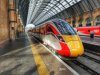
I don't mind it, but it won't suit any of the main stations it calls in with the possible exception of Leeds. That is a shame as stations are where they will be seen most. The Virgin livery was as bad. GNER looked really good, East Coast branding was pretty dreadful but always intended to be temporary.
As this is meant to become the permanent brand of the most iconic line in the country I would like to see something a bit better. Even running some green through the stripy bits might help to mirror the brilliant countryside it is running through.
I don't understand why Hitachi don't have a better solution for the blanked out windows, it really does look amateur - I am sure I have missed a post with the reasons somewhere. They let the aesthetics down badly.
The reasons why the windows are blanked out at the ends is due to the kitchen/galley being situated there: while I don't know if the blanking-out lets some light in (or no light at all), it's probably not a safe idea to dazzle chefs in an environment where hot liquids, heavy pots/pans and sharp tools are in very close proximity.
I agree, GNER did look rather smart, but I am (surprisingly, I might add) quite a fan of the LNER livery - it's very reminiscent of the ICE units in Germany. Indeed, most countries in Europe have a white livery with minimalistic additions for their high-speed fleet: SNCF's Carmillon livery, DB Fernverkehr's red/white, Trenitalia's Frecciabianca livery, RENFE's AVE livery etc.
Going to the Japanese roots of the Azumas though, it seems like (if LNER had cash to spend on rebranding, which I know they almost certainly don't) white and a blue stripe (as per the Shinkansen) would have been a huge missed trick, and certainly more evocative of the original "garter blue" which everyone seems to suddenly want back in vogue. But, as such, LNER (being run by the most tight-fisted gov't in my admittedly short living memory) want to save money on rebranding, so are keeping the VTEC-style red - which was also voted to stay by staff.
Joe Public's not gonna care much about what his train looks like from the outside as he races across the Vale of York at 125mph. Joe Public wants to have a seat on his journey.