nat67
Established Member
220-222 and the new AGA stuff.
700, 707 and 717


Yeah, this thread is I think about the vehicle being ugly rather than the livery. The Class 360 front end, for example, would look rubbish whatever colour you painted it. Whereas the classic HST would look good even in luminous pink.

Ugly: Class 313-317, 507-508, 321, 360 (because it was meant to have an inter gangway unit but was removed last minute for visibility issues) it wasn’t supposed to look so ugly.
Surprised at all the hate at the 321s, I love them. They’re one of my favourite multiple unit. The slanting headlights looks so sleek 1980s.
For me it's pretty much anything in BR blue, because the livery subleties were included as part of the original design... then BR simply threw blue and yellow paint pretty much indiscriminately at them.
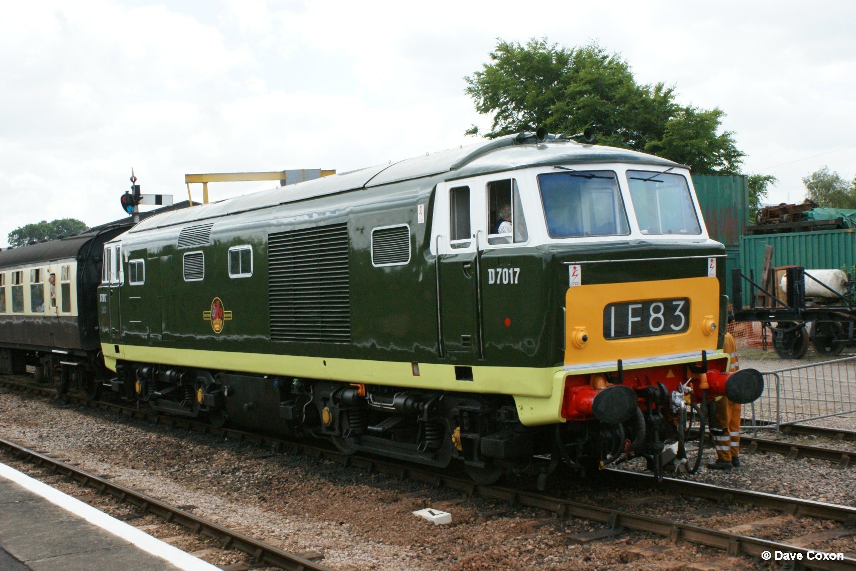
I know that nowadays spotters froth indiscriminately over blue livery, but if you are seriously trying to tell me that this...
... looks as stylish as this...
... then I seriously suggest you should have gone to Specsavers.
For me there's only one variation of BR blue that was appealing to the eye...
(None of the above are my images)
Class 195
350's remind me of a modernised Cravens 105.To be fair, the Heathrow Connect ones look much better with the slight curve in the yellow/black border making the front look far less slabby and plain
I don't think you can separate the two. Aesthetics is aesthetics, no matter what it is that makes the eye go yay or nay.Yeah, this thread is I think about the vehicle being ugly rather than the livery.
I'm obviously a similar age as you, although we differ in that I thought the blue era was ugly even then. One of the reasons I disliked it was precisely because everything was intended to look the same. Whereas I thought all the regional variations of the pre-Corporate Identity eras made the railway a much more colourful and interesting place.Whilst I agree that the Hymek undoubtedly looks better in green, and reflects the design better, and blue was plain and bland and made things look more like unattractive lumps, I'm quite nostalgic about Corporate Blue. Everything was painted in it when I was a kid, and therefore it reminds me of my early days out enjoying trains. I'm too young to remember green, and I think blue is a bit under-represented in preservation.
50x have a very American "subway train" look about them, but are also quite timeless - I actually think they look more modern than the 1980s Mk3 based DMUs and EMUs.