simple simon
Member
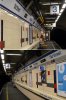
Tbh the NSE signage looks better than the new stuff!
My view exactly! The only positive thing I can say about the new station name frieze is that its functional.
I find the older NSE frieze to have been more attractive (visually). A nicer font, more colourful, even some transport operator branding!
I wonder what is the fate of the old signage - dumped? for sale? donated to a transport museum?
It would be a shame to see it dumped, especially when there will people people who would 'show the love' with hard earned cash. After all, if the London Transport Museum can make money selling former train parts (luggage racks, passenger door buttons, etc) and even BR sold off things at its Collectors Corner shop near Euston station, so the same should be possible with this iconic, historic and authentic Network SouthEast signage.
re: the platform wall tiles, I hope they are kept. They are very acceptable visually and my concern is that any replacement would be horrid - by way of example, Kings Cross Underground subsurface station (ie: Met, Circle Hamm& City lines) which had attractive 1940's era tiles but these were replaced with what I can only describe as a visual dogs dinner. Sheer vandalism - things which are not broken should not be 'fixed'.
However, the passageways would benefit from a refresh, as these are dull and uninspiring - maybe the new tiles could be installed over the old ones?
Last edited: