I spent a little time at Cambridge and think Abellio were taken in by fancy graphics and animations - just like people used to buy a TV because Dixons turned the saturation up to 100% and people thought colour=quality.
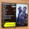
The presentation looks slick, but there was some disruption and the screens seem totally unable to convey this information clearly and there are some odd choices of colour for things. The text size doesn't adapt, and the Infotec screens used in the core on Thameslink convey information clearer - with scrolling (heck even the amber or white LED matrix screens can do it well, with the white screens having different shades of grey through dimming) and a clear understanding of the railway - no doubt because they've had more experience.
I also saw a few error messages that had a dialogue that needed someone (!) to click okay, but I wonder where the person is who oversees all of the displays?
Finally, the positioning of the screens was odd. Two banks of screens on platform 7 very close together and then nothing further down for ages. The way they show information in the booking hall also looked odd, and I didn't realise they swapped about based on timings (which would really throw people, thinking their train has disappeared).
I have no doubt the information can be fixed once the company gets a better understanding of what passengers want and need - but surely this should have been done 'behind closed doors' with focus groups and usability testers.
By all means split the screen to show other messages, but do it intelligently. For example, if everything is on time and the next service isn't for 5 minutes or more, show ads and promotions. If there's disruption, hide the ads and show more useful information. When a train is due, maybe use the screen to remind people to stand back, let people off, use all doors etc.
I am a firm believer that the next train should always remain on screen. Split things so that remains visible at all times. Use colours wisely to show when someone should pay attention etc.