• Our booking engine at tickets.railforums.co.uk (powered by TrainSplit) helps support the running of the forum with every ticket purchase! Find out more and ask any questions/give us feedback in this thread!

New Ticket Design Launched

Status
Not open for further replies.

thedbdiboy

Member
Joined
10 Sep 2011
Messages
960
What about a QR code on tickets which takes you to a webpage with restriction details?
Can't remember now where the new design puts restriction codes but I know on the old ones it is in small print, had I not seen the restriction code on brfares I would never have known that the tiny UT US next to "Validity" is the restriction code. Mind you, NRE could be more helpful with the restriction details...
There is space for a QR code and plans are afoot...
 
Sponsor Post - registered members do not see these adverts; click here to register, or click here to log in
R

RailUK Forums

kieron

Established Member
Joined
22 Mar 2012
Messages
3,055
Location
Connah's Quay
Its great it tells you which webpage to go to for that restriction (although 9I has several stations where you need to look up other restriction codes for instead and that webpage doesn't tell you how to find those..I know its a simple task but still!).
They definitely missed a trick by not including a link for each of those codes, particularly when the URL on the ticket redirects to something unmemorable like http://www.nationalrail.co.uk/times_fares/ticket_types/64133.aspx. Maybe they'll add links when they've converted the rest to HTML. Only http://nationalrail.co.uk/CG is there at the moment.

The text isn't the clearest, even given that it's trying to cover a lot of tickets other than a single from Watford Junction to Coventry not via London (which appears only to be valid on the WCML).

"London Paddington before 08:10 or after 16:40 until 18:31, except for Easements shown below. See also 'Notes' below;" is probably the worst one. I suppose the notes are a reference to the "travel via Hereford, Oxford or Newport" thing, but I can't say what they are referring to by "Easements".

I do know that this restriction code has changed quite a lot over the past few months (there were a lot more notes on the PDF version), so maybe it's something they intended to remove but haven't yet. I am wondering if there would be any way to find out the restriction code which applied to your ticket at the time you bought it.

I suspect front-line staff will quickly realise that printing out restriction codes isn't always all that helpful for the customer, even if they are professional enough to find out how to do it in the first place.
However if I'm on an unstaffed station with no internet coverage and I have to buy before boarding I have no way of checking if my ticket is valid and asking staff is no help as there aren't any and webpages are useless as there's no coverage so the new line is not any more helpful than the current useless "see restrictions".
Don't do that, then?
 
Last edited:

bb21

Emeritus Moderator
Joined
4 Feb 2010
Messages
24,151
Using the same abbreviations for dates that the rest of the English-speaking world uses is not a negative change.

But what are you gaining with this change, or is this a change for change's sake?

Remember that every time a change is made it makes life more difficult for many people, without necessarily many benefits.

They definitely missed a trick by not including a link for each of those codes, particularly when the URL on the ticket redirects to something unmemorable like http://www.nationalrail.co.uk/times_fares/ticket_types/64133.aspx. Maybe they'll add links when they've converted the rest to HTML. Only http://nationalrail.co.uk/CG is there at the moment.

The links work with all restriction code (or at least the vast majority of them). They are redirected to the actual pages which have different actual html page names.
 

jon0844

Veteran Member
Joined
1 Feb 2009
Messages
28,055
Location
UK
The various rail apps, including those from the TOCs (albeit rebranded/white label sites) should all show restriction codes too.

As for asking staff, TOCs should also consider adding an app for staff issued with a BlackBerry to look up codes easily (offline) so they don't actually need to learn or remember any.

But, just as some people might ask staff about the restrictions, the passenger will also benefit from having easy access to the codes when trying to ARGUE with staff that they are entitled to travel!!
 

Crossover

Established Member
Joined
4 Jun 2009
Messages
9,253
Location
Yorkshire
On a semi-related note, it would appear National Rail also own the domain nres.co.uk - this could be beneficial for printing links (the restriction codes work with the shorter domain too, redirecting to the full URL)
 

bb21

Emeritus Moderator
Joined
4 Feb 2010
Messages
24,151
On a semi-related note, it would appear National Rail also own the domain nres.co.uk - this could be beneficial for printing links (the restriction codes work with the shorter domain too, redirecting to the full URL)

Clever thinking indeed.
 

kieron

Established Member
Joined
22 Mar 2012
Messages
3,055
Location
Connah's Quay
There are plenty of others that work too - I've tried 8A, 8X, 2V, BX, ...
Sorry, I should have made it a bit clearer that I was referring to the codes which are mentioned in the details of the 9I code, as mentioned in embers25's post. I think I was mistaken, as 2V is there now. CG, YQ and YG aren't, though.
 

RJ

Established Member
Joined
25 Jun 2005
Messages
8,407
Location
Back office
It is not expected that every member of staff will be able to know or help with a restriction; but it is entirely reasonable that any member of staff should be able to direct a passenger as to where they can find the information out.

As has already been pointed out, the full text actually includes a web link to the restriction as well.

On that basis, I do find it hard to understand why it can be argued that the old method of printing 'see restrictions' with absolutely no other information can be seen as better.

"See restrictions" wasn't helpful and I didn't understand that statement either. Thanks for explaining the rationale behind the wording.

I expect that customers wishing to speak to someone will ultimately end up being directed to a guard or a ticket office. In both cases, tools are available at their fingertips to help customers with restrictions. I think an appropriate level of encouragement of their use would be beneficial for all concerned - even if it is to point out that the link on tickets isn't just for the benefit of the customers.

It's a significant move, opening up the world of restrictions to those who come into contact with tickets, not least because it will change public perception of what the concept of "off peak" actually is - i.e it not being a fixed thing for all tickets. It may also prompt more guards to consult the restriction text in their Avantix Mobile machines, which is great. The greatest benefit may be of people using tickets marked with a Maltese cross, as mid-route restrictions tend to knock people for six. I like the move and think it's to be applauded, but with some reservation. 'Bizarre' local arrangements for peak time upgrades in some areas undermine restriction codes and the NRCoC c.19, it'll be interesting to see what happens in the coming months. I anticipate possible media coverage too - MSE seeking out tickets with favourable restrictions anyone?

The opportunity could also be taken to clarify Break of Journey restrictions. A simple "Break of Journey permitted - Yes or No" at the very top of each restriction would help to achieve this. I think it's fair to say that information on BoJ is fairly obfuscated at the moment, save for well publicised exceptions like Virgin SV tickets from North Wales to the south.

As for the ticket itself, I don't see anything wrong with it - but I'd like to see more examples, different discounts applied, Travelcards and how longer route restrictions are shown. It's clear a lot of hard work and thought has gone into the design. People will get used to the smaller date font and I like the idea of the graphic denoting a discount. I would nip up north after work on Saturday to get some samples, but I don't think Northern's TVMs have a "buy from another station" function.

Also, "exchangeable for a fee" - are customers to be charged for excesses?
 
Last edited:

kieron

Established Member
Joined
22 Mar 2012
Messages
3,055
Location
Connah's Quay
The opportunity could also be taken to clarify Break of Journey restrictions. A simple "Break of Journey permitted - Yes or No" at the very top of each restriction would help to achieve this. I think it's fair to say that information on BoJ is fairly obfuscated at the moment, save for well publicised exceptions like Virgin SV tickets from North Wales to the south.
I did think something like that would be helpful. Then I found the code for the Tackley-London off-peak day return, which prohibits break of journey if you go to Paddington, and bans boarding anywhere other than Tackley or Heyford if you go another way. I don't think you could explain that on a ticket.
 
Last edited:

LexyBoy

Established Member
Fares Advisor
Joined
23 Jan 2009
Messages
4,478
Location
North of the rivers
I did think something like that would be helpful. Then I found the code for the Tackley-London off-peak day return, which prohibits break of journey if you go to Paddington, and bans boarding anywhere other than Tackley or Heyford if you go another way. I don't think you could explain that on a ticket.

I think "break of journey: no" on the OUT portion would suffice to replace the pig's ear they've made there :|
 

Solent&Wessex

Established Member
Joined
9 Jul 2009
Messages
2,684
And here is one in real life!

Not my picture, but sent to me by a friend.
 

Attachments

  • New Ticket.jpg
    New Ticket.jpg
    86.1 KB · Views: 271

hassaanhc

Established Member
Joined
5 Jan 2014
Messages
2,206
Location
Southall
There is space for a QR code and plans are afoot...

Thanks :) yeah I noticed it when I had the time to find the prototype posted on here. It is also good to see the NRE website working on telling you more about the restriction codes and finding information about them easily.
 

northernman

Verified Rep - Northern
Joined
19 Jul 2012
Messages
139
Good evening,

Some great feedback on the new formats so far, thanks very much. I thought it would be useful to share the roll out with you:

Hebden Bridge: ready now
Bingley: ready now
Glossop: ready now
Burley Park: ready now
Prudhoe: updated tonight
Pannal: updated 24/3
Irlam: updated 24/3

Regards

Ian Borthwick
Revenue Projects Manager
Northern Rail
 

Starmill

Veteran Member
Joined
18 May 2012
Messages
23,385
Location
Bolton
Good evening,

Some great feedback on the new formats so far, thanks very much. I thought it would be useful to share the roll out with you:

Hebden Bridge: ready now
Bingley: ready now
Glossop: ready now
Burley Park: ready now
Prudhoe: updated tonight
Pannal: updated 24/3
Irlam: updated 24/3

Regards

Ian Borthwick
Revenue Projects Manager
Northern Rail

Very good Thank you, Ian. :D I'll go investigate tomorrow: but if it's not enabled on ToD I suspect I'll only have something very similar to the already printed ticket to show for it!
 

Hassocks5489

Member
Joined
2 Feb 2014
Messages
244
Location
Hove, Sunny Sussex by the Sea
Good evening,

Some great feedback on the new formats so far, thanks very much. I thought it would be useful to share the roll out with you:

Hebden Bridge: ready now
Bingley: ready now
Glossop: ready now
Burley Park: ready now
Prudhoe: updated tonight
Pannal: updated 24/3
Irlam: updated 24/3

Regards

Ian Borthwick
Revenue Projects Manager
Northern Rail

Thanks Ian - I'll share this with my contact in the north who can go and get some samples for our collections. Thanks also to kwvr45 for the scan. I'll provide some feedback tomorrow, hopefully.
 

furlong

Established Member
Joined
28 Mar 2013
Messages
3,575
Location
Reading
I would be happy to use this thread for people to offer feedback to me

OK, I'll bite. I looked at a handful of these new tickets today alongside some in the old format from the same machine. Here are my personal opinions based on what I've seen so far.

I think there are three aspects to this.

1) The information printed on the ticket and the choice of words and phrases used.

2) The printing quality.

3) The layout.

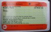
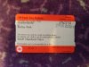
In the first category, the tickets are considerably clearer to the passenger. Fewer abbreviations. Better explanations. Informing travellers whether or not their ticket can be refunded or exchanged. Reducing the scope for passengers to misinterpret something on the ticket, deliberately or otherwise. There's still room for improvement. The requirement to carry/show railcards should be made explicit: Make it unarguable that the ticket is invalid otherwise. Terminology should not differ between the tickets and the ticket machines - for example the ticket says "Under 16 year old" but the machine still says "Child". I note that the "Concession Single" is not yet being printed in the new format, and as others have already mentioned, the machine needs to be a lot clearer about what qualifies as a "concession". Why can't the day of the week also appear now on the ticket next to the date of travel? (How often do people know today is "Friday" but forget whether it's the 20th or 21st?)


The printing quality is unsatisfactory. A ticket printed in advance has the date of travel printed in inverse. From the same machine, in the old format the date is just about readable, but on the new version it is illegible: the black has come out too solid in places. If this were to move beyond a small-scale trial, more work would be needed to tune the tickets to match more closely the capability of the printers in these machines. The green 'National Rail' text in the background is too strong and makes the tiny black printed text hard to read. (Again, on the old tickets, this is less of a problem because of a better choice of font for the text in an equivalent position.)

The layout is a mess and, in my view, still not fit for purpose. The existing layout wins hands down. The gains in clarity for the passenger have come at too great a price for staff, whose brains can glance at an existing ticket and rapidly process the patterns on it, home in on the areas of interest, and judge instinctively whether or not it needs closer examination. Either it will take longer to check each new ticket or that check will simply be less effective. Unlike the mocked up examples at the start of the thread, there is no space between some lines of text: the text is so squashed up vertically that it makes it slow to read it. "Valid for one journey from" has been pushed upwards and overlaps the orange band. The solid black symbols on the top right are a nice idea but badly implemented. The circle looks like a hole in the ticket and is smaller than in the mock-up. It is far too similar to the diamond - you have to look closely to see which it is. The symbols need to be more obviously distinct from each other and each symbol should appear in a fixed position on every ticket - they should not move left or right depending on what other ticket text there is. I think more symbols should be used. Much more attention should be paid to the choice of fonts, sizes and spacing used in different parts of the ticket.
 

transmanche

Established Member
Joined
27 Feb 2011
Messages
6,018
Much more attention should be paid to the choice of fonts, sizes and spacing used in different parts of the ticket.
I suspect that a lot of the issues you've highlighted are down to the font used by the specific model of TVMs involved in the trial. It's the same font they've always used and is quite different to the fonts used by other types of TVM.
 

furlong

Established Member
Joined
28 Mar 2013
Messages
3,575
Location
Reading
I suspect that a lot of the issues you've highlighted are down to the font used by the specific model of TVMs involved in the trial. It's the same font they've always used and is quite different to the fonts used by other types of TVM.

Tickets in the old format from the same machine are quite readable, so I don't accept that this is an unfixable problem caused by the machine's limited capabilities
 

Starmill

Veteran Member
Joined
18 May 2012
Messages
23,385
Location
Bolton
What is so badly illegible? Everything on that pic looks legible to me? Have you got a picture of a new-style ticket printed from a Parkeon machine for futrue travel?

These dates were very, very difficult to make out in some cases with the old-style tickets.
 

NorthernSpirit

Established Member
Joined
21 Jun 2013
Messages
2,184
I know that the ticket ofice in York already issues these new ones with a barcode, I did ask what is the barcode for and the person who served me told me that these barcodes are for the guard to scan the tickets.
 

ModernRailways

Established Member
Joined
21 Apr 2011
Messages
2,050
Looking at the ticket, it looks like there is a lot of dead space on it. On the current ticket there is next to no dead space.

I don't understand why the formatting on the current ticket wasn't just updated, for example the 'Route' could be changed to show an ID which when put onto National Rail will display a list of routes you can take in an easy to read format (including Via points).

I hate change, but this new design just seems flawed. I'll hold proper judgement till I've seen one in the flesh, but to me changing the design - whilst on the same ticketing stock - will just confuse a lot more people. It also seems to me that it would be easier to fake, since everything is left aligned with the exception of one or two items and since there isn't a universal font type it makes it even easier.
 

jon0844

Veteran Member
Joined
1 Feb 2009
Messages
28,055
Location
UK
I know that the ticket ofice in York already issues these new ones with a barcode, I did ask what is the barcode for and the person who served me told me that these barcodes are for the guard to scan the tickets.

I wonder if staff on trains will be given new equipment that will, obviously, know what service it is - so it will be like scanning a boarding card. If the ticket is valid, the scanner will show a green light (or whatever) and if not, go red.. or alert the staff member that a railcard is needed etc.

That's assuming their existing kit can't do that, with a suitable scanner add-on.

I hate change, but this new design just seems flawed. I'll hold proper judgement till I've seen one in the flesh, but to me changing the design - whilst on the same ticketing stock - will just confuse a lot more people. It also seems to me that it would be easier to fake, since everything is left aligned with the exception of one or two items and since there isn't a universal font type it makes it even easier.

I hope that once the system is in place to produce these new tickets, which are far more dynamic, it will be possible to make tweaks and adjustments to the text and layout with relative ease.

Ideally every TVM, which must be connected, can receive the changes as a software update that doesn't even require a visit.

Can TVMs get 'over the air' updates currently, or do they require someone to come out, open them up and physically change/update the software?
 
Last edited:

Starmill

Veteran Member
Joined
18 May 2012
Messages
23,385
Location
Bolton
Here is another one, I'll offer a bit more detailed feedback shortly:

EDIT:

So from my having handled these, here are the few things that stick out (don't worry about me having any delusions as to the value of my opinion though!).

  • There is definetly an issue with the 'from' and 'to' - and the date, on the same line as 'from'. There is not any space AT ALL between one line of text and the next, without a gap, so, for example the 'T' joins straight onto the 'I' in Ilkley.
  • The month is shown as 'Mch' - that just seems like inconsistencey ot me. 'Mch' is not a word, so I don't see how mixed case is appropriate! Either 'mch' or the existing 'MCH' would probably be just fine here?
  • The screen on the TVM was a LOT clearer with the new-style font and looked less discoloured - maybe even slightly less flickery?
  • The font on the tickets is much better than it was on the old Parkeon TVMs. I can't wait to check out the caligraphy when this nice font is used something other than a chipshop printer!
  • The use of mixed case is a huge improvment which makes it easier to read the place names quickly, and is more natural. The supporting text is clearer too, but of course there is now more of it!
  • Fears about the 'office use' field being difficult to read so far appear to be unforunded? Since this information is of almost no use to the passenger I like that it's importance on the tickets has been so reduced.
  • Printing anything over the gap between the orange bars and the faint green-on-white text is going to make it very difficult to read indeed! This example suffers from that in a minor way, but the one posted by kwvr45 seems worse! Perhaps just another consequnce of the shoddy printing!

Funny story really, the guard on the way back asked for a closer look at my ticket before saying "Oh is this one of the new ones? They are very hard to read aren't they!" Hehehe.
 

Attachments

  • 1978618_729001203806913_115153560_n.jpg
    1978618_729001203806913_115153560_n.jpg
    98.8 KB · Views: 247
Last edited:

34D

Established Member
Joined
9 Feb 2011
Messages
6,042
Location
Yorkshire
Thank you starmill. Looks nice and clear.

A question for those who know - if there was one QR code on the ticket, could this have a dual function:

-give detailed information to a barrier or a guard with suitable software

-when scanned by Joe public, go to a website with validity information?
 

jon0844

Veteran Member
Joined
1 Feb 2009
Messages
28,055
Location
UK
The background text is too dark IMO. And clearly there needs to be an adjustment to separate the text to stop it touching the next line.

And why does the above not stress the ticket is invalid without the railcard? It says about single usage and time restrictions. There's plenty of room.

As for the date, why not just have the month written in full? Again, there's the room.
 
Status
Not open for further replies.

Top