")
But there was absolutely no difficulty reading it the way it was - the site was an absolute model of clarity compared to pretty much every other website designed in the last 15 years.
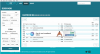
The problem now is that if you're using the simple view as a lightweight departures board - which I do, amongst many other things - it is much harder to see at a glance what is going on than it was before, because much less information fits on the screen.
Looking a bit more, I think the main issue is due to the operator now being listed. In the simple view, I don't feel I need a large proportion of my screen estate telling me that a train is a 'East Midlands Railway Service', especially when on my phone screen that wraps to be over two lines in portrait orientation.
(Please note : I think RTT is an absolutely brilliant website, it has made a massive difference to so many people and is to be congratulated. But due to that, I use it so much that I feel unhappy if it takes what seems even a slightly backward step...)
.png")