• Our booking engine at tickets.railforums.co.uk (powered by TrainSplit) helps support the running of the forum with every ticket purchase! Find out more and ask any questions/give us feedback in this thread!

Slight changes you would make to liveries to make them nicer

Status
Not open for further replies.

DasLunatic

Member
Joined
11 May 2015
Messages
696
So as the thread title suggests, what small tweaks to a livery would you do to a livery to make them look nicer?

A couple of mine:Untitlesd.png
(185 with a more 360-based front end)
Cl170_wo_yellow.png
(Class 170 with no yellow above orange line)
(also, excuse the poor painting)
 
Sponsor Post - registered members do not see these adverts; click here to register, or click here to log in
R

RailUK Forums

AndrewE

Established Member
Joined
9 Nov 2015
Messages
5,096
Cue the people suggesting they should be in Rail Blue...
What do you think most (non-enthusiast) travellers want? Pretty colours, or a co-ordinated network that runs on time, where you can understand the fares structure and where conections are protected if things are going wrong?
 
Last edited:

LOL The Irony

On Moderation
Joined
29 Jul 2017
Messages
5,335
Location
Chinatown, New York
So as the thread title suggests, what small tweaks to a livery would you do to a livery to make them look nicer?

A couple of mine:View attachment 39762
(185 with a more 360-based front end)
Fixed it further.

(PS: If these aren't your images, you need to credit the original poster or sate it's not your image)
 

Attachments

  • Class 185 with 360 front end.jpg
    Class 185 with 360 front end.jpg
    329.4 KB · Views: 534
Last edited:

gazthomas

Established Member
Joined
5 Jun 2011
Messages
3,053
Location
St. Albans
What do you think most (non-enthusiast) travellers want? Pretty colours, or a co-ordinated network that runs on time, where you can understand the fares structure and where conections are protected if things are going wrong?
I would suggest the latter.
 

Harbornite

Established Member
Joined
7 May 2016
Messages
3,634
Referring to the now out-of-date Virgin livery on the Pendolinos and Voyagers, red doors would have looked better than striped and would have still provided sufficient contrast with the rest of the bodyside.
 

Up_Tilt_390

Member
Joined
10 Oct 2015
Messages
923
I think the new Virgin Trains livery used on the West Coast Main Line could use a few changes. The final product looks something like a Swiss livery.

Virgin Trains White.png
 
Last edited:

talltim

Established Member
Joined
17 Jan 2010
Messages
2,454
What do you think most (non-enthusiast) travellers want? Pretty colours, or a co-ordinated network that runs on time, where you can understand the fares structure and where conections are protected if things are going wrong?
They aren’t mutually exclusive.

I think the XC 170 looks better but the 185 and the Voyager worse. Each to their own.
I also thought the striped doors on Virgin stock was great, glad I still get to see them in the inside of XC Voyagers!
 

xc170

Member
Joined
9 Feb 2008
Messages
815
The Pendolino looks excellent, I really like that, simple but stylish!

The 185 however, looks terrible.
 

3141

Established Member
Joined
1 Apr 2012
Messages
1,772
Location
Whitchurch, Hampshire
What do you think most (non-enthusiast) travellers want? Pretty colours, or a co-ordinated network that runs on time, where you can understand the fares structure and where conections are protected if things are going wrong?

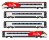
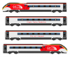
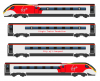
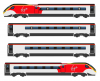
"Pretty colours" was obviously intended to be disparaging, but the trains should have a quality appearance and liveries should not look as if they're a thrown-on afterthought. Indeed, it's desirable that everything should look good and be well looked after - trains, buses, buildings, streets, parks.

I don't consider the current network uncoordinated, though I'm sure everyone can point to some areas where things could be better. You could do that under BR as well.

"Runs on time." Of course everyone would like that. Did BR always do it? Would they be able to do it with all the additional passengers and train movements of today?

Maybe the most difficult thing about the fares structure is the idea of split ticketing. But apart from that, things such as advance fares and internet-only offers shouldn't be a problem these days, and when you consider the extent to which a high proportion of the population uses various kinds of technology to do a very wide range of things it's difficult to see why buying a train ticket should be regarded as so outrageously complicated. If BR was still here they'd be using the same technology, and employing yield management to try to fill seats on more lightly-used services.

Protected connections. Yes, I'd definitely like that when my train is delayed for some reason. But the people in the train that's held for my benefit may think differently, and the ones in the train beyond that may have an even more different view.
 

Temple Meads

Established Member
Joined
2 Sep 2010
Messages
2,231
Location
Devon
Here's one I made earlier - finally a perfect thread for it...
 

Attachments

  • VTEC225improved.jpg
    VTEC225improved.jpg
    1.2 MB · Views: 856

TT-ONR-NRN

Established Member
Joined
30 Dec 2016
Messages
10,441
Location
Farnham
I couldn’t tell the difference to start with either. There is just one neat white swoosh as opposed to the actual swoosh with branches coming off it. That does look better!
 

Bletchleyite

Veteran Member
Joined
20 Oct 2014
Messages
97,784
Location
"Marston Vale mafia"
Yep, white liveries only look good with a window band.

Re VTWC it's deliberately bland/generic, allegedly they had to hassle DfT to allow any red. If Virgin's consortium's bid wins, more red will be added.
 

Bletchleyite

Veteran Member
Joined
20 Oct 2014
Messages
97,784
Location
"Marston Vale mafia"
As for XC it's a cheap vinyl job and looks like it. Just like "cheap job" summarises most of what that TOC does of course, so it's quite appropriate :)

Too many logos, too - understated is better.
 

43096

On Moderation
Joined
23 Nov 2015
Messages
15,270
As for XC it's a cheap vinyl job and looks like it. Just like "cheap job" summarises most of what that TOC does of course, so it's quite appropriate :)

Too many logos, too - understated is better.
Quite. I like their solution (ok, actually I’m being sarcastic) to the Virgin red on the roof. Just don’t wash them, as the exhaust and whatever else dirt is similar in colour to the XC livery.
 

Up_Tilt_390

Member
Joined
10 Oct 2015
Messages
923
With extension to my original post, I have also created a diagram of what the Pendolino would look like in the better livery. I think instead of the nameplates/stickers, maybe the name of the unit can be placed on the side to spice up the blandness a little. The logos could also be just Virgin, or have the Virgin Trains logo. Perhaps everyone can say which of the four images they like better.
 

Attachments

  • Virgin Trains White Diagram 2.png
    Virgin Trains White Diagram 2.png
    117.4 KB · Views: 430
  • Virgin Trains White Diagram 3.png
    Virgin Trains White Diagram 3.png
    124.9 KB · Views: 374
  • Virgin Trains White Diagram 4.png
    Virgin Trains White Diagram 4.png
    162 KB · Views: 359
  • Virgin Trains White Diagram.png
    Virgin Trains White Diagram.png
    122.6 KB · Views: 351

bastien

Member
Joined
14 Aug 2016
Messages
427
GWR Green, lovely, but what's the point of that matte stripe? Take it away!
 

D365

Veteran Member
Joined
29 Jun 2012
Messages
11,450
Quite possibly the most idiotically dangerous post of recent times. :rolleyes:

Do bear in mind that this is one of those 'fantasy' threads!

Imagine taking the yellow off a Deltic!
 
Status
Not open for further replies.

Top