• Our booking engine at tickets.railforums.co.uk (powered by TrainSplit) helps support the running of the forum with every ticket purchase! Find out more and ask any questions/give us feedback in this thread!

Stagecoach Repaint Updates

Status
Not open for further replies.

buslad1988

Member
Joined
28 Dec 2018
Messages
349
Much better than the current scheme, however i'm not a fan of the grey seats which are almost identical in shade to the bland ones First use.

Change the grab rails to magenta and it pretty much is the First interior!

The blue on the seats breaks it all up a bit but still very clinical... currently they have a nice bright set of brand colours to work from (just needs toning down) but appear to be going as bland as possible.
 
Sponsor Post - registered members do not see these adverts; click here to register, or click here to log in
R

RailUK Forums

Rod Harrison

Member
Joined
15 Oct 2017
Messages
116
I like the grey interior, looks smart. Just getting rid of all the non-beachball brands would be a huge step forward as is said above beachball is easily recognisable and has a good profile.
 

Flinn Reed

Member
Joined
8 Dec 2017
Messages
192
Change the grab rails to magenta and it pretty much is the First interior!

The blue on the seats breaks it all up a bit but still very clinical... currently they have a nice bright set of brand colours to work from (just needs toning down) but appear to be going as bland as possible.
I agree it looks bland, and loses all distinction with a blue interior without the orange. I think Stagecoach's interiors became a bit too bright when leather seats became standard. The switch from bright blue leather seats to grey has helped, but not sure if the blue theme fits with Stagecoach's recognisable brand colours.

I would suggest keeping the grey seats and the blue detailing on them, but with orange poles instead of blue. Would tone down the use of bright colours with the grey seats, but keeping the theme of both orange and blue.
 

Flinn Reed

Member
Joined
8 Dec 2017
Messages
192
A picture has appeared on Facebook supposedly showing the new style interior on an E400MMC at Hyde Road. It's a pale grey and dark blue colour scheme. Perhaps we're moving closer to an official announcement?
Are there any exterior images of this vehicle yet?
 

ClydeCoaster

Member
Joined
31 Jul 2019
Messages
155
B11R / Elite-I 54208 has moved from South Glocs Bus & Coach to Stagecoach Midlands Reserve Fleet "to prepare for Rebrand" - does that mean Megabus is in for a rebrand too?
 

hst43102

Member
Joined
28 May 2019
Messages
948
Location
Tyneside
B11R / Elite-I 54208 has moved from South Glocs Bus & Coach to Stagecoach Midlands Reserve Fleet "to prepare for Rebrand" - does that mean Megabus is in for a rebrand too?
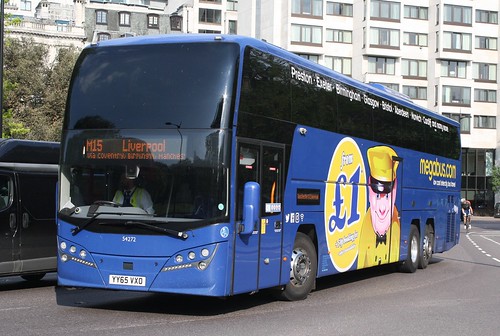
Megabus had a "facelift" to the livery a few years back - compare these two (not my pics)

42617733460_f2624e31fa.jpg
44041085530_86b0ca7717_b.jpg


The new B11RT / Plaxton Panoramas being delivered to Megabus have new interior but the old livery.
 

LOL The Irony

On Moderation
Joined
29 Jul 2017
Messages
5,335
Location
Chinatown, New York
Megabus had a "facelift" to the livery a few years back - compare these two (not my pics)

42617733460_f2624e31fa.jpg
44041085530_86b0ca7717_b.jpg


The new B11RT / Plaxton Panoramas being delivered to Megabus have new interior but the old livery.
They made the dude (forgot his name) look cleaner. The £1 advert had to go because the ASA got on their back because very few tickets could be had for a quid. The blue looks lighter but that could be due to lighting & camera settings.
 

Jordan Adam

Established Member
Joined
12 Sep 2017
Messages
5,527
Location
Aberdeen
They made the dude (forgot his name) look cleaner. The £1 advert had to go because the ASA got on their back because very few tickets could be had for a quid. The blue looks lighter but that could be due to lighting & camera settings.

Same blue, they just changed a few vinyls. I'd hardly call it a facelift. Many older vehicles are running about with the £1 logo covered over with a sticker advertising reclining seats, Wi-Fi etc.
 

scosutsut

Member
Joined
1 Jan 2019
Messages
933
Location
scosutsut
Simple changes, biggest improvement in my eyes is making the facial expression of the man on the side considerably less sinister!
 

tbtc

Veteran Member
Joined
16 Dec 2008
Messages
17,882
Location
Reston City Centre
Not my photo - 11254 presumably in Hyde Road depot - beachball livery but new interior
https://www.flickr.com/photos/128789124@N06/48617039416/in/dateposted/

That picture shows the problem that operators have when trying to have a stylised livery at the front of the vehicle.

Despite all of the complaints, it's not surprising that operators are going for similar liveries where there's a big darker sweep at the rear of the vehicle (i.e. the bit of the bus that will attract most dirt)... a fairly bland light colour scheme towards the front of the vehicle (due to the large black space taken up by the destination screen/ lights/ modern glazing)... and the only place that the operator can really express much creativity is underneath the (downstairs) windows - hence the various swooshes and patterns that give the impression of momentum (and fit in around the wheels).

Hence all of the apparently similar examples on the "Best Impressions" thread recently - it's very hard to make a bus livery work on modern vehicles due to the huge black spaces taken up by the destination screen area/ light clusters/ glazing.

Beachball worked well on vehicles around the millennium time, where you could have the descending blue bit of the "beachball" clearly visible, but there's not enough space for that level of detail now - we are entering an era where all buses look like big black slabs to passengers waiting at stops (with only one panel underneath the driver with any colour on it - often cream/white), so quite indistinguishable.

It's similar to the way that intrusive adverts on the front and a clear space for numbers on the back have ruined the striped football shirts of many teams!
 

overthewater

Established Member
Joined
16 Apr 2012
Messages
8,161
Said buses are now out in service. However still not talk of new livery, which seem weird, new interior but get old livery?
 

Rod Harrison

Member
Joined
15 Oct 2017
Messages
116
Don’t understand why they would spend millions rebranding their well recognised and respected brand. Just get rid of all non-beachball brands. People generally feel comfortable with what they know, familiarity is what people like and firms push brand loyalty always. However if it is a brand that has lost confidence which certainly doesn’t apply to Stagecoach. The whole rebranding May appeal to the bus spotters but not customers.
 

Bletchleyite

Veteran Member
Joined
20 Oct 2014
Messages
97,783
Location
"Marston Vale mafia"
Don’t understand why they would spend millions rebranding their well recognised and respected brand. Just get rid of all non-beachball brands. People generally feel comfortable with what they know, familiarity is what people like and firms push brand loyalty always. However if it is a brand that has lost confidence which certainly doesn’t apply to Stagecoach. The whole rebranding May appeal to the bus spotters but not customers.

Yeah, you can see how First might want to hide its brand as it is in a way toxic - but Stagecoach is (so far as buses go) a respected brand, so why change it?

(There are those who hate any bus company just because they are a bus company, but realistically they can be ignored)
 

Mal

Member
Joined
22 Feb 2015
Messages
248
Location
Liverpool
Don’t understand why they would spend millions rebranding their well recognised and respected brand. Just get rid of all non-beachball brands. People generally feel comfortable with what they know, familiarity is what people like and firms push brand loyalty always.

Agreed. There was a real big controversy when Lothian ditched madder and white for Harlequin as Edinburghers (and I am one) are real traditionists and stick with what we know and trust.
 

TheGrandWazoo

Veteran Member
Joined
18 Feb 2013
Messages
20,028
Location
Somerset with international travel (e.g. across th
Don’t understand why they would spend millions rebranding their well recognised and respected brand. Just get rid of all non-beachball brands. People generally feel comfortable with what they know, familiarity is what people like and firms push brand loyalty always. However if it is a brand that has lost confidence which certainly doesn’t apply to Stagecoach. The whole rebranding May appeal to the bus spotters but not customers.

Yeah, you can see how First might want to hide its brand as it is in a way toxic - but Stagecoach is (so far as buses go) a respected brand, so why change it?

(There are those who hate any bus company just because they are a bus company, but realistically they can be ignored)

Think there's a bit of a misunderstanding and it may seem like semantics but really, it's not.

Stagecoach AREN'T rebranding. When you fundamentally change a brand and what it stands for, that is rebranding. In the bus world, the biggest examples of that are probably the creation of the First and Arriva brands - taking and removing a disparate set of other brands, liveries, images etc and creating something new. That is rebranding. Of course, there were many others like the creation of Northumbria and North Western out of the better cuts of United and Ribble.

What Stagecoach seem to be doing is refreshing the brand. This is not to fundamentally change (the logo and name are staying the same) but to freshen it up.

All firms in all markets do it and always have. Of course, some rebrands/refreshes have been notorious - re: Consignia, or the British Airways one are ones that were reversed. The BP sun instead of the shield motif was another but we got used to it. Firms do it to either leave a toxic brand/image behind OR to simply pep up a flagging image. The latter is probably true here.
 

Jordan Adam

Established Member
Joined
12 Sep 2017
Messages
5,527
Location
Aberdeen
All firms in all markets do it and always have. Of course, some rebrands/refreshes have been notorious - re: Consignia, or the British Airways one are ones that were reversed. The BP sun instead of the shield motif was another but we got used to it. Firms do it to either leave a toxic brand/image behind OR to simply pep up a flagging image. The latter is probably true here.

Also the world evolves and so do design styles with it, bus operators (and all businesses) need to refresh their brand now and again to keep with the times. Beachball in my view is rather outdated now and in dire need of a refresh, it just screams early 00s. The shades of paint used are not very durable with vehicles looking tatty very quickly and livery application is horrendously inconsistent. Especially at a certain area (no name mentioned...) where the A9, A82 & A96 meet. :lol:
 

LOL The Irony

On Moderation
Joined
29 Jul 2017
Messages
5,335
Location
Chinatown, New York
Also the world evolves and so do design styles with it, bus operators (and all businesses) need to refresh their brand now and again to keep with the times. Beachball in my view is rather outdated now and in dire need of a refresh, it just screams early 00s. The shades of paint used are not very durable with vehicles looking tatty very quickly and livery application is horrendously inconsistent. Especially at a certain area (no name mentioned...) where the A9, A82 & A96 meet. :lol:
I think the Enviro 400MMC looks fresh, despite being 5 years old and just a modified 20 year old livery.
 

Jordan Adam

Established Member
Joined
12 Sep 2017
Messages
5,527
Location
Aberdeen
I think the Enviro 400MMC looks fresh, despite being 5 years old and just a modified 20 year old livery.

They look okay but i'm still not a huge fan, maybe if they weren't cheapskates with the application on the front i'd prefer it, the E200MMCs look particularly awful in beachball. The livery was designed to fit the buses of 20 years ago, but it does no justice to the lines of today. MMCs in beachball just look cheap when compared to other liveries.
 

ClydeCoaster

Member
Joined
31 Jul 2019
Messages
155
Agreed with the 200MMC - particularly when branding is applied ilke those in Fife, just awful. The E400MMCs do look decent in their variation, but I've noticed inconsistencies now - some repaints (such as the ex-London Omnicities) are going into full original beachball, while others have the white stripe separating the red and orange removed, some have the red and orange aligning with the dark blue skirt, some have it ending in the dark blue skirt...
 

Jordan Adam

Established Member
Joined
12 Sep 2017
Messages
5,527
Location
Aberdeen
Agreed with the 200MMC - particularly when branding is applied ilke those in Fife, just awful. The E400MMCs do look decent in their variation, but I've noticed inconsistencies now - some repaints (such as the ex-London Omnicities) are going into full original beachball, while others have the white stripe separating the red and orange removed, some have the red and orange aligning with the dark blue skirt, some have it ending in the dark blue skirt...

I was in Inverness yesterday, masters of painting buses they are!... They recently got some second hand Solo SRs, Streetlites, Centros and Enviro200s from D&E coaches, each one has a totally different paint application. Nothing new though as Inverness have been putting out the bodged swoop for about a decade now.
 
Status
Not open for further replies.

Top