It is when it's a typo.No it isn't, it's a town in the East Riding.
-
Our booking engine at tickets.railforums.co.uk (powered by TrainSplit) helps support the running of the forum with every ticket purchase! Find out more and ask any questions/give us feedback in this thread!
You are using an out of date browser. It may not display this or other websites correctly.
You should upgrade or use an alternative browser.
You should upgrade or use an alternative browser.
TfL Maps
- Thread starter leytongabriel
- Start date
- Status
- Not open for further replies.
Sponsor Post - registered members do not see these adverts; click here to register, or click here to log in
R
RailUK Forums
I understand the town motto is "Be Evil".No it isn't, it's a town in the East Riding.
I've just noticed that you show the Met fast line joining the slow line to serve Wembley Park, whereas the fast trains only stop at Wembley Park when there is a stadium event on.I don't think in principle there are too many lines on the tube map (Paris has what, 20ish lines on a tiny map), but the pocket size tube map isn't fit for purpose. Maybe consider having only a larger size and redraw some parts, especially Thameslink so it's neater. I don't know if it's true, but I've heard the Wimbledon Loop is actually busier on a weekend than pre-Covid. If it's a result of the Tube Map, then it can only be a good thing.
This one - a project I've worked on for a while and I'm still working on it...
Last edited:
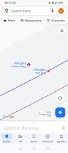
It is quite frustrating however because when they have assigned the wrong mode / logo to stations. This is because it stops things like timetabled or live departures from working when you press on the station. I have reported on this on the forum in the past; Hillingdon station has been shown as a NR station for years. This means that if you press on it you don’t get any departures like you would for any other LU station.Should maybe, but we're not talking about anything life changing here. Were this not a railway centric forum, I doubt there would be so much debate on whether google maps assigned BR (sic) or TfL implied ownership on a geographical map. Most passengers get tickets and travel, and don't really care who is running the station, track or trains as long as they run.
Sorry my mistake I skim read the article, it was introduced on 01 May.Actually I heard it had been implemented at the beginning of May so it was there for the opening.
However, if you zoom in close enough it does actually show the roundel with correct Met & Pic departures. I agree it's confusing though and should be corrected.... Hillingdon station has been shown as a NR station for years. This means that if you press on it you don’t get any departures like you would for any other LU station.
Attachments
I understand the town motto is "Be Evil".
I've just noticed that you show the Met fast line joining the slow line to serve Wembley Park, whereas the fast trains only stop at Wembley Park when there is a stadium event on.
I thought they skipped Wembley Park altogether, but then I jumped on one and I noticed the Met line diagrams say different. Says only skips during the morning peak (Southbound). The timetable confirms.
Thanks, I never knew that. I checked the southbound morning working timetable before complaining, but I didn't check the northbound. Do northbound Met passengers wanting the cross-platform interchange for Stanmore get any warning as to which Wembley Park platform they will be arriving at before they get there?I thought they skipped Wembley Park altogether, but then I jumped on one and I noticed the Met line diagrams say different. Says only skips during the morning peak (Southbound). The timetable confirms.
Fast trains off peak vanished a few years ago, the Amersham/Cheshams only miss Preston Road and Northwick Park nowThanks, I never knew that. I checked the southbound morning working timetable before complaining, but I didn't check the northbound. Do northbound Met passengers wanting the cross-platform interchange for Stanmore get any warning as to which Wembley Park platform they will be arriving at before they get there?
Doesn’t come up at all on my phone no matter how far in I zoom. I doubt Google will correct it as there doesn’t seem to be any way to report it. I have tried numerous times to suggest it’s deleted as it doesn’t exist or is a duplicate, however it never happens.However, if you zoom in close enough it does actually show the roundel with correct Met & Pic departures. I agree it's confusing though and should be corrected.
This isn’t the only place.
They don’t, they call at all stations during the daytime, leading to the rather perverse situation where Preston Rd & Northwick Park are served by more trains off peak than at peak times!Fast trains off peak vanished a few years ago, the Amersham/Cheshams only miss Preston Road and Northwick Park now
Thanks, I never knew that. I checked the southbound morning working timetable before complaining, but I didn't check the northbound. Do northbound Met passengers wanting the cross-platform interchange for Stanmore get any warning as to which Wembley Park platform they will be arriving at before they get there?
No worries. For cross-platform interchange, I've never had it announced. I do get the impression with the Met that it's really a suburban railway that the locals know how it works, and everyone else must figure it out. One thing I'd like TfL to do, which they seem to really not like doing, is listing the calling points on the onboard screens for routes where trains may skip stops. Doesn't even need to be verbally announced, but that little extra confirmation would be good for the Met, Overground & Elizabeth.
My mistake, I didn't realise it was as bad as that for passengers towards AmershamDoesn’t come up at all on my phone no matter how far in I zoom. I doubt Google will correct it as there doesn’t seem to be any way to report it. I have tried numerous times to suggest it’s deleted as it doesn’t exist or is a duplicate, however it never happens.
This isn’t the only place.
They don’t, they call at all stations during the daytime, leading to the rather perverse situation where Preston Rd & Northwick Park are served by more trains off peak than at peak times!
A very good map if I may say so.I don't think in principle there are too many lines on the tube map (Paris has what, 20ish lines on a tiny map), but the pocket size tube map isn't fit for purpose. Maybe consider having only a larger size and redraw some parts, especially Thameslink so it's neater. I don't know if it's true, but I've heard the Wimbledon Loop is actually busier on a weekend than pre-Covid. If it's a result of the Tube Map, then it can only be a good thing.
This one - a project I've worked on for a while and I'm still working on it...
I think the inclusion of canals and rivers other than the Thames clutters up the map more than it's helpful, similarly with parks. But I suppose that's a question of personal preference.
The boundaries of the fare zones could really do with being rounded as they look a bit blocky with straight lines. Particularly for Reading, where the cut-out bottom left hand corner looks a little bit strange.
The shading of the Woolwich Arsenal DLR service is a little too light in my view - it rather blends in with the Thames! Whilst I certainly see value in distinguishing the various DLR service patterns, perhaps there are some clearer shades of blue that could be used?
The hexagon for 'limited service' is a nice touch but is a difficult to distinguish from the normal circle at a glance. Perhaps you could use a square or triangle instead?
Also, just a minor error I spotted - Woolwich EL's station code is actually WWC, not WOW
")
AlbertBeale
Established Member
A very good map if I may say so.
I think the inclusion of canals and rivers other than the Thames clutters up the map more than it's helpful, similarly with parks. But I suppose that's a question of personal preference.
The boundaries of the fare zones could really do with being rounded as they look a bit blocky with straight lines. Particularly for Reading, where the cut-out bottom left hand corner looks a little bit strange.
The shading of the Woolwich Arsenal DLR service is a little too light in my view - it rather blends in with the Thames! Whilst I certainly see value in distinguishing the various DLR service patterns, perhaps there are some clearer shades of blue that could be used?
The hexagon for 'limited service' is a nice touch but is a difficult to distinguish from the normal circle at a glance. Perhaps you could use a square or triangle instead?
Also, just a minor error I spotted - Woolwich EL's station code is actually WWC, not WOW
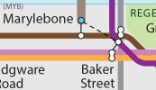
I too like this map, though there are some aspects I find a bit confusing. For example, Marylebone / Baker Street, where I'd like it clearer that the M'bone name applies to the mainline and the Bakerloo at that point and that they're one station really (at least one building, even if separate gatelines); it looks as though the mainline is as close to Baker St tube station as it is to M'bone tube. Similarly, it's unclear that the two Edgware Road stations are completely separate, though sharing a name. So I think that the distinction between usefiul links which are on the street and within-station links needs to be clearer. It's only when magnifying the map a lot that the dotted/non-dotted difference was clear. Fine on a massive wall map, but... Perhaps the non-dotted lines could be thicker.
In general though, I find the layout here less confusing than much of it is on the official maps!
Yes, the Bakerloo and Jubilee at Baker Street are cross-platform, they should be a blob rather than a connecting line — then the Marylebone walking route dotted line could connect instead to the Metropolitan part.I too like this map, though there are some aspects I find a bit confusing. For example, Marylebone / Baker Street, where I'd like it clearer that the M'bone name applies to the mainline and the Bakerloo at that point and that they're one station really (at least one building, even if separate gatelines); it looks as though the mainline is as close to Baker St tube station as it is to M'bone tube. Similarly, it's unclear that the two Edgware Road stations are completely separate, though sharing a name. So I think that the distinction between usefiul links which are on the street and within-station links needs to be clearer. It's only when magnifying the map a lot that the dotted/non-dotted difference was clear. Fine on a massive wall map, but... Perhaps the non-dotted lines could be thicker.
In general though, I find the layout here less confusing than much of it is on the official maps!
The path of the lines through the area would need to be altered to make it work neatly, but this topology makes much more sense:
Attachments
A very good map if I may say so.
I think the inclusion of canals and rivers other than the Thames clutters up the map more than it's helpful, similarly with parks. But I suppose that's a question of personal preference.
The boundaries of the fare zones could really do with being rounded as they look a bit blocky with straight lines. Particularly for Reading, where the cut-out bottom left hand corner looks a little bit strange.
The shading of the Woolwich Arsenal DLR service is a little too light in my view - it rather blends in with the Thames! Whilst I certainly see value in distinguishing the various DLR service patterns, perhaps there are some clearer shades of blue that could be used?
The hexagon for 'limited service' is a nice touch but is a difficult to distinguish from the normal circle at a glance. Perhaps you could use a square or triangle instead?
Also, just a minor error I spotted - Woolwich EL's station code is actually WWC, not WOW
Thank you!
I'm considering removing all waterways but the Thames, Lea & Regents Canal. I'll do a version with and without and decide on it. For parks, I may reduce them and I want to improve the look of them as well. This is only my second project, so still improving on my Illustrator skills.
I'm really not fond of the zones if I'm honest, I'd be inclined to take them off if they weren't useful. I'll try rounding them off and might redraw a few bits.
The Woolwich DLR route had no outline at first, but I found it difficult myself, so added a white outline. I might change it to black and see if that works better. I wanted to stick to the official colours used, but if needs must, I'll try a slightly darker line colour.
The hexagon I've also been thinking about, I'll try out a square.
Cheers for Woolwich station code. I looked at Real Time for Crossrail codes, I guess it was wrong?
I too like this map, though there are some aspects I find a bit confusing. For example, Marylebone / Baker Street, where I'd like it clearer that the M'bone name applies to the mainline and the Bakerloo at that point and that they're one station really (at least one building, even if separate gatelines); it looks as though the mainline is as close to Baker St tube station as it is to M'bone tube. Similarly, it's unclear that the two Edgware Road stations are completely separate, though sharing a name. So I think that the distinction between usefiul links which are on the street and within-station links needs to be clearer. It's only when magnifying the map a lot that the dotted/non-dotted difference was clear. Fine on a massive wall map, but... Perhaps the non-dotted lines could be thicker.
In general though, I find the layout here less confusing than much of it is on the official maps!
Yes, the Bakerloo and Jubilee at Baker Street are cross-platform, they should be a blob rather than a connecting line — then the Marylebone walking route dotted line could connect instead to the Metropolitan part.
The path of the lines through the area would need to be altered to make it work neatly, but this topology makes much more sense:
I'll see what I can do with the OSI interchanges. I'm not bothering with cross-platform interchanges as I don't think many people would really notice it. On the official, you'll never know Oxford Circus has a Bakerloo-Victoria line cross-platform interchange until you get there. But I'll look at Marylebone OSI with Baker Street. It did cross my mind that it looked a little unclear too.
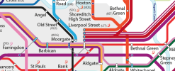
There are few changes I've already made that I haven't uploaded yet, such as straightening the Farringdon-Moorgate Crossrail route (thanks to the lack of proper Barbican interchange) and the location of Bethnal Green tube. I'm also thinking of moving the Bethnal Green Overground label to the other side and redrawing the ELL around Shoreditch for more space.
Attachments
MCR247
Established Member
- Joined
- 7 Nov 2008
- Messages
- 9,596
Thank you!
I'm considering removing all waterways but the Thames, Lea & Regents Canal. I'll do a version with and without and decide on it. For parks, I may reduce them and I want to improve the look of them as well. This is only my second project, so still improving on my Illustrator skills.
I'm really not fond of the zones if I'm honest, I'd be inclined to take them off if they weren't useful. I'll try rounding them off and might redraw a few bits.
The Woolwich DLR route had no outline at first, but I found it difficult myself, so added a white outline. I might change it to black and see if that works better. I wanted to stick to the official colours used, but if needs must, I'll try a slightly darker line colour.
The hexagon I've also been thinking about, I'll try out a square.
Cheers for Woolwich station code. I looked at Real Time for Crossrail codes, I guess it was wrong?
I'll see what I can do with the OSI interchanges. I'm not bothering with cross-platform interchanges as I don't think many people would really notice it. On the official, you'll never know Oxford Circus has a Bakerloo-Victoria line cross-platform interchange until you get there. But I'll look at Marylebone OSI with Baker Street. It did cross my mind that it looked a little unclear too.
There are few changes I've already made that I haven't uploaded yet, such as straightening the Farringdon-Moorgate Crossrail route (thanks to the lack of proper Barbican interchange) and the location of Bethnal Green tube. I'm also thinking of moving the Bethnal Green Overground label to the other side and redrawing the ELL around Shoreditch for more space.
A very minor thing to pick up on but the ELL looks like it goes under the GA and WA lines but over Crossrail
It does go over the Lizzie at Whitechapel, (but under the District/H & C). The NLL also goes over the two MML services three times but is shown on the maps as under in each case. This is of course a diagram and not a scale map, which is fine as apart from the likes of posters here, it's irrelevant to passengers.A very minor thing to pick up on but the ELL looks like it goes under the GA and WA lines but over Crossrail
I wouldn't say Z-ordering is irrelevant. The Z-order should aid clarity, so the straightest lines on the diagram should go under the bendiest ones, and the physical Z-order should be wilfully ignored.It does go over the Lizzie at Whitechapel, (but under the District/H & C). The NLL also goes over the two MML services three times but is shown on the maps as under in each case. This is of course a diagram and not a scale map, which is fine as apart from the likes of posters here, it's irrelevant to passengers.
MCR247
Established Member
- Joined
- 7 Nov 2008
- Messages
- 9,596
I should’ve been more specific but I’m actually referring to the approach to Liverpool St (High Level). It would simply make sense for consistency more than anything elseIt does go over the Lizzie at Whitechapel, (but under the District/H & C). The NLL also goes over the two MML services three times but is shown on the maps as under in each case. This is of course a diagram and not a scale map, which is fine as apart from the likes of posters here, it's irrelevant to passengers.
Western Sunset
Established Member
I do like LeeLivery's map. I'd def keep the parks are they do add something without adding to the clutter. Not sure if the three-letter station codes are worth keeping though. Are they of value?
In Hong Kong they use(d) these symbols for interchange:I'm not bothering with cross-platform interchanges as I don't think many people would really notice it.
Prince Edward: cross-platform interchange to the other line in the opposite direction
Mong Kok: cross-platform interchange to the other line in the same direction (it should really be an X since the green line has now been extended past Yau Ma Tei)
Yau Ma Tei: standard up/down stairs interchange

boiledbeans2
Member
One thing I'd like TfL to do, which they seem to really not like doing, is listing the calling points on the onboard screens for routes where trains may skip stops. Doesn't even need to be verbally announced, but that little extra confirmation would be good for the Met, Overground & Elizabeth.
It seems TfL has done the opposite...
Whenever the driver on the train (or a person on the platform at busy stations) makes manual announcements, they often say something like "This is a Victoria Line train calling at all stations to Brixton". Well, I don't think it's ever been otherwise...
There are times when stations are closed thoughIt seems TfL has done the opposite...
Whenever the driver on the train (or a person on the platform at busy stations) makes manual announcements, they often say something like "This is a Victoria Line train calling at all stations to Brixton". Well, I don't think it's ever been otherwise...
A very minor thing to pick up on but the ELL looks like it goes under the GA and WA lines but over Crossrail
Planning to change that. The layering is a pain.
I do like LeeLivery's map. I'd def keep the parks are they do add something without adding to the clutter. Not sure if the three-letter station codes are worth keeping though. Are they of value?
Yeah, I'm keeping parks, but will work on the look of them. As for station codes, I find it useful to speed up checking the next departures at my most regular stations.
In Hong Kong they use(d) these symbols for interchange:
Prince Edward: cross-platform interchange to the other line in the opposite direction
Mong Kok: cross-platform interchange to the other line in the same direction (it should really be an X since the green line has now been extended past Yau Ma Tei)
Yau Ma Tei: standard up/down stairs interchange
View attachment 115506
Ahh, that's not the simplest indication they could've done, but a good idea.
- Status
- Not open for further replies.