• Our booking engine at tickets.railforums.co.uk (powered by TrainSplit) helps support the running of the forum with every ticket purchase! Find out more and ask any questions/give us feedback in this thread!

Ticket machine interface design

Status
Not open for further replies.

py_megapixel

Established Member
Joined
5 Nov 2018
Messages
6,673
Location
Northern England
These [referring to some Chiltern machines described in another thread] look to be the same god-awful Parkeon/Flowbird ticket machines that Northern have (I think it's an Arriva-wide thing). They seem to be designed to look as fancy and futuristic as possible, while being needlessly slow to use by forcing everyone to go through a journey planner even if they know exactly what they want, and generally having an unintuitive and poorly laid-out user interface. Classic example of form over function.

The procedure for getting a ticket out of them is:
- skip past a list of commonly chosen stations
- skip past another list of commonly chosen stations
- type destination (whether it accepts CRS codes or not seems to be hit-and-miss)
- choose date
- select departure time (even if you want an open ticket??)
- click "continue"
- select ticket type/number of passengers/railcards etc.
- read a redundant confirmation screen
- pay; cross your fingers that your perfectly valid debit card isn't declined because the machine doesn't feel like it today.

and throughout this whole time, the touchscreen is really unresponsive and annoying to use.

To put that into perspective, at a few stations these pieces of cr*p are installed next to Virgin Trains/Avanti machines, where the procedure is literally as simple as
- type destination
- select ticket type and number of passengers (as well as railcards and things if you want)
- pay

If I was in a hurry, and know what I want, I can get a ticket out of one of those in less than a minute. Which means that even if the Virgin machine has a substantial queue, it can be quicker to wait that use the Northern one. Not that Northern deserve the commission for selling me the ticket anyway.
 
Last edited:
Sponsor Post - registered members do not see these adverts; click here to register, or click here to log in
R

RailUK Forums

Bletchleyite

Veteran Member
Joined
20 Oct 2014
Messages
97,873
Location
"Marston Vale mafia"
These look to be the same god-awful Parkeon/Flowbird ticket machines that Northern have (I think it's an Arriva-wide thing). They seem to be designed to look as fancy and futuristic as possible, while being needlessly slow to use by forcing everyone to go through a journey planner even if they know exactly what they want, and genuinely having an unintuitive and poorly laid-out user interface. Classic example of form over function.

I think the reason these awful machines came into play was Arriva's push to prat about with Advance Purchase on the Day on short-distance regional trains, a decision almost as stupid (and demonstrating of everything that is wrong with the present structure of the railway) as the machines themselves.

Though solving it would be as simple as having a button "I don't want to choose a specific train" with a subnote of "this may result in a higher ticket price as Advance fares will not be available". Then go into the near-standard Scheidt & Bachmann style interface Northern used to use.
 

py_megapixel

Established Member
Joined
5 Nov 2018
Messages
6,673
Location
Northern England
I think the reason these awful machines came into play was Arriva's push to prat about with Advance Purchase on the Day on short-distance regional trains, a decision almost as stupid (and demonstrating of everything that is wrong with the present structure of the railway) as the machines themselves.

Though solving it would be as simple as having a button "I don't want to choose a specific train" with a subnote of "this may result in a higher ticket price as Advance fares will not be available". Then go into the near-standard Scheidt & Bachmann style interface Northern used to use.
S&B interfaces do seem to be rather more intuitive (though if I remember, their payment interface went down for a few hours one day a few years ago and caused thousands of commuters to be unable to buy their tickets!)

My favourite ticket machine interface has to be the Manchester Metrolink one, where buying a ticket for almost any journey can be done in less than 5 button presses from start to finish. Select the zones you want - select whether you want a single or a travelcard - select number of adults, children and group tickets - done. It's rare I see someone struggling with this, and when they are, it's invariably because they are unsure what zones they are travelling in, and not because they can't figure out how to work the machine.

Once you're used to it, it only takes a few seconds, plus the time the printer takes to actually print the tickets. (as an aside, I've always liked TfGM's approach of using credit-card sized ticket stock but making it yellow; it works well.)

Granted, that's a zoned network, so there are far fewer possible fares, but it doesn't mean that something equally intuitive (but possibly requiring a few more button presses) couldn't be implemented on e.g. Northern or Chiltern.

They also don't bother with the "Touch here to start" nonsense, and just have it permanently displaying the first screen, which TOCs presumably don't like because you can't then give the machine a secondary role as a digital advertising billboard when not in use.
 

Bletchleyite

Veteran Member
Joined
20 Oct 2014
Messages
97,873
Location
"Marston Vale mafia"
They also don't bother with the "Touch here to start" nonsense, and just have it permanently displaying the first screen, which TOCs presumably don't like because you can't then give the machine a secondary role as a digital advertising billboard when not in use.

TVMs generally mostly don't show advertising. I wonder if that's mostly because people developing them still think you get screen burn-in on LCDs (you don't to any significant extent, though you do a bit on OLEDs) and so think a screensaver is necessary (it's not).

I do think TVMs should have an option "I don't know which ticket to buy, please help me" type option which is where the planners come in, but Northern and Chiltern are used primarily by regular travellers who know full well what they want.

Though I think there's scope to simplify even that in most cases. 99% of people rocking up at Chiltern stations will be wanting either a day return (of whatever type) to London Terminals or a Travelcard for use on the next direct train, which doesn't require a "full-fat" journey planner. So you could start with destination (as most do), then the ticket type list with an "I don't know" button, which would then take you to a list of the next 2 or 3 direct trains to your destination, then only move onto the "full fat" journey planner if you then press "I'm not taking one of these trains"?
 
Last edited:

CyrusWuff

Established Member
Joined
20 May 2013
Messages
4,025
Location
London
The original software installed on the machines in question didn't include the "Journey Planner" functionality, but customers complained that they couldn't use them to buy tickets originating from other stations or time-restricted tickets in advance.

It would be helpful to have an option to revert to the "simple" interface when buying tickets for immediate travel, but we're stuck with what we've got for now.
 

Bletchleyite

Veteran Member
Joined
20 Oct 2014
Messages
97,873
Location
"Marston Vale mafia"
The original software installed on the machines in question didn't include the "Journey Planner" functionality, but customers complained that they couldn't use them to buy tickets originating from other stations or time-restricted tickets in advance.

You can do both of those things from the LNR Scheidt & Bachmann machines without a planner.

You press "tickets from another station" and pick which station (I think it also asks what day/time if you do that), or "tickets for another day/time" and pick what day/time you are travelling, then it shows the normal UI the same as if you were stood at the TVM at that time on that day. No journey planner necessary.
 

Wallsendmag

Established Member
Joined
11 Dec 2014
Messages
5,200
Location
Wallsend or somewhere in GB
Why not simply reduce the cost of an anytime return, rather than jumping through hoops, requiring complex expensive validation, and removing rights like break of journey?

If you really want to make it more expensive for occasional users who would normally travel via another means, you could introduce a railcard to give the discount.

You can do both of those things from the LNR Scheidt & Bachmann machines without a planner.

You press "tickets from another station" and pick which station (I think it also asks what day/time if you do that), or "tickets for another day/time" and pick what day/time you are travelling, then it shows the normal UI the same as if you were stood at the TVM at that time on that day. No journey planner necessary.
S&B TVMs are notoriously expensive to keep up to date.
 

miami

Established Member
Joined
3 Oct 2015
Messages
3,167
Location
UK
Why is a TVM anything more than a touchscreen webpage with an attached card reader and printer? If internet connection is down, then it's out of use, same as if power is off. Metrics of the TVM being online/offline could be visible.

Vast majority of TVMs are in locations where running a bit of DSL, or at most a 4G directional antenna on a stick, is trivial.
 

Watershed

Veteran Member
Associate Staff
Senior Fares Advisor
Joined
26 Sep 2020
Messages
12,077
Location
UK
Not that Northern deserve the commission for selling me the ticket anyway.
Doesn't make any difference at the moment. All goes to the DfT one way or the other.

while being needlessly slow to use by forcing everyone to go through a journey planner even if they know exactly what they want
The majority of TVM users will want something off the list of popular destinations and tickets.

Though I think there's scope to simplify even that in most cases. 99% of people rocking up at Chiltern stations will be wanting either a day return (of whatever type) to London Terminals or a Travelcard for use on the next direct train, which doesn't require a "full-fat" journey planner. So you could start with destination (as most do), then the ticket type list with an "I don't know" button, which would then take you to a list of the next 2 or 3 direct trains to your destination, then only move onto the "full fat" journey planner if you then press "I'm not taking one of these trains"?
Have you come across any Chiltern station that doesn't list London on the first screen?

Why is a TVM anything more than a touchscreen webpage with an attached card reader and printer? If internet connection is down, then it's out of use, same as if power is off. Metrics of the TVM being online/offline could be visible.

Vast majority of TVMs are in locations where running a bit of DSL, or at most a 4G directional antenna on a stick, is trivial.
A quick buy button should, on average, be quicker than a journey planner. 'Throughput' matters at TVMs - you can't justify having tens of them for the few hours of peak demand most stations (used to) see.
 

py_megapixel

Established Member
Joined
5 Nov 2018
Messages
6,673
Location
Northern England
The majority of TVM users will want something off the list of popular destinations and tickets.
That's the problem. These aren't suggested destinations, these are suggested tickets.
9 times out of 10, I want something which is suggested as a destination, but not that ticket type. (For example I might want an off peak single but the suggested ticket is an anytime day return).
 

Wallsendmag

Established Member
Joined
11 Dec 2014
Messages
5,200
Location
Wallsend or somewhere in GB
By far the majority of TVM users want one thing and one thing only, to collect their pre-booked tickets.

Flowbird TVMs have two popular screens, popular tickets and popular destinations
 

Bletchleyite

Veteran Member
Joined
20 Oct 2014
Messages
97,873
Location
"Marston Vale mafia"
That's the problem. These aren't suggested destinations, these are suggested tickets.
9 times out of 10, I want something which is suggested as a destination, but not that ticket type. (For example I might want an off peak single but the suggested ticket is an anytime day return).

That's one that I think Shere did better - the front screen is popular destinations then you pick your ticket next. That makes the screen more useful as you can fit more on.
 

py_megapixel

Established Member
Joined
5 Nov 2018
Messages
6,673
Location
Northern England
Flowbird TVMs have two popular screens, popular tickets and popular destinations
Which is a horrible bit of design. Essentially it makes me feel like I'm playing one of those "Can I guess your number" quizzes, except it's "Can I guess your ticket?"...

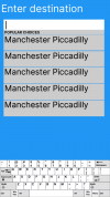
The idea layout IMO would be being presented with a text box immediately, but with a drop down menu of the typical destinations - something like what I've put below. The options in the drop down could then adapt themselves to what the user is typing (for example, typing "Bram" would bring Bramhall, Bramley and Brampton to the top of the list)
Note that the options would not all be Manchester Piccadilly (I wasn't feeling very imaginative), and the touchscreen keyboard would not be the diagram copied and pasted from the Wikipedia page for the QWERTY layout - but you get the idea.

1609709297982.png


This isn't rocket science, Parkeon (or whoever writes their software)! Google Search and its competitors have been doing it for years!
 

Wallsendmag

Established Member
Joined
11 Dec 2014
Messages
5,200
Location
Wallsend or somewhere in GB
Strangely enough, because the favourite tickets bypasses the journey planning screen its disabled on our TVMs currently. Leaving popular destinations Or one touch to enter where you want to go.
 

Bletchleyite

Veteran Member
Joined
20 Oct 2014
Messages
97,873
Location
"Marston Vale mafia"
Strangely enough, because the favourite tickets bypasses the journey planning screen its disabled on our TVMs currently. Leaving popular destinations Or one touch to enter where you want to go.

Even if you wanted to force the use of a planner, the way it's implemented is usually fairly cack-handed for a TVM. Most users of TVMs want the next connection to their chosen destination from that station or the one after, so when you've selected the station it would make most sense to show the next few connections for the chosen destination straight away (plus slower ones if a cheaper ticket exists). Selecting a different origin/day/time should be a secondary option because fewer people will want it.

In the event of the next train being delayed, it also needs to include that provided any connections wouldn't be likely to miss. People on here know that you can just pick any peak/off peak train as appropriate then use the ticket on the delayed one, but the layman will think they can't buy a ticket for the delayed train and give up.

A "full Trainline style" UI should be a secondary option under something like "I want to purchase a ticket in advance for a later date or time or from a different station".
 

py_megapixel

Established Member
Joined
5 Nov 2018
Messages
6,673
Location
Northern England
Strangely enough, because the favourite tickets bypasses the journey planning screen its disabled on our TVMs currently. Leaving popular destinations Or one touch to enter where you want to go.
That's an interesting one.

While I'm glad that one less needless screen is being displayed, I am led to wonder why there is such an obsession with customers completing the arduous and in many cases superfluous journey planner step.
Is it perhaps to force the customer to specify which train they are travelling on, so that if it's marked as "reservations only" they can be required to make a reservation before continuing?
 

Wallsendmag

Established Member
Joined
11 Dec 2014
Messages
5,200
Location
Wallsend or somewhere in GB
That's an interesting one.

While I'm glad that one less needless screen is being displayed, I am led to wonder why there is such an obsession with customers completing the arduous and in many cases superfluous journey planner step.
Is it perhaps to force the customer to specify which train they are travelling on, so that if it's marked as "reservations only" they can be required to make a reservation before continuing?
We have to have the journey planner as if you pick one of our trains you need a reservation
 

Haywain

Veteran Member
Joined
3 Feb 2013
Messages
15,191
That's an interesting one.

While I'm glad that one less needless screen is being displayed, I am led to wonder why there is such an obsession with customers completing the arduous and in many cases superfluous journey planner step.
Is it perhaps to force the customer to specify which train they are travelling on, so that if it's marked as "reservations only" they can be required to make a reservation before continuing?
The journey planner predates mandatory reservation but is useful/essential in the current circumstances.
 

Bletchleyite

Veteran Member
Joined
20 Oct 2014
Messages
97,873
Location
"Marston Vale mafia"
How many times has this subject come up? The majority of TVM customers buying tickets don’t frequent these forums and are reassured by the journey planning function.

That they may be, but with all due respect it's cack-handed and awkward; it needs redesigning to produce a ticket more quickly.
 

infobleep

Veteran Member
Joined
27 Feb 2011
Messages
12,658
The solution is to offer both options. I appreciate if a reservation is mandatory then obviously a journey planner is needed but that isn't the case every where. Some services doesn't even offer reservations, even if a passenger would like one.

There may even be e passengers who are reassured that they will be able to get on a train if they have a reservation but the service doesn't offer it.
 

Steddenm

Member
Joined
2 Mar 2017
Messages
790
Location
Clane, Co. Kildare
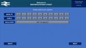
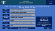
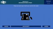
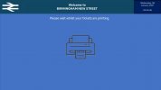
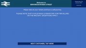
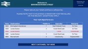
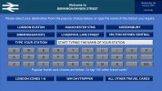
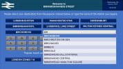
I've been thinking with all the talk of how confusing the Arriva, LNER and Avanti ticket machines are whether it is best to go back to basics, so I've redesigned the interface.

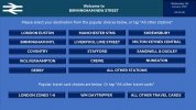
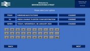
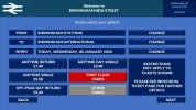
I have chosen Birmingham New Street as a station to try....

(Click on the thumbnail to view full image)

Slide1.JPG
This is the screen passengers see to start.

Slide2.JPG
This is the screen passengers see if they select a destination that isn't on the main screen.

Slide3.JPG
This is where they'll select their ticket type.

Slide4.JPG
Number of passengers and railcards.

Slide5.JPG
Confirmation screen.

Slide6.JPG
Payment screen.

Slide7.JPG
Printing screen.

Slide8.JPG
Thank you screen.
 

py_megapixel

Established Member
Joined
5 Nov 2018
Messages
6,673
Location
Northern England
I really don't understand why ever ticket machine I've seen to date insists on having the "popular destinations" screen separate from the text box screen.

Here is an (admittedly a lot less refined) verison I designed on another thread about this subject, which uses the model Google etc. have for years - a dropdown as you type.

Note that the options would not all be Manchester Piccadilly (I wasn't feeling very imaginative), and the touchscreen keyboard would not be the diagram copied and pasted from the Wikipedia page for the QWERTY layout - but you get the idea.

1609709297982-png.88146


But other than that, yes those designs certainly look reasonable. Having to click "Change" to type in something new is a bit clunky though.
 

RailAleFan

Member
Joined
2 Jul 2014
Messages
316
Location
Midlands
Showing the next departure(s) valid for the ticket just purchased might be a nice touch on the "Thank you" screen, not sure if any do that, it's not something i've ever seen.
 

ainsworth74

Forum Staff
Staff Member
Global Moderator
Joined
16 Nov 2009
Messages
27,671
Location
Redcar
Impressive! I've long despaired that the industry has somehow ended up with TVM software that is worse to use than just one of the myriad online journey planners. One thought is that it does lack the fully featured journey planning options that are slowly creeping out (see LNER, Northern and I'd assume others). But! This is no bad thing as for the simple "I want a ticket to the next station for immediate travel" this seems much slicker than a lot of existing TVM software. It would perhaps be nice as something you could select from the first screen along side popular destinations and other destinations.
 

Haywain

Veteran Member
Joined
3 Feb 2013
Messages
15,191
I really don't understand why ever ticket machine I've seen to date insists on having the "popular destinations" screen separate from the text box screen.
Because there's a benefit in saving 80% of your users from having to type in the name of the station they want? And, I would add, when asking them to type we do have the equivalent of a drop down by showing stations that fit with the typed letters.
 

Steddenm

Member
Joined
2 Mar 2017
Messages
790
Location
Clane, Co. Kildare
Slightly modified on your comments:

Slide9.JPG
Welcome screen now allows you to enter your destination manually

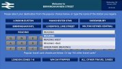
Slide10.JPG
An alphabetised list appears when you start typing the name of the station

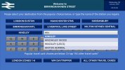
Slide11.JPG
This will only show the stations which have the first three letter in it's name (eg HIN), or if the station has a name in brackets (i.e. Green Park (Reading)):

Slide12.JPG

By tapping on the name of the station it will automatically take you to the purchase ticket type page, however the button on the left will display the first station in the dropdown.
 
Status
Not open for further replies.

Top