swt class 450
Guest
- Joined
- 9 Apr 2016
- Messages
- 1,909
What are your favourite and least favourite bus liveries? What do you like or dislike about them?
You can include current companies or defunct companies that have shut down.
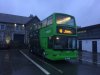
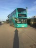
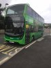
The new Arriva livery is one of my favourites. I think it looks really smart and nice. It is a nice simple livery as well. I think it really suits the buses. I like their other two older ones as well.
So these twelve are probably among my favorites:
• https://flic.kr/p/29APmCS - Arriva 3rd
• https://flic.kr/p/nWTUaQ - Arriva 2nd
• https://flic.kr/p/28A8FbP - Arriva 1st
• https://flic.kr/p/aLu3pp - Countryliner
• https://flic.kr/p/ajc4pm - Sunray Travel
• https://flic.kr/p/aBfGJL - Coastal Coaches
• https://flic.kr/p/ahzoR3 - Kent Top Travel
• https://flic.kr/p/xxZxM4 - Buses Excetera
• https://flic.kr/p/24m9bVe - Compass Bus
• https://flic.kr/p/ny6bb6 - Southdown PSV
• https://flic.kr/p/eSPq8U - Wiltshire Buses
• https://flic.kr/p/nP6aHD - Pennine Bus
A lot of these liveries i have linked are very simple (often just white with one other colour) but i think they work very well. I think the colours suits the bus. I quite like the liveries where it is mostly white but with a different colour at the bottom or at the top (or both).
My least favourite is anything designed by Ray Stenning (Best Impressions). This man has made a huge amount of money just reusing the same old livery hundreds of times but just changing the colours. They all look the same. You can always tell when a livery has been designed by him. I also find his liveries are all so boring. I don't know why he is so popular. So i am not a fan of any of those.
So what are your favourites and least favourites? What have been the best and worst liveries?
You can include current companies or defunct companies that have shut down.
The new Arriva livery is one of my favourites. I think it looks really smart and nice. It is a nice simple livery as well. I think it really suits the buses. I like their other two older ones as well.
So these twelve are probably among my favorites:
• https://flic.kr/p/29APmCS - Arriva 3rd
• https://flic.kr/p/nWTUaQ - Arriva 2nd
• https://flic.kr/p/28A8FbP - Arriva 1st
• https://flic.kr/p/aLu3pp - Countryliner
• https://flic.kr/p/ajc4pm - Sunray Travel
• https://flic.kr/p/aBfGJL - Coastal Coaches
• https://flic.kr/p/ahzoR3 - Kent Top Travel
• https://flic.kr/p/xxZxM4 - Buses Excetera
• https://flic.kr/p/24m9bVe - Compass Bus
• https://flic.kr/p/ny6bb6 - Southdown PSV
• https://flic.kr/p/eSPq8U - Wiltshire Buses
• https://flic.kr/p/nP6aHD - Pennine Bus
A lot of these liveries i have linked are very simple (often just white with one other colour) but i think they work very well. I think the colours suits the bus. I quite like the liveries where it is mostly white but with a different colour at the bottom or at the top (or both).
My least favourite is anything designed by Ray Stenning (Best Impressions). This man has made a huge amount of money just reusing the same old livery hundreds of times but just changing the colours. They all look the same. You can always tell when a livery has been designed by him. I also find his liveries are all so boring. I don't know why he is so popular. So i am not a fan of any of those.
So what are your favourites and least favourites? What have been the best and worst liveries?