trash80
Established Member
I dig that dark grey, i hope they use more of that on the finalised liveries
That one isn't the full WMR livery though at least, it's just a temporary cover up for units that are soon to be leaving the franchise. Other units, such as the 172s, will be getting the full orange and purple livery, rather than this one. Besides, I'm sure the orange will look a lot nicer once we have trains without the yellow ends.
I disagree about having standardisation, it's nice to have a variety of liveries across the country, especially when they're ran by different TOCs. If this were British Rail, I'd be inclined to agree, but those days are long gone and I personally can't see them returning soon.
Coming thick and fast now!
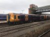
Image credit to David Carter-Coates
Wow, thats much better that the original 172 livery!Coming thick and fast now!
Image credit to David Carter-Coates
Looks good
Will clash horribly with the Interiors will the 172s be refreshed ?
Unit number?
Much prefer that to the original - the dark purple gives an impression of quality. Still not sure about just the gangway being yellow though. The front should either be all yellow or no yellow.Coming thick and fast now!
Image credit to David Carter-Coates
Much prefer that to the original - the dark purple gives an impression of quality. Still not sure about just the gangway being yellow though. The front should either be all yellow or no yellow.
Much prefer that to the original - the dark purple gives an impression of quality. Still not sure about just the gangway being yellow though. The front should either be all yellow or no yellow.
Photo from Martin Bromage-Griffiths
View attachment 50231
The deeper purple is much better.
Can't be called Double Decker anymore though
That would be my preferred option, yes. Even top black and bottom yellow would be better, though if the headlights don't comply I'm not sure that's enough yellow.How about the top half black (linking both windows which are black outlined) and the bottom orange on the gangway?
How about the top half black (linking both windows which are black outlined) and the bottom orange on the gangway?
The lights themselves might be (but I'm not sure that the way in which they operate do), but because they were introduced at a time when the new headlight rules didn't exist, they had to have the yellow panel and in order to get rid of it now they would have to go through mountains of paperwork - potentially in addition to modifying the lightsCall me naive but can someone explain the reason as to why they have kept a strip of yellow? I was under the impression the lights on the 172 were good enough to operate without the yellow strip
The orange and purple is good, but I'd like to see a livery entirely in that beautiful deep purple. Along with a good logo, that could end up looking very smart.

Trams in Coventry... What a bizarre notion! They used to terminate at the bottom of my street sometime before WWII.If a future tram system is introduced for Coventry, then I suppose this may be branded separately to the Metro if both systems are not linked. With a different name and the Coventry buses already in blue, then another colour will have to be selected for the Coventry trams therefore complicating TfWM's colour coordinated policy more!
Much better than anything else WMT have produced.
Whilst I still don't like the Yellow/Purple combo (that's personal preference and doesn't count for anything), this iteration looks smart, with just two colours, easily-distinguished ends and doorways, it's tidy, professional, and will be easy to keep looking clean (unlike white liveries).
If only they'd have done this to the 323s too (yes I know they're leaving the franchise and thus won't be fully re-liveried for economic reasons...)
In terms of colour; this still looks very yellow-gold rather than Orange to me, I know camera and lighting can affect things but no way is this the same shade of Orange that has been used to paint stations. They should have used this deep purple as their main / station-painting colour, instead of bizarrely trying to emulate the London Overground.