• Our new ticketing site is now live! Using either this or the original site (both powered by TrainSplit) helps support the running of the forum with every ticket purchase! Find out more and ask any questions/give us feedback in this thread!

Best Impressions

Status
Not open for further replies.

Tetchytyke

Veteran Member
Joined
12 Sep 2013
Messages
14,924
Location
Isle of Man
I'll start a new thread about Best Impressions liveries, as they're always a little bit more controversial than I've ever understood.

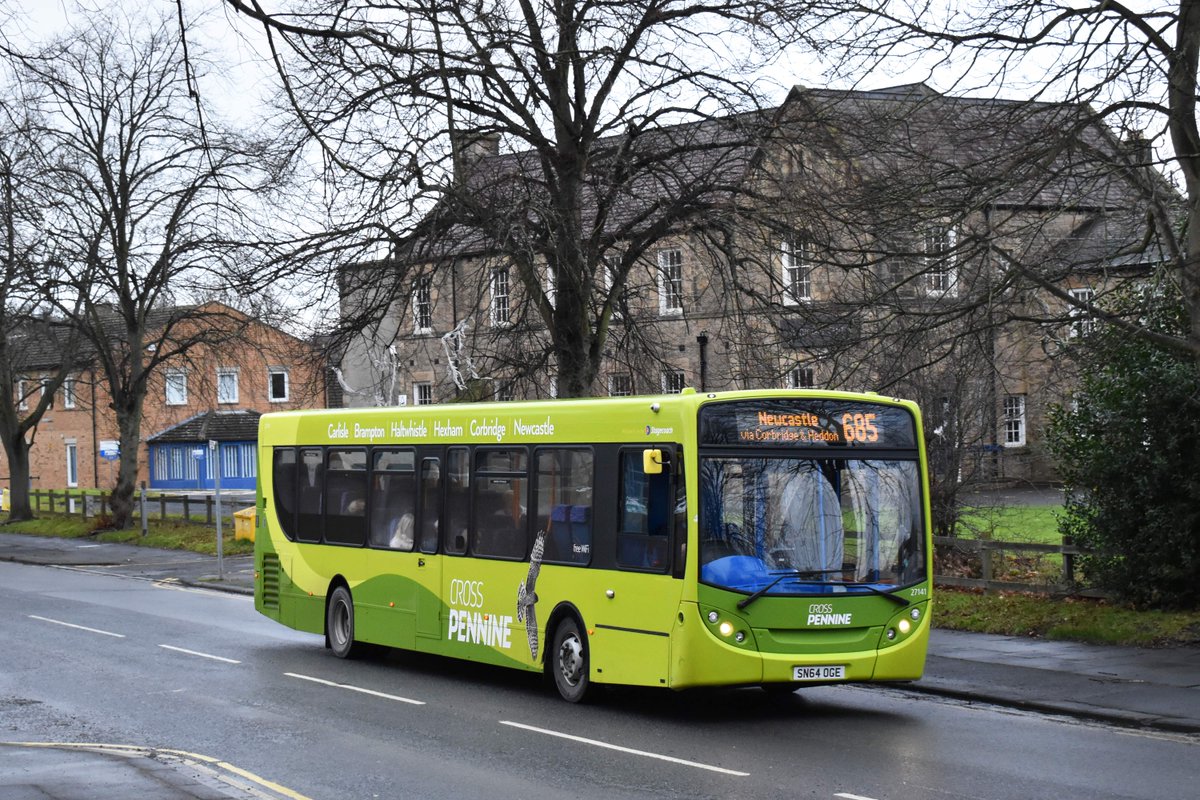
I think when BI liveries started appearing they knocked everything else out of the water. Ray took everything to a whole new level of professionalism. As people like @TheGrandWazoo have said, you get the whole package with BI, the leaflets and the flags not just a livery. You only have to look at some of the in-house efforts through the ages to see how much better that is.

But everything is just a bit...samey these days. See the following examples, and try and spot the difference (not my photos, they're randomly off Flickr):

30924279257_04ffdcab7b_b.jpg


X-lines_X20.jpg.386x216_q85_crop-smart.jpg


0_JWE_HMB_05032019EastYorkshirebus_02001JPG.jpg


DCwQGBoXUAAXuFI.jpg


15916066557_f4eb3f6484_b.jpg


I think the criticism is harsh, but where is the line where "house style" turns into "rehashed"?
 
Sponsor Post - registered members do not see these adverts; click here to register, or click here to log in
R

RailUK Forums

cnjb8

Established Member
Joined
26 Feb 2019
Messages
2,256
Location
Nottingham
I think his liveries are great. If a style is successful and attracts costumers then stick with it.
 

Robertj21a

On Moderation
Joined
22 Sep 2013
Messages
7,686
Great liveries. Good to have someone with flair.

It's inevitable that some will look a bit 'samey' given how long he's been doing them, and how many colours there are to play with. I'd rather have one of his liveries that some of the poor ones around.
 

carlberry

Established Member
Joined
19 Dec 2014
Messages
3,169
Whilst there's a tendency to feel that most BI liveries follow a house style the examples above prove the opposite to me! Theres some examples of similar themes (wavy 'hills' for example) and the X Lines one dosent look as well designed as the others but to me none of them suggest that somebody had just knocked off a previous design.

I also suspect most companies that work with BI start off with an idea of what they want based on something that BI has done before as that's why they want to use them. If BI then came back with something vastly different they're just as likely to walk away.
 

Andyh82

Established Member
Joined
19 May 2014
Messages
3,980
Also, you can’t beat a Best Impressions timetable leaflet. I know they always look very similar, but they really sell the service, unlike some more run of the mill leaflets.
 

Jordan Adam

Established Member
Joined
12 Sep 2017
Messages
5,610
Location
Aberdeen
They generally come up with decent schemes.

The issue i have with BI is that much of their liveries for different companies are simply copy+paste versions of previous designs with some minor alterations. They've also became known in recent times for using the exact same template but just changing the colours and/or vinyl pattern.
 

Alexbus12

Member
Joined
19 Jul 2018
Messages
387
The go north east one and the East Yorkshire liveries are awful :| Most of his other work is just copied and pasted.. But if operators want to pay for the same livery style used by other operators then so be it..
 

TheGrandWazoo

Veteran Member
Joined
18 Feb 2013
Messages
21,091
Location
Somerset with international travel (e.g. across th
They generally come up with decent schemes.

The issue i have with BI is that much of their liveries for different companies are simply copy+paste versions of previous designs with some minor alterations. They've also became known in recent times for using the exact same template but just changing the colours and/or vinyl pattern.

So the same design except changing the colours AND the vinyl pattern..... that's actually quite a lot of the design changed!

As was said above
It's inevitable that some will look a bit 'samey' given how long he's been doing them, and how many colours there are to play with. I'd rather have one of his liveries that some of the poor ones around.

You have a limited number of vehicle designs, a finite number of colour combinations and a range of other constraints in terms of practicality. And of course, you always have the wavy lines, but if it's not that, then it's always swoops, or diagonal lines - it's always got to be something!!!!

As I said before, does it really matter if the Norwich park and ride livery has a passing resemblance (and it isn't a direct copy) to Buses of Somerset....???
 

carlberry

Established Member
Joined
19 Dec 2014
Messages
3,169
The go north east one and the East Yorkshire liveries are awful :| Most of his other work is just copied and pasted.. But if operators want to pay for the same livery style used by other operators then so be it..
I'd agree that the go north east one is poor however I'm not aware that BI impose these designs so we'll never know if this is what BI wanted to do if given a free hand or not. If design was easy then there would be lots of BIs out there however there arnt, especially as most operators want the 'package' of marketing expertise that goes with it and only care that their vehicles look eye catching in their local environment.
 

goldisgood

Member
Joined
5 Mar 2018
Messages
431
The go north east one and the East Yorkshire liveries are awful :| Most of his other work is just copied and pasted.. But if operators want to pay for the same livery style used by other operators then so be it..
The GNE corporate one isn't a Best Impressions livery, pretty sure it's a local company. The xLines livery is a Best Impressions however.

On terms of the liveries looking similar, I have to say- outside of the enthusiast community, does anyone really care? They may see a bus with a livery similar and think 'oh that looks like my bus back home' but not think anything else about it. The truth is, the liveries look good and work well which is why they are a popular choice. In the end, does it really matter if ideas are transferred between them?
 

Busaholic

Veteran Member
Joined
7 Jun 2014
Messages
14,671
Also, you can’t beat a Best Impressions timetable leaflet. I know they always look very similar, but they really sell the service, unlike some more run of the mill leaflets.
I'm not aware of having seen a B.I. designed timetable leaflet, but if they're advocates of printing information in yellow on a white background then less power to their elbow! I'm utterly unable to read what's printed, and I've heard of plenty of other people with this form of colour blindness. Unfortunately, Buses magazine uses this colour combination too, rendering some parts of articles literally illegible to me.
 

PhilStockley

Member
Joined
21 Jun 2016
Messages
75
I’ve known and worked with Ray for almost twenty years. Apart from being an incredible designer, he’s also one of the most warm hearted and generous people you could wish to meet, and passionate about the industry. He would be the first to recognise that all art is subjective and that debate and criticism is perfectly valid, if there’s reasoning behind it, but I find it quite sad when at the extreme end this almost verges into the abusive because everything he does is with the best of intentions.

His academic knowledge of design is awe inspiring, and in any livery he could point out design cues (and the reasons for them, and why they’re important) that would blow many people’s minds. Above all, he understands very well that most people’s conscious response to brands is just the tip of the iceberg, and it’s people’s subconscious appreciation that really matters. That’s why there is a perfectly good reason for similarities in his work - they contain design features that are known to work. Don’t forget that the community of people who make a pastime out of comparing BI brands is tiny compared to the actual target market of potential bus users.

Having said that, I certainly don’t automatically like everything he does and we’ve often had some quite forthright - but always amicable - debates. To get the best out of the Best, you have to understand you’re entering a partnership - it’s not a client/supplier relationship. He will never just design what the client wants - he will always challenge every preconception that the operator brings to the process. At the same time, it’s important for clients to challenge every part of their output - not simply accept whatever he produces without question. I can usually tell when a client has just accepted whatever they’re given without question, and when a much stronger creation has emerged from a vigorous process of design and challenge.

Finally, Best Impressions is not just Ray. He is surrounded by a team of very talented individuals, all with their own particular skills, ideas and attributes. Their output is always much stronger when it’s not just Ray working alone but when his team is able to get involved and express themselves.
 

class387

Established Member
Joined
9 Oct 2015
Messages
1,541
I'm not aware of having seen a B.I. designed timetable leaflet, but if they're advocates of printing information in yellow on a white background then less power to their elbow! I'm utterly unable to read what's printed, and I've heard of plenty of other people with this form of colour blindness. Unfortunately, Buses magazine uses this colour combination too, rendering some parts of articles literally illegible to me.
Reading Buses leaflets are Best Impressions. Don't remember yellow on white on any of them, which I agree is an awful combination.
 

Fryschocream

Member
Joined
24 May 2019
Messages
44
The man gets results.....that's why people use him and the likes of mhd use a similar template. Samey? Yeah.....but someone in the isle of wight doesn't care what p&r buses look like in Norwich.
 

ChrisPJ

Member
Joined
26 Aug 2015
Messages
318
I’ve known and worked with Ray for almost twenty years. Apart from being an incredible designer, he’s also one of the most warm hearted and generous people you could wish to meet, and passionate about the industry. He would be the first to recognise that all art is subjective and that debate and criticism is perfectly valid, if there’s reasoning behind it, but I find it quite sad when at the extreme end this almost verges into the abusive because everything he does is with the best of intentions.

His academic knowledge of design is awe inspiring, and in any livery he could point out design cues (and the reasons for them, and why they’re important) that would blow many people’s minds. Above all, he understands very well that most people’s conscious response to brands is just the tip of the iceberg, and it’s people’s subconscious appreciation that really matters. That’s why there is a perfectly good reason for similarities in his work - they contain design features that are known to work. Don’t forget that the community of people who make a pastime out of comparing BI brands is tiny compared to the actual target market of potential bus users.

Having said that, I certainly don’t automatically like everything he does and we’ve often had some quite forthright - but always amicable - debates. To get the best out of the Best, you have to understand you’re entering a partnership - it’s not a client/supplier relationship. He will never just design what the client wants - he will always challenge every preconception that the operator brings to the process. At the same time, it’s important for clients to challenge every part of their output - not simply accept whatever he produces without question. I can usually tell when a client has just accepted whatever they’re given without question, and when a much stronger creation has emerged from a vigorous process of design and challenge.

Finally, Best Impressions is not just Ray. He is surrounded by a team of very talented individuals, all with their own particular skills, ideas and attributes. Their output is always much stronger when it’s not just Ray working alone but when his team is able to get involved and express themselves.

Great insight. Most of the people leveling criticism at BI for producing identikit work, which I don’t believe is the case by the way, almost certainly couldn’t come anywhere remotely close to doing a better job themselves.
 

PhilStockley

Member
Joined
21 Jun 2016
Messages
75
Great insight. Most of the people leveling criticism at BI for producing identikit work, which I don’t believe is the case by the way, almost certainly couldn’t come anywhere remotely close to doing a better job themselves.

Thank you. I think the key point about the 'identikit work' that many people miss, is that these are not abstract works of art designed to hang in a gallery, they are working brands, designed to fulfil a business objective. It should not therefore come as a huge surprise if the elements that work well in one place also work well in another.
 

Alexbus12

Member
Joined
19 Jul 2018
Messages
387
The man gets results.....that's why people use him and the likes of mhd use a similar template. Samey? Yeah.....but someone in the isle of wight doesn't care what p&r buses look like in Norwich.

But I can't understand why an operator would pay for virtually the same livery, if I wanted a product or design making I would want it original, not one that's already plastered over Manchester, Yorkshire etc etc
 

Fryschocream

Member
Joined
24 May 2019
Messages
44
Because it gets results. Look at arriva sapphire. Turned the ashington network around. Arriva have now watered it down but the whole concept was more than a livery. The guy knows his stuff.
 

Cesarcollie

Member
Joined
5 Jun 2016
Messages
679
But I can't understand why an operator would pay for virtually the same livery, if I wanted a product or design making I would want it original, not one that's already plastered over Manchester, Yorkshire etc etc

No. An operator wants a livery/brand that will provide a basis to attract more passengers and hence grow revenue in the area they run their business. They may want particular colours to reflect their heritage, or to be different from others in the area. They may have their own views on what they like. But it’s highly unlikely they will care if, when you stand on your head and squint through one eye, it looks a bit similar to that of another operator 100 miles away!!
 

carlberry

Established Member
Joined
19 Dec 2014
Messages
3,169
But I can't understand why an operator would pay for virtually the same livery, if I wanted a product or design making I would want it original, not one that's already plastered over Manchester, Yorkshire etc etc
I suspect that no operator has ever approached BI wanting a unique livery. They want more passengers and therefore more money. If they wanted a unique artwork they'd approach an artist to produce a painting and hang it in head office.
 

ChrisPJ

Member
Joined
26 Aug 2015
Messages
318
This exactly. Any anti Best Impressions sentiment is solely from “enthusiasts” who think they know better (and often express a wish for things to be how they were in the good old days, whenever that was)
 

PhilStockley

Member
Joined
21 Jun 2016
Messages
75
But I can't understand why an operator would pay for virtually the same livery,

Fair question. But very often an operator will have seen something somewhere else that they've really liked, and want something similar. So actually "virtually the same livery" may well be exactly what they want! Also, as I said above, they will have the good sense to know that the design cues that work well in one place will also work well in another. When an operator specifically wants something different (eg Transdev 36, which you'd surely have to agree is not a 'standard' BI livery) that's what they get.

The other key point is that usually you're buying a lot more than just a livery. A well executed brand will stretch across every aspect of the visible manifestation of the product, including vehicles, signage, publicity, uniforms and a whole lot more.

For the operators who think they can do a Best Imitations on the cheap, there are plenty of wannabe designers out there who will look at a BI livery and think "I could do that", and that's fine - you get what you pay for - but very few of them have the talent, understanding or patience to apply a brand consistently across every touch point.
 

Busaholic

Veteran Member
Joined
7 Jun 2014
Messages
14,671
Isn't the First Kernow book a Best Impressions production?
I suspected it was, but didn't have one to hand to check, in which case yellow on white is part of it - which may look nicer/smarter , or whatever, than the normal 'boring' timetable but is less than useful to those of us who can't assimilate the colour combination I quoted.

Re Ray Stenning himself, though, he's been an incredible force for good in the wider bus industry, so any minor criticism I make of a particular facet has to be seen in that context. The true 'enthusiast' which he undoubtedly is often doesn't make a great success in the realities of the bus operating world, so he's a rare exception.
 

Alexbus12

Member
Joined
19 Jul 2018
Messages
387
This exactly. Any anti Best Impressions sentiment is solely from “enthusiasts” who think they know better (and often express a wish for things to be how they were in the good old days, whenever that was)

Apologies if some of us "enthusiasts" don't have wet dreams over his liveries...

My point really was that if you wanted exactly the same livery that's already about, or a tiny variation, why would you not do design it yourself. Would save a hell of a lot of money.
 

TheGrandWazoo

Veteran Member
Joined
18 Feb 2013
Messages
21,091
Location
Somerset with international travel (e.g. across th
Apologies if some of us "enthusiasts" don't have wet dreams over his liveries...

My point really was that if you wanted exactly the same livery that's already about, or a tiny variation, why would you not do design it yourself. Would save a hell of a lot of money.
Have you actually read what Phil Stockley said? He eruditely explains why.

The fact is that, despite what you may think, it’s about a lot more than just knocking up a livery. It extends much further and the principles of successful design are not easily learned. It’s a highly skilled profession and not something the office junior can knock up.
 

Alexbus12

Member
Joined
19 Jul 2018
Messages
387
The fact is that, despite what you may think, it’s about a lot more than just knocking up a livery. It extends much further and the principles of successful design are not easily learned. It’s a highly skilled profession and not something the office junior can knock up.

I'm surprised, because many of his liveries are exactly the same. A knocked up two tone colour with a diagonal line. If that's what a successful design is then Jesus, I might want to change my career path...
 

PhilStockley

Member
Joined
21 Jun 2016
Messages
75
Apologies if some of us "enthusiasts" don't have wet dreams over his liveries...

Don’t worry, it’s absolutely fine! Ray is himself one of the biggest enthusiasts around, but his work is targeted at operators and bus users, not other enthusiasts, so I doubt he’ll lose any sleep over it.

My point really was that if you wanted exactly the same livery that's already about, or a tiny variation, why would you not do design it yourself. Would save a hell of a lot of money.

If that’s all you wanted, then yes that’s probably exactly what you would do. There’s nothing wrong with that. Plenty of operators choose not to use BI and there are plenty of alternative designers out there, so there’s nothing to stop an operator doing exactly as you suggest. Indeed, if that was really all you wanted, it’s quite likely that BI would choose not to work with you anyway - they prefer long term partnerships over knocking out work on demand for a price. I can’t think of a single BI job that is just a livery (though I stand to be corrected).

But the operators that actually commission this work do so because they know they’re buying into a complete brand building package backed up by the best knowledge and understanding of brand and design principles money can buy. The livery is just one part of the package. It’s not cheap, but the operators who invest in such a service do so knowing they’ll get a return on that investment.

It’s perfectly okay for others not to.
 

TheGrandWazoo

Veteran Member
Joined
18 Feb 2013
Messages
21,091
Location
Somerset with international travel (e.g. across th
I'm surprised, because many of his liveries are exactly the same. A knocked up two tone colour with a diagonal line. If that's what a successful design is then Jesus, I might want to change my career path...

Why? What do you do for a living? C’mon Alex - what do YOU do?

The fact is that it isn’t just a two tone design in some cut and paste template. Phil has explained this, having worked with BI in the past. He should know!!! Creating a full design package (using the principles of successful design) is a much more involved process than you can believe.
 
Status
Not open for further replies.

Top