• Our new ticketing site is now live! Using either this or the original site (both powered by TrainSplit) helps support the running of the forum with every ticket purchase! Find out more and ask any questions/give us feedback in this thread!

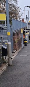
Two black bands on platform lamp posts..

mind-the-gap

Member
Joined
22 Jan 2011
Messages
11
Travelling on the Portsmouth direct line noticed that on most platforms the lamp posts and some other vertical structures eg roof supports they have two black bands painted(?) on them.

pics attached, apologies for the quality as taken from moving train

anyone know the reason for these bands?
something to do with improving visibility for the visually impaired? Due to contrast?

thanks in advance
 

Attachments

  • IMG_3816.jpeg
    IMG_3816.jpeg
    1.6 MB · Views: 138
  • IMG_3815.jpeg
    IMG_3815.jpeg
    1.5 MB · Views: 137
  • IMG_3814.jpeg
    IMG_3814.jpeg
    1.5 MB · Views: 138
Sponsor Post - registered members do not see these adverts; click here to register, or click here to log in
R

RailUK Forums

High Dyke

Established Member
Joined
1 Jan 2013
Messages
4,453
Location
Yellabelly Country
Can't say for certain, but stations may be painted in the colours of the predominant train operator. There are some exceptions however.

Some of the branding was merely repainting the base of a lamp column. Could it be that sort of idea?
 

LowLevel

Established Member
Joined
26 Oct 2013
Messages
7,977
They are indeed for aiding the visually impaired by contrast.
 

michael8

Member
Joined
13 Feb 2021
Messages
117
Location
UK
Just on a slight tangent it's actually very interesting. The heights are for children and for adults. It's very similar heights, if not the same heights for glazing manifestations (rows of dots on glass panels that might be mistaken for open spaces, eg. automatic doors, transport, airports etc.) Anyone more intersted please contact me !
 
Joined
18 Mar 2007
Messages
197
Location
North Oxfordshire
You've got to love the contradictions on our rail network:
They put black bands on lampposts to help the visually-impaired travel safely (which I fully agree with), but then deliberately turn off the audio announcements at major stations like Birmingham New St and Liverpool St!

You also sometimes get wonderful obstacle courses like the below:
20241109_012557.jpg
[Photo is of a station exit and gateline. In the middle of the walkway leading to the gates is are no fewer than 6 'Caution Wet Floor' signs laid out like an obstacle course and acting as a major trip hazard].
 

mind-the-gap

Member
Joined
22 Jan 2011
Messages
11
The band aren't black they are dark green. Pretty much all Southern operated stations are like this.
the example photos in my original post were from stations on the Portsmouth Direct Line, which I am sure were black. This may be due to them being SWR operated stations?

So it looks like Black for SWR and Green for Southern?

is this just a certain area thing, or are there any examples north of London, perhaps with operator specific colours?
 

Trainguy34

Member
Joined
29 Apr 2023
Messages
891
Location
Kent
I know some near me are in Southeastern Blue, don't have a photo to hand unfortunately
 
Joined
1 May 2022
Messages
136
Location
Greater Manchester
is this just a certain area thing, or are there any examples north of London, perhaps with operator specific colours?
On the Manchester Metrolink, the lamp posts are grey with one or two yellow stripes.

Attached image shows a grey lamppost with a yellow stripe on the Metrolink.
 

Attachments

  • VideoCapture_20241109-185525.jpg
    VideoCapture_20241109-185525.jpg
    1.7 MB · Views: 33

hwl

Established Member
Joined
5 Feb 2012
Messages
7,542
the example photos in my original post were from stations on the Portsmouth Direct Line, which I am sure were black. This may be due to them being SWR operated stations?

So it looks like Black for SWR and Green for Southern?

is this just a certain area thing, or are there any examples north of London, perhaps with operator specific colours?
I know some near me are in Southeastern Blue, don't have a photo to hand unfortunately
The problems is pillars / posts etc. that don't stand out from the background especially light/mid grey.

Thameslink us their pink logo colour for the twin bands

Southeastern use the same dark blue/navy used on the lower side of the trains.

LNER use a dark blue that looks similar but slightly lighter to the old GNER blue (in GNER days they lampposts were GNER red/dark blue.)

NR at London Bridge - the pillars are dark grey so they use twin light grey bands for contrast. Else where NR use the dark blue colour used for the background colour in station sign names as the two band colour.

LWNR use their two greens and white, as there is quite a lot of difference between the greens so there is only a single white band between.

Avanti use their green (pillar main colour) and white-ish (bands) colours from the side of train (VTWC used red with white bands)
 

DelW

Established Member
Joined
15 Jan 2015
Messages
4,367
This seems to be an example of a disparity in safety standards between rail and road authorities.

These contrast bands are widespread (maybe universal?) on station platforms, yet urban pavements are full of monochromatic poles. Street signs are on grey or self-colour galvanized poles, traffic signals on black poles, street lighting columns are khaki or olive green, yet I don't think I've seen any with contrast bands.

Until the late 1960s street signs were on black and white poles, in bands about a foot wide. When they were redesigned around 1967, all those poles became grey (though there's a very old one on a minor lane near me where the grey is flaking off to reveal that it was originally black and white!). So road sign designers deliberately changed their poles to monochrome.

It seems a curious disparity of approach, when many more people walk along pavements than along platforms.
 
Joined
6 Jan 2018
Messages
128
Location
Carluke
On ScotRail, where the lampposts are painted, the bands are usually ScotRail blue, as it contrasts with the white paint. But where the lampposts are unpainted (new stations, renewals etc), they are usually reflective yellow tape (Though blue tape is found on some older renewals).

On painted ScotRail lampposts however, the base is usually blue with a white post. So there is already some contrast, but I guess that’s quite some way from the eye level of an average non-mobility impaired adult.

At my local station however, I’d argue that the waiting shelter is the biggest impediment to a visually impaired person. It’s somewhat transparent, the frame is sky coloured (grey), and sticks so far into the platform it’s less than a foot from the front of it to the yellow line (with a 95mph line speed).
 

Meerkat

Established Member
Joined
14 Jul 2018
Messages
8,459
This seems to be an example of a disparity in safety standards between rail and road authorities.

These contrast bands are widespread (maybe universal?) on station platforms, yet urban pavements are full of monochromatic poles. Street signs are on grey or self-colour galvanized poles, traffic signals on black poles, street lighting columns are khaki or olive green, yet I don't think I've seen any with contrast bands.

Until the late 1960s street signs were on black and white poles, in bands about a foot wide. When they were redesigned around 1967, all those poles became grey (though there's a very old one on a minor lane near me where the grey is flaking off to reveal that it was originally black and white!). So road sign designers deliberately changed their poles to monochrome.

It seems a curious disparity of approach, when many more people walk along pavements than along platforms.
And the railway are a bit careful where they put stuff, whereas it seems fine to stick ever increasing numbers of signs in blocking the pavement, always with yet another new pole.
Its the 20 limit signs now, plus the fibre broadband cowboys plonk their poles in ridiculous positions.
 

Railsigns

Established Member
Joined
15 Feb 2010
Messages
2,655
On ScotRail, where the lampposts are painted, the bands are usually ScotRail blue, as it contrasts with the white paint. But where the lampposts are unpainted (new stations, renewals etc), they are usually reflective yellow tape (Though blue tape is found on some older renewals).
I read that ScotRail switched from using yellow bands to dark blue bands because the latter gives better visual contrast against a white or grey post. All of ScotRail's newest stations are littered with unpainted galvanised posts and there isn't a yellow band in sight; they're all blue.
 

Top