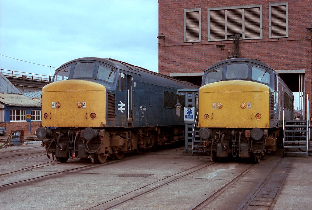
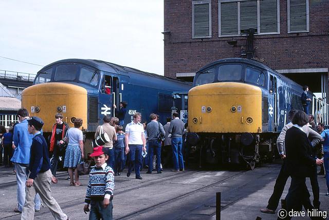
Flickr is useful as there are thousands of photos of the BR Blue era on there. It gets interesting when two people upload photos of the same event:
You can't trust scanned photo negatives or vintage colour photography!
Indeed, it would be so helpful if locos could have been kitted out like this:

I use an iPhone XR, Canon 80D and Leica M10-P; it appears to me that iOS performs colour processing on the captured image before saving. Colours are often vivid with the resultant image “better” than real life.
Yeah, phones are consumer products, looking to impress people with vivid colours, etc. I have a 14 year old DSLR that produces more detailed (and better colour fidelity), than any phone I've had, where the detail becomes mush at even a moderate magnification.
I've just quickly put this little thing together in Photoshop, using the images which have been put up on this thread:
View attachment 66340
Interesting compilation, but it's just impossible to rely on the colour fidelity of old photos - so many variables: even professional films had different renditions - Kodak was red biased/Fujichrome green/blue. Then you've got the lower colour stablity of consumer film, degradation of colour layers over time, were these scanned from negatives or positives, or from fading prints? Then you've got the digital aspects - were images uploaded with a colour profile?
Unless someone took photos with a standard reference, eg:

then there's no way to know for sure, except perhaps recreate the paint, or examine an old tin, and hope it hasn't varied too much.
And yes, these images I posted came from a Style Guide. The BR Corporate Identity Manual.
-Peter
But print images scanned and uploaded for a website - how accurate is the colour in the scan compared to the original? Websites use a lower gamut colour space sRGB.
Let alone the fact that likely no one reading this thread keeps their monitors colour calibrated, unless they are a photographer!
I found a photo of one of these 'Gronks' when it was fresh out the paintshop:
I wouldn't trust any of those colours - someone's obviously oversaturated that photo without a care in the world about accurate colour reproduction!
Blue was always the "difficult" colour. You only have to look at all those nice summer day photos, including above, to find that the blue sky has rendered a milky white.
That’s more typically the result of exposure issues: the film hadn’t sufficient dynamic range, in modern parlance, to accommodate the brightness of the sky on exposure for the subject.
Positive film would typically have a range of five stops, compared to seven of negative film, so you’d need to have used a graduated neutral density filter to keep the sky from burning out.

")