• Our new ticketing site is now live! Using either this or the original site (both powered by TrainSplit) helps support the running of the forum with every ticket purchase! Find out more and ask any questions/give us feedback in this thread!

Earliest use of Corporate Era B.R. Signage?

Status
Not open for further replies.

Chrius56000

Member
Joined
18 Aug 2010
Messages
137
Location
Walsall
When Coventry Station was totally rebuilt by the L.M.R. in 1961/1962 contemporary photographs of the station in 1962 after rebuilding was completed indicate that it opened with black–on–white Corporate Era signage from the outset – was this the earliest station to open with Corporate Era signage throughout?

The Warwickshire Herald/Times website does have a photo of the temporary wooden station building erected by the L.M.R. whilst the new buildings were under construction, and the entrance to this did have a maroon LMR sign "British Railways Coventry – Temporary Station Entrance during Rebuilding", but it seems all the maroon signage was cleared away before opening – can anyone confirm this?

Chris Williams
 
Sponsor Post - registered members do not see these adverts; click here to register, or click here to log in
R

RailUK Forums

SargeNpton

Established Member
Joined
19 Nov 2018
Messages
1,397
I didn't think that the BR corporate design, with the rail alphabet, etc, came into being until 1965. Did Coventry get a signage makeover a few years after the rebuild perhaps?
 

edwin_m

Veteran Member
Joined
21 Apr 2013
Messages
26,845
Location
Nottingham
From https://thebeautyoftransport.com/2019/10/30/send-me-to-coventry-coventry-station-west-midlands-uk/

The station was actually completed a few years before Rail Alphabet made its debut. Initially, the station signs used a typeface derived from another of Calvert’s (with Jock Kinneir this time) peerless transport typefaces, Transport, originally designed for use on road signs (The Beauty of Transport 3 December 2014). But while Transport was designed to be read at speed, Rail Alphabet recognised that readers of station signs would be able to take more time over things. In a sense then, with the reconstruction of stations like Coventry demonstrating where British Rail (or rather, British Railways as it then was) was going design-wise, Rail Alphabet was designed with Coventry and other contemporary stations in mind. The metal frame of the timetable poster board in the ticket still has “Train Information” engraved on it, in Transport.

This photo shows what is almost certainly the original signage, stated to be 1963 and certainly before any visible sign of electrification which was completed in 1966: https://www.geograph.org.uk/photo/6466955

This had been open for less than a year when the picture was taken. It was one of the largest stations to be rebuilt as part of the electrification of the West Coast Main Line, and incorporated many of the modular components, and lettering, that appeared on stations large and small involved in the programme.

The signs for station facilities (not the nameboards) certainly show some resemblance to the corporate identity, but could well be in the Transport typeface mentioned above rather than Rail Alphabet. The first link above also shows some "standard" corporate identity signage which I assume was added some time later.
 

Ashley Hill

Established Member
Joined
8 Dec 2019
Messages
4,217
Location
The West Country
That Gentleman sign looks like lower case Gill Sans. Several enamel signs appeared in the mid sixties with black lettering on white as the “new standard”. However,it was not standard. Whilst these were going up the tail end of the totem era was still happening with the last one’s being put up about the same time. Then there’s the BR(s) experiments with pink Ladies signs in the same lower case Gill Sans lettering that appeared around the same time. Coventrys new signage was probably part of the route modernisation with electrification.
 

32475

Member
Joined
2 Nov 2019
Messages
811
Location
Sandwich
That Gentleman sign looks like lower case Gill Sans. Several enamel signs appeared in the mid sixties with black lettering on white as the “new standard”. However,it was not standard. Whilst these were going up the tail end of the totem era was still happening with the last one’s being put up about the same time. Then there’s the BR(s) experiments with pink Ladies signs in the same lower case Gill Sans lettering that appeared around the same time. Coventrys new signage was probably part of the route modernisation with electrification.
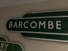
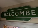
Indeed the tail end of the totem era produced a number of examples on Southern Region such as this example from Balcombe of 1963/4 compared with Barcombe Mills from the 1950s. Noticeably the later transport letter type has an oval shape of C and O and the length of the bars on the E differ. My own examples in the ‘32475 Collection’ demonstrate:
IMG_6364.jpegIMG_6363.jpeg
 

Ashley Hill

Established Member
Joined
8 Dec 2019
Messages
4,217
Location
The West Country
Indeed the tail end of the totem era produced a number of examples on Southern Region such as this example from Balcombe of 1963/4 compared with Barcombe Mills from the 1950s. Noticeably the later transport letter type has an oval shape of C and O and the length of the bars on the E differ. My own examples in the ‘32475 Collection’ demonstrate:
View attachment 149788View attachment 149789
Very nice,and yet other late arrivals like St James Park and Yeoford still persisted with Gill Sans.
 

WesternLancer

Established Member
Joined
12 Apr 2019
Messages
10,744
Indeed the tail end of the totem era produced a number of examples on Southern Region such as this example from Balcombe of 1963/4 compared with Barcombe Mills from the 1950s. Noticeably the later transport letter type has an oval shape of C and O and the length of the bars on the E differ. My own examples in the ‘32475 Collection’ demonstrate:
View attachment 149788View attachment 149789
I never new the typeface on the totems changed like that - fascinating. Looks like you have some nice sussex examples too. I recall 'discovering' the closed Barcombe Millls station as a child in the 70s as it was not too far from where I grew up (my nearest station being Berwick), and I was always fascinated by the closed station in Horam that I would see regularly when we had cause to visit Horam - at the time buildings still extant IIRC in Horam.
 

Ashley Hill

Established Member
Joined
8 Dec 2019
Messages
4,217
Location
The West Country
I never new the typeface on the totems changed like that
It only really affected the Southern,I think it may be due to using different manufacturers. The shade of green varied inconsistent too. Then there was condensed Gill Sans for those stations with longer names. Some stations had different styles of totem layout or colour where extras were added or damaged ones replaced.
 

Taunton

Established Member
Joined
1 Aug 2013
Messages
11,212
One of the issues with old photos like these is they are black/white, so the use of colour is not apparent. For example I recall some of those long tube platform lights, same as shown at the new Coventry, having the station name characters in regional colours, although photos do not show that. In fact these lasted well after the station signage was changed to new corporate style, as they were not so easy to replace.
 

WesternLancer

Established Member
Joined
12 Apr 2019
Messages
10,744
One of the issues with old photos like these is they are black/white, so the use of colour is not apparent. For example I recall some of those long tube platform lights, same as shown at the new Coventry, having the station name characters in regional colours, although photos do not show that. In fact these lasted well after the station signage was changed to new corporate style, as they were not so easy to replace.
Point well made ref the lights - you still see them (v occasionally nowadays) IIRC - think I saw one remaining at Manchester Oxford Road a couple of years ago. Always though the typeface used on them, in the relevant colour, was stylish. Perhaps the last thing to outlast most other regional colour branded items - the other one being LMR red enamel number plates on catenary stanchions on the WCML 1960s electrified routes that I assume was in a regional colour chosen for them - I think you still see those occasionaly.
 

32475

Member
Joined
2 Nov 2019
Messages
811
Location
Sandwich
One of the issues with old photos like these is they are black/white, so the use of colour is not apparent. For example I recall some of those long tube platform lights, same as shown at the new Coventry, having the station name characters in regional colours, although photos do not show that. In fact these lasted well after the station signage was changed to new corporate style, as they were not so easy to replace.
There was a discussion topic about illuminated station names in July 2021 entitled Station Names on Platform Lights. A number of photos of examples were highlighted including regional colour variations. Well worth looking at.
 

edwin_m

Veteran Member
Joined
21 Apr 2013
Messages
26,845
Location
Nottingham
the other one being LMR red enamel number plates on catenary stanchions on the WCML 1960s electrified routes that I assume was in a regional colour chosen for them - I think you still see those occasionaly.
You do - noticed one this week just east of Proof House Junction.
 

WesternLancer

Established Member
Joined
12 Apr 2019
Messages
10,744
You do - noticed one this week just east of Proof House Junction.
are there any on other routes in other colours that were electrified during the period? I'm thinking the other option would be blue ones on any lines elctrified in the eastern region during the relevant period (if there were any schemes on the ER at the relevant time).
 

Beebman

Member
Joined
17 Feb 2011
Messages
803
are there any on other routes in other colours that were electrified during the period? I'm thinking the other option would be blue ones on any lines elctrified in the eastern region during the relevant period (if there were any schemes on the ER at the relevant time).
This was discussed in a thread a year or two back which I've unsuccessfully tried to find but basically OHLE structure number plates existed in LMR maroon, ER dark blue and ScR light blue. No other region had them (including the SR which had overhead wiring at some goods yards). There are still a number of LMR ones around, even as far south as South Hampstead (at least there were last summer when I passed through). The last time I was on the GEML in 2021 there were still a few ER ones in the Colchester area (and more recently last September I saw a couple of LNER-style cast-metal ones surviving, one either side of Stratford station). I don't know what the current status is of any surviving ScR ones but they seemed rare even when I visited the Glasgow area in the late 80s.
 

WesternLancer

Established Member
Joined
12 Apr 2019
Messages
10,744
This was discussed in a thread a year or two back which I've unsuccessfully tried to find but basically OHLE structure number plates existed in LMR maroon, ER dark blue and ScR light blue. No other region had them (including the SR which had overhead wiring at some goods yards). There are still a number of LMR ones around, even as far south as South Hampstead (at least there were last summer when I passed through). The last time I was on the GEML in 2021 there were still a few ER ones in the Colchester area (and more recently last September I saw a couple of LNER-style cast-metal ones surviving, one either side of Stratford station). I don't know what the current status is of any surviving ScR ones but they seemed rare even when I visited the Glasgow area in the late 80s.
Many thanks for this info - interesting, thanks for trying to find the old thread too.
 

Taunton

Established Member
Joined
1 Aug 2013
Messages
11,212
This was discussed in a thread a year or two back which I've unsuccessfully tried to find
There was this thread in 2023


and this one in 2019

 
Status
Not open for further replies.

Top