There seemed to some issue with Knaresborough High Street at least for part of last week causing significant delays. On Friday they sought to regain the timetable by changing the 1241 1A into a c.1305 1 to Starbeck only which left just before the nominally 1251 1C and 1301 1B

-
Our booking engine at tickets.railforums.co.uk (powered by TrainSplit) helps support the running of the forum with every ticket purchase! Find out more and ask any questions/give us feedback in this thread!
You are using an out of date browser. It may not display this or other websites correctly.
You should upgrade or use an alternative browser.
You should upgrade or use an alternative browser.
Transdev Blazefield
- Thread starter RustySpoons
- Start date
Sponsor Post - registered members do not see these adverts; click here to register, or click here to log in
R
RailUK Forums
Just to prove you cannot wholly rely on Bustimes being right, I have just used Harrogate's 1255 Service 3 which Bustimes.org is not listing as being worked today; it was a B7RLE standing in for a missing Electric and presumably not tracking. Only 5 of the 8 Electrics being available. Two, 805 and 808,have not worked since September although both were re-taxed subsequently.
Last edited by a moderator:
dodecahedron67
Member
With a very big caveat that it could be nothing and just an error in the ticketer backend somewhere
CityZap running boards have returned as available to select on ticketers at Malton/York…
CityZap running boards have returned as available to select on ticketers at Malton/York…
peterblue
Member
With a very big caveat that it could be nothing and just an error in the ticketer backend somewhere
CityZap running boards have returned as available to select on ticketers at Malton/York…
I shall remain sceptical...
Would also be a weird time to relaunch the route.
Agreed - and where would the vehicles come from ?I shall remain sceptical...
Would also be a weird time to relaunch the route.
Leedsbusman
Member
Don’t let little details like that (or the lack of a registration or any public info) get in the way of someone’s flight of fancy…Agreed - and where would the vehicles come from ?
dodecahedron67
Member
“Flight of fancy” where did I state I, myself, thought cityzap was returning?Don’t let little details like that (or the lack of a registration or any public info) get in the way of someone’s flight of fancy…
I have my quite severe doubts about it returning hence me saying “very big caveat” in my original post…
Leedsbusman
Member
I didn’t say it was your flight of fantasy - but you did repeat it even though it is obviously rubbish as it’s not running or registered and I’m sure that would have been simple for you to check!“Flight of fancy” where did I state I, myself, thought cityzap was returning?
I have my quite severe doubts about it returning hence me saying “very big caveat” in my original post…
RustySpoons
Member
- Joined
- 5 Apr 2019
- Messages
- 777
With a very big caveat that it could be nothing and just an error in the ticketer backend somewhere
CityZap running boards have returned as available to select on ticketers at Malton/York…
I think there was still a business case for CityZap, although for it to work it needs to use vehicles that are both fully paid for therefore owing the company nothing, and still be reliable and comfortable enough for intense high speed running all day.
The service was seemingly doing very well until it had to pay for the new Sky Class ADLs. Maybe if those went to Burnley instead and CityZap received some of the old Witch Way B9s instead it could still be able to pay for itself.
TheGrandWazoo
Veteran Member
And until it had to contend with Covid and the resultant drop in passenger numbers.The service was seemingly doing very well until it had to pay for the new Sky Class ADLs. Maybe if those went to Burnley instead and CityZap received some of the old Witch Way B9s instead it could still be able to pay for itself.
Think those might be mutually exclusive. 62/63 plates are unlikely to be fully depreciated?for it to work it needs to use vehicles that are both fully paid for therefore owing the company nothing, and still be reliable and comfortable enough for intense high speed running all day.
M803UYA
Member
The service was seemingly doing very well until it had to pay for the new Sky Class ADLs. Maybe if those went to Burnley instead and CityZap received some of the old Witch Way B9s instead it could still be able to pay for itself.
I don't have the ticket machine data obviously but my very random observations at different times of the day of Cityzap at the York end of the route, and along the A64 beyond Tadcaster didn't seem to support the business case for new double decker buses. I never saw the original deckers fully loaded. Going off some of the press releases trumpeting the supposed success of the route it would imply that the average loadings on the route would be adequately handled by a 29 seat short Enviro 200.... or an Optare Versa!And until it had to contend with Covid and the resultant drop in passenger numbers.
So I can't get my head around why you'd go out and order a brand new fleet of over specified buses for the route. Unless we take into consideration who created said route and the need for all creations of his to be amazing and successful regardless of the actual reality.
TheGrandWazoo
Veteran Member
At the time when the order was announced, I was sceptical about the business case for new buses.I don't have the ticket machine data obviously but my very random observations at different times of the day of Cityzap at the York end of the route, and along the A64 beyond Tadcaster didn't seem to support the business case for new double decker buses. I never saw the original deckers fully loaded. Going off some of the press releases trumpeting the supposed success of the route it would imply that the average loadings on the route would be adequately handled by a 29 seat short Enviro 200.... or an Optare Versa!
So I can't get my head around why you'd go out and order a brand new fleet of over specified buses for the route. Unless we take into consideration who created said route and the need for all creations of his to be amazing and successful regardless of the actual reality.
My scepticism now is about the business case to bring back a service given the challenges with ridership, let alone driver availability
markymark2000
On Moderation
I hope this isn't deemed as going off topic but I always thought that it would have been better having the Leeds - York stopper as it's own service and then having Coastliner doing the 'Zap' route seeing as this would encourage the longer distance travellers and I can't see there being many Tadcaster - Malton passengers or other similar such journey patterns. I think the Zap route needed something else for it to thrive rather than just the Leeds - York trade. There are only so many people who make that journey and would be willing to take a bus.
So, if you wouldn't take the Zap into York City Centre, where would you take it?There is a market for Leeds<-->York trips, which are not well-served by Coastliner when there are delays in York City Centre and east of York. It probably doesn't warrant anything too fancy, however.
peterblue
Member
There is a market for Leeds<-->York trips, which are not well-served by Coastliner when there are delays in York City Centre and east of York. It probably doesn't warrant anything too fancy, however.
I believe there is demand for it as specific times (e.g. perhaps weekends, summer holidays, Christmas shopping, peak workers)
I've seen CityZap be reasonably busy before, but it's also been carting around fresh air a lot too.
I hope this isn't deemed as going off topic but I always thought that it would have been better having the Leeds - York stopper as it's own service and then having Coastliner doing the 'Zap' route seeing as this would encourage the longer distance travellers and I can't see there being many Tadcaster - Malton passengers or other similar such journey patterns. I think the Zap route needed something else for it to thrive rather than just the Leeds - York trade. There are only so many people who make that journey and would be willing to take a bus.
That may be true, but there are probably even fewer people travelling from Scarborough, Pickering, Whitby or Malton direct to Leeds by bus.
TheGrandWazoo
Veteran Member
I think this is the point. Pre-Covid there was clearly a market. I'd seen deckers with reasonable loads (30 ish) but plenty with penny numbers too. In those days, and using 13/14 year old deckers that had little or no book value, it doubtless made a turn.I believe there is demand for it as specific times (e.g. perhaps weekends, summer holidays, Christmas shopping, peak workers)
I've seen CityZap be reasonably busy before, but it's also been carting around fresh air a lot too.
It was a surprise when new vehicles were then specified. Whether it was hubris on Alex Hornby's part, or a speculative yet logical punt that new vehicles would help build the market further, is open to speculation and is doubtless tainted by an individual's existing views.
What is clear is that Covid dealt a fatal blow to that business model. It certainly couldn't sustain having brand new vehicles, and it may well have been the case that having lost 20% of its trade (assuming it reflected many similar routes) that it simply wouldn't pay its way.
Last edited:
Still serving the city centre, but a truncated route wouldn't get caught up in congestion around Monksgate, Heworth, Stockton and the Whitby Road. It's simply not possible to mitigate the delays of up to an hour in a 15 minute turnaround in Leeds, especially as the driver needs a PNB before going back out again. Short trips could well be cheaper than adding in long turnaround times in Leeds. A combined 15-minute headway could also prove more attractive to passengers, too.So, if you wouldn't take the Zap into York City Centre, where would you take it?
RustySpoons
Member
- Joined
- 5 Apr 2019
- Messages
- 777
I think this is the point. Pre-Covid there was clearly a market. I'd seen deckers with reasonable loads (30 ish) but plenty with penny numbers too. In those days, and using 13/14 year old deckers that had little or no book value, it doubtless made a turn.
It was a surprise when new vehicles were then specified. Whether it was hubris on Alex Hornby's part, or a speculative yet logical punt that new vehicles would help build the market further, is open to speculation and is doubtless tainted by an individual's existing views.
What is clear is that Covid dealt a fatal blow to that business model. It certainly couldn't sustain having brand new vehicles, and it may well have been the case that having lost 20% of its trade (assuming it reflected many similar routes) that it simply wouldn't pay its way.
Something I keep overlooking, although people travelling for leisure are back now post-Covid, a large amount of the commuter travellers will now be missing as a lot of them will still be working from home.
I think CityZap needed both to work. Commuters in the AM and PM rush hour, and leisure travellers at the times inbetween.
kewal_7770
New Member
I used the Zap from it's start. Not many times was it full but I did see standing passengers at some times! However when it was announced that the service would be ending, some single decks were borrowed from Rosso and they seemed to have quite good loads on a good deal of the times I traveled.
Tetchytyke
Veteran Member
I think Hornby made a sensible and pragmatic decision.Whether it was hubris on Alex Hornby's part, or a speculative yet logical punt that new vehicles would help build the market further, is open to speculation and is doubtless tainted by an individual's existing views
New buses would either develop the service- you don’t create a flagship service with knackered old vehicles. But, if they failed, the new buses would easily be cascaded elsewhere in the operation to replace life-expired buses.
It’s not like any bus operator is going to struggle to find a replacement role for a few double decker buses. And, indeed, Transdev have easily found a home for all of the new buses.
RustySpoons
Member
- Joined
- 5 Apr 2019
- Messages
- 777
There's going to be some changes to the Transdev Go app...
https://www.transdev.com/en/innovation-tech/new-transdev-go-app-and-website/
https://www.transdev.com/en/innovation-tech/new-transdev-go-app-and-website/
New Transdev GO app and website on the way, as Transdev UK reveals plan for swift and simple bus journeys in 2024
Transdev UK launched its ‘Transdev Go’ app in 2017, and as the bus operator accelerated its post-pandemic business recovery, numbers using its existing app doubled in just 18 months to February 2023, with over 100,000 users a month.
...
Transdev has signed up Bexley-based Rise Digital Media to develop and maintain its all-new Transdev Go app and website, replacing previous supplier Passenger. Rise already provides its fully integrated ‘BusHub Mobility Platform’ app and web-based products for several UK bus firms, including North West bus operators Preston Bus and Diamond, and a range of UK independent firms including Leicester-based Centrebus and Berkshire’s White Bus...
markymark2000
On Moderation
What a poor choice. RiseDigitalMedias platform is awful from my experiences. Only thing I'd praise RDM on is the fact their ticket list is much more user friendly. The rest of RDMs sites seem to be a bit poor though, especially if poorly maintained.There's going to be some changes to the Transdev Go app...
https://www.transdev.com/en/innovation-tech/new-transdev-go-app-and-website/
Yet another poor choice from an MD with a building history of them. I mean, even Connexions use Passenger.What a poor choice. RiseDigitalMedias platform is awful from my experiences. Only thing I'd praise RDM on is the fact their ticket list is much more user friendly. The rest of RDMs sites seem to be a bit poor though, especially if poorly maintained.
Whats so wrong with the Preston Bus website ? I would expect Transdev will want some customisation to, for instance, not have the 36 buried down a list of services.
Examples ?Yet another poor choice from an MD with a building history of them
markymark2000
On Moderation
The harder to get maps. Whether that be network map or ticket zone map. The tickets are tends to get very cluttered. Timetable pages you just get a random break in the timetable and then you scroll down to get the rest of the timetable.Whats so wrong with the Preston Bus website ? I would expect Transdev will want some customisation to, for instance, not have the 36 buried down a list of services.
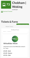
This is how the website can look on mobile, this example was taken from WhiteBus. (Photo shows how the layout isn't user friendly. Download fares link hidden behind other text. Select mobile ticket isn't shown very well.
Depending on how well the site is maintained, you could end up with a site like Adventure Travel where routes are duplicated many times and you can't find any information. Or Diamonds site whereby you have to keep selecting the area and/or there is a shed loads of area specific information in general areas as everything is one one website.
Plus and down side is for Passenger, if people select a date, they can see the timetable for that day so helpful around Christmas time. No provision on RDM sites for that I believe. Only 2 up sides of RDM over passengers systems are the ticket list can be reduced a lot as RDM groups tickets rather than Passenger where every one is listed separately. The other benefit is passengers aren't forced into selecting a date for the timetable or download the PDF, the basic Mon-Fri timetable is all there.
Suppose there are up and down sides to both but on the whole, I've always found RDM a much worse platform than Passenger.
Attachments
Suppose the they are expecting the app to be used on a mobile not the website.The harder to get maps. Whether that be network map or ticket zone map. The tickets are tends to get very cluttered. Timetable pages you just get a random break in the timetable and then you scroll down to get the rest of the timetable.
This is how the website can look on mobile, this example was taken from WhiteBus. (Photo shows how the layout isn't user friendly. Download fares link hidden behind other text. Select mobile ticket isn't shown very well.
Depending on how well the site is maintained, you could end up with a site like Adventure Travel where routes are duplicated many times and you can't find any information. Or Diamonds site whereby you have to keep selecting the area and/or there is a shed loads of area specific information in general areas as everything is one one website.
Plus and down side is for Passenger, if people select a date, they can see the timetable for that day so helpful around Christmas time. No provision on RDM sites for that I believe. Only 2 up sides of RDM over passengers systems are the ticket list can be reduced a lot as RDM groups tickets rather than Passenger where every one is listed separately. The other benefit is passengers aren't forced into selecting a date for the timetable or download the PDF, the basic Mon-Fri timetable is all there.
Suppose there are up and down sides to both but on the whole, I've always found RDM a much worse platform than Passenger.
If you're trying to have a go at Alex, he isn't there anymoreYet another poor choice from an MD with a building history of them. I mean, even Connexions use Passenger.
The Transdev 66 Dalesway Keighley - Skipton was until recently mostly double deckers. Looking now there are 3 buses working the route and one is 1751 K100TDV, a Volvo B7RLE Wright Eclipse Urban. It was YJ05 FNK. It's a single decker.
I have had reason to be travelling around the 66 route recently and noticed the number of single deck 66s.
Are they short of double deckers, or is it a cost saving measure? Or a realisation that loadings won't come back post Covid?
Sorry, I don't know how to find out what buses operated the 66 earlier this week from bustimes. 1751 wasn't on the 66 yesterday or Wednesday.
Last edited by a moderator:
If you scroll to the bottom of the timetable, you'll see "Vehicles" (or you can add it to the end of the timetable webpage, so https://bustimes.org/services/66-keighley-cross-hills-skipton/vehicles). That will show you all the journeys of the day.[...]
Sorry, I don't know how to find out what buses operated the 66 earlier this week from bustimes. 1751 wasn't on the 66 yesterday or Wednesday.
By changing the date field at the top, you can go back as far as the site keeps data for (it is cleared occasionally) - the last two or three weeks are usually available.
The allocation this week appears to have consistently been two doubles and a single.