It's pretty indecipherable at places like Custom House westbound which has got 20 stops to Reading, to just notice which of the Thames Valley stations it is not stopping at.
Exacerbated by the non-stopped stations being listed as "Not stopping at Acton, West Ealing AND Hanwell". It should be "... West Ealing NOR Hanwell" for a negative statement. Someone didn't do 'English Usage and Abusage' by Eric Partridge at school!
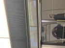
Exacerbated by the non-stopped stations being listed as "Not stopping at Acton, West Ealing AND Hanwell". It should be "... West Ealing NOR Hanwell" for a negative statement. Someone didn't do 'English Usage and Abusage' by Eric Partridge at school!