superkopite
Member
- Joined
- 14 Jan 2016
- Messages
- 212
Over the past few years, I have boarded the wrong train at London Bridge quite a few times, and I could never really work out why until last night when I nearly did it again.
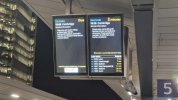
This is how Thameslink presents their live running data. 2 screens, always reading left to right.
However, if you are standing on the left side of a platform the first service is shown on the screen closest to the tracks, if you are standing on the right side of the platform, the first service is shown on the screen furthest from the tracks. This seems counterintuitive, I think my mistake has always been assuming the screen closest to the Track is the next service, that makes sense to me.
What is the right way to display this data?
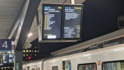


")