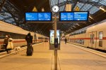
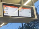
As it happens I was arguing strongly for ‘nearest the platform’; and I also thought that ‘First train’ should be a permanent printed sign on the top of the monitor. I lost that argument!
In my view this would have been the right solution. Alas.
Is the "screen next to the platform edge shows the next train" something historical or done widely elsewhere?
I also agree that "nearest to platform edge" feels more intuitive.
It's also the pattern used by the two other places that I can think of (off the top of my head, anyway) that use multiple screens to show several departures at once;
Germany:

(from
https://drivest.de/4783/deutsche-bahn-rollt-digitale-auslastungsanzeige-in-weiteren-regionen-aus)
and Sydney:

(from
https://twitter.com/hgreenies/status/1544435753832566784)
Notice that both configurations also have a different display format for the following trains, causing the next train to appear most prominent.
In particular the blue/cyan is not more eye-catching than the white and the yellow. It is exactly the opposite.
Overall I do wonder if the blue font used to denote the 1st / 2nd trains is not very visible. Its the white that draws me.
I agree on this too; the blue font appears subordinate to the other information. It should be in white or yellow, or reversed out from the background, and maybe even marked on the screen bezel like Bald Rick suggested.
I think a yellow border around the one on the left with a "Next train" sign on the top would help.
Alternately, this.
In an ideal situation what might also be done is to create a right-aligned version of the display for set-ups where the right-hand board is nearer to the track. In this configuration, you'd have the line diagram on the right-hand side of the screen with the station names positioned to the left, mirroring the position of the track as a subconscious clue.
However, I believe that most of us know where to look on a bus for its route number and destination.
Yeah the bus example isn't very applicable, because there's only one display on the front of the bus, and it stands out well enough. Indeed the size of the outline is almost counterproductive in the way it clutters up the front.


