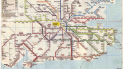
I was going to post this in the existing GBR branding thread, but I think this deserves a topic in its own right. Basically, if Great British Railways adopts a single unified brand (by that I mean like the old BR - a single livery for the entire UK rail network), what could the implications be for schematic railway mapping?
For example, the London & South East railway map is displayed at almost every station in the region and is a very useful tool for identifying who operates which services. If however there is no longer any distinction between operators and indeed brands, then what is the point of showing services in separate colours? Well, for a schematic map to work, you need to have some sort of colour distinction between routes so it works as a piece of information design. In the event that there is only one operator, why not take this opportunity to group the colours by another means of data, like which London Terminal the service runs to?
The attached NSE map from 1990s did just that with more distinction between routes then there is now, such as using using separate colours for the Chatham and South Eastern mainlines, and having a separate identity altogether for the North Downs Line. Such distinction didn’t matter then as all NSE trains were operated and branded the same, so this approach could potentially be used again if GBR becomes a unified brand for the entire British rail network.
The other option is to colour code routes on the map based on speed, so basically one colour for fast, one for semi-fast and one for all stations. This could work from a passenger perspective since customers would know exactly which services stopped where, but you would also lose the regional distinction between lines. You could use alternatively use groups of colour for each region, so for example, SWR shown in various shades of red with darker shades denoting faster services, but adding too many distinctions would make the map way to cluttered and lose clarity as a piece of information design.
With so many possibilities, I think it would be a good idea to discuss what the future holds in store for the LSE and other schematic rail maps in a post-GBR scenario. Do you see these staying in their current form, becoming more diverse in response to a unified brand, or simply being scrapped altogether in favour of more personalised, digital alternatives?
Attachments
Last edited:

