• Our booking engine at tickets.railforums.co.uk (powered by TrainSplit) helps support the running of the forum with every ticket purchase! Find out more and ask any questions/give us feedback in this thread!

In your opinion, what are the ugliest units/locos/liveries on the network? Interior or exterior.

Status
Not open for further replies.

Bletchleyite

Veteran Member
Joined
20 Oct 2014
Messages
98,010
Location
"Marston Vale mafia"
I think it depends on how used to it people are, on the WCML people are used to the 2+2 arrangement and not used to using the middle seat so it doesn't get used. At Greater Anglia (for example) people are used to the 3+2 seating so it does get used. Didn't LM regret specifying the 350/2s with 3+2? I think LNWR will make the same mistake...

We had 321s prior to the 350s, which were 3+2. I do recall LM saying that somewhere, yes, and I agree not ordering a homogeneous fleet was an error.
 
Sponsor Post - registered members do not see these adverts; click here to register, or click here to log in
R

RailUK Forums

hst43102

Member
Joined
28 May 2019
Messages
950
Location
Tyneside
I think it depends on how used to it people are, on the WCML people are used to the 2+2 arrangement and not used to using the middle seat so it doesn't get used. At Greater Anglia (for example) people are used to the 3+2 seating so it does get used. Didn't LM regret specifying the 350/2s with 3+2? I think LNWR will make the same mistake...
Surely people on the WCML are "used" to it after 12 years of the 350/2s?
 

Energy

Established Member
Joined
29 Dec 2018
Messages
4,499
Surely people on the WCML are "used" to it after 12 years of the 350/2s?
There is a variety in which rolling stock turns up, when you only sometimes get 3+2 seating you get less used to it than always having it.
 

hst43102

Member
Joined
28 May 2019
Messages
950
Location
Tyneside
There is a variety in which rolling stock turns up, when you only sometimes get 3+2 seating you get less used to it than always having it.
That's true. I suppose LNWR must see some value in the 3+2 seating however as they have ordered 730s with it!
 

Bletchleyite

Veteran Member
Joined
20 Oct 2014
Messages
98,010
Location
"Marston Vale mafia"
That's true. I suppose LNWR must see some value in the 3+2 seating however as they have ordered 730s with it!

I fear it may have had value about 9 months ago, but it will be more negative now. I wonder if the seats have been ordered, or if it'd be viable to change the order so they're all 2+2?
 

xotGD

Established Member
Joined
4 Feb 2017
Messages
6,093
Hurray. This thread has turned into yet another about seating.

On topic, the Class 13s were fairly ugly looking lash-ups.
 

BogiePicker

Member
Joined
29 Dec 2020
Messages
34
Location
Leeds
Having actually joined a forum full of rail enthusiasts, it's hard, since I love trains.

But in any case, here are some:

Jubilee/Northern lines: they don't have a nicely smoothly curved front cross-section, unlike the Victoria line. I don't like their faces either. In the Jubilee's case, the traction motor sounds make up for it.

Travelling inside them is generally quite unpleasant because they are quite tatty; this includes the Bakerloo and the Piccadilly lines.

Class 153, they look industrial without having a sense of solidity and power.

Class 70: a strong, powerful, yet unbalanced design.

And the worst is...

Class 374 Eurostar ICE Velaro D. Aesthetically, a huge retrograde move from the cool elegance of the Class 373 before it. It looks like a whale in the worst sense. The body looks bloated and underwheeled (the latter being nonetheless forgivable in a Voyager), and the 'face' is excessively expressive and overstyled, especially with the slats, which add to the impression of someone who is straining their face or gurning. Even as a rail enthusiast, it is one of the few trains I do not enjoy looking at.
 

AverageTD

Member
Joined
13 Aug 2017
Messages
266
Location
West London
And the worst is...

Class 374 Eurostar ICE Velaro D. Aesthetically, a huge retrograde move from the cool elegance of the Class 373 before it. It looks like a whale in the worst sense. The body looks bloated and underwheeled (the latter being nonetheless forgivable in a Voyager), and the 'face' is excessively expressive and overstyled, especially with the slats, which add to the impression of someone who is straining their face or gurning. Even as a rail enthusiast, it is one of the few trains I do not enjoy looking at.
This hit my profile pic in the feels! I like the look of the 374 as it's pretty much an ICE in a Eurostar livery which I will never complain about. I'd go as far to say it's the best looking unit in the country, my only gripe is that slight rise halfway up the end cars but apart from that it's fairly loveable.
 

BogiePicker

Member
Joined
29 Dec 2020
Messages
34
Location
Leeds
This hit my profile pic in the feels! I like the look of the 374 as it's pretty much an ICE in a Eurostar livery which I will never complain about. I'd go as far to say it's the best looking unit in the country, my only gripe is that slight rise halfway up the end cars but apart from that it's fairly loveable.
Sorry about that! I don't mind the normal ICE 3, but this one is quite a bit overstyled, very in-your-face, in my view.
 

Furrysquid

Member
Joined
15 Apr 2020
Messages
22
Location
Solihull
Class 175. Characterless blank slab of a front, not helped by the TfW livery. Also, Pendolinos in that unbranded period between Virgin and Avanti - always reminded me of blind questing serpents, slithering out of their underground lair Birmingham New Street in search of a victim ...
 

py_megapixel

Established Member
Joined
5 Nov 2018
Messages
6,675
Location
Northern England
Class 175. Characterless blank slab of a front, not helped by the TfW livery. Also, Pendolinos in that unbranded period between Virgin and Avanti - always reminded me of blind questing serpents, slithering out of their underground lair Birmingham New Street in search of a victim ...
175s are just ugly in my opinion.
I wouldn't say they're ugly... I would say they're another one to add to the "bland and characterless" list.
 

DB

Guest
Joined
18 Nov 2009
Messages
5,036
So far as locos, surely has to tbe the Class 70 - extremely ugly-looking things.
 

HSTEd

Veteran Member
Joined
14 Jul 2011
Messages
16,777
I hate pointless curves on locomotives.

So the Class 90 and 91 are the pinnacle of train design.
Boxes that do the job they are meant to do.
 

Doomotron

Member
Joined
25 Jun 2018
Messages
1,188
Location
Kent
  • I like SWR's interior, it's very fresh and cool, compared to SWT's horrific 70s throwback (sarcasm) interior. However, their updated livery without the stripes is just too simple and the colour of light grey looks like undercoat to be honest. I really like the livery with the stripes (don't shoot me) but as it is now I don't like it. They also changed the shape of the yellow on the Desiros and I don't like it.
  • Pretty much most BR multiple units. They are very industrial looking (although not as bad as in other countries!) but by the end of the Mark 3 design I think they'd figured it out. I liked the 319 and 321 designs, but everything else was just underdesigned (assuming they were designed in the first place :D). 442s though... :wub:
  • Talking about BR multiple units, the Networkers (particularly the 465/466) are a weird one for me. In photos I think they look quite good but when I see them in the flesh I see how dated they look. It's ironic how the Turbostars and Electrostars, which were built not long after and based on the same design, look so much more modern than them and have aged quite well.
  • Class 52s. Sorry, we all love them, but they were never a shining example of 1960s design!
  • The First Great Western interior on the HSTs was a wonderful combination of the worst colours possible in a train interior. The purple seats were alright, but they had hot pink handrails and a weird shade of blue for the walls that I found to be quite sickly. At least the exterior was better, even if it wasn't as good as the First Capital Connect livery.*
  • FGW's Local Lines livery... Possibly one of the worst I have ever seen.
  • Southern's livery is popular, but I have never liked it. I never saw the appeal for the external livery. Yes, I understand it's the Southerm logo stretched across the train, but it's a bunch of large circles in an ugly colour that awkwardly border every coach, with no flow throughout the train. The interior is the real problem though. There's muted green with a few pink stripes, with fluorescent yellow handrails. Jumping from a Class 171 at Ashford onto a Southeastern Class 395 or 375 is like advancing two decades in design taste.

*I know lots of you love the FGW livery, and I think it is a good design. However, I don't like it as much as the FCC livery because at high speeds the curves at the ends of the coaches can't easily be seen separately, which means that they merge as they go past and look more like a smudge than waves. The FCC livery, while not as interesting, is able to continue the stripe while at high speeds.
 

DM352

Member
Joined
9 Oct 2019
Messages
82
Location
Matlock
  1. The 153 no 2 end has the lights up too high in my opinion but read somewhere if they were put the same level as no 1 end they would be in front of the drivers toes.
  2. 455/7 - never liked the 508 trailer with original low seating but know when they came in, money was tight and a 4 coach with 508 otherwise spare trailer was perferable for capacity than a more asthetically pleasing 3 car 455/7. 455's in general always felt a downgrade from the 317's with similar shell.
  3. units with corridor removed like the 318 and south 455/8
  4. liveries wise, the wmr one just does not look right.
 

Halish Railway

Established Member
Joined
26 Apr 2017
Messages
1,718
Location
West Yorkshire / Birmingham
3. units with corridor removed like the 318 and south 455/8
4. liveries wise, the wmr one just does not look right.
And then there’s the 376s and 360s, I can’t help but wonder how much nicer looking they would be with gangways.

I quite like the WMR livery, especially on the 196s. The LNWR livery just isn’t very nice with the dark green front in my opinion, it’s quite a downgrade from the elegant LM livery.
 

Bletchleyite

Veteran Member
Joined
20 Oct 2014
Messages
98,010
Location
"Marston Vale mafia"
I quite like the WMR livery, especially on the 196s. The LNWR livery just isn’t very nice with the dark green front in my opinion, it’s quite a downgrade from the elegant LM livery.

It looks better on the 730s with longer vehicles and black gangway ends. Just having the gangway yellow always looks awful - it's just emphasizing the ugliest part of the train as well as all the dead flies stuck all over it.
 

mightyena

Member
Joined
13 Aug 2011
Messages
51
For the exterior, pretty much anything heading for ScotRail! It's almost like the manufacturers are using ScotRail contracts as a competition to see how ugly they can get away with making a train...

Alstom made a strong first play with the 334, Siemens countered by taking a 350, melting the front a bit, and calling it a 380, then Hitachi came in, said "hold my beer", and gave us the 385.

As for the 67s, I dunno, maybe they forgot to hire a designer? I can just imagine the conversaiton in the office:

"Here we go, this is what it'll look like."
"That's just a cuboid, we can't release that!"
"It's not my fault, I don't know how this software works! Oh wait, what's this? 'Bevel tool'? Well, we might as well give that a go..." *click click click*
"Errm, well I guess it will do. Send it out."
 

Mex I can

Member
Joined
6 Aug 2019
Messages
44
Please see my previous answer for my thoughts on the class 70, I can’t find any redeeming features. Maybe ease of maintenance due to all of the removable panels?
 

AMR

On Moderation
Joined
17 Jan 2021
Messages
62
Location
Stockport
Tfl Rail Class 315's, Look like someone did it in the space of 30 seconds using ms paint.
 

Inversnecky

Member
Joined
1 Jan 2021
Messages
581
Location
Scotland
Our brains are wired to see faces in everything, including trains!

While many locomotives and MUs are a joy to behold, many, though of course functional, have the archetypal "face that only a mother could love".

We instinctively feel a train looks "happy" or "sad", "weird" or just plain ugly!

Here's my personal nominees for the most egregious offenders.

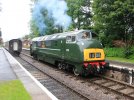
CATEGORY 1 - DIESEL HYDRAULIC

There's something about the sad looking face of the Class 42 "Warships" that don't quite do it for me.

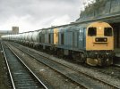
CATEGORY 2: DIESEL ELECTRIC

No question about it: the Class 20.

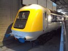
CATEGORY 3: HSTs

The HST prototype...what were they thinking...

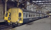
CATEGORY 4: DMU

Some of these look like carriages that someone has just carved windows out of. The Class 126 just edges it over the Class 128.

CAT 5: EMUs

This sadly has rich and varied competition :)
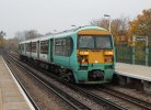
It is a tough battle between the 380, 402, 456, 503 and 506.
For me, it's the 450 by a nose.
 

Attachments

  • Crowcombe_832_light_engine_to_Bishops_Lydeard.jpg
    Crowcombe_832_light_engine_to_Bishops_Lydeard.jpg
    588.1 KB · Views: 30
  • Railway_Station,_Shrewsbury_-_geograph.org.uk_-_656019.jpg
    Railway_Station,_Shrewsbury_-_geograph.org.uk_-_656019.jpg
    89.8 KB · Views: 17
  • 800px-252001_at_NRM_York_-_DSC07812.JPG
    800px-252001_at_NRM_York_-_DSC07812.JPG
    80.9 KB · Views: 27
  • 126.jpg
    126.jpg
    2.4 MB · Views: 40
  • 450.jpg
    450.jpg
    123.7 KB · Views: 40
Last edited:

TT-ONR-NRN

Established Member
Joined
30 Dec 2016
Messages
10,509
Location
Farnham
Our brains are wired to see faces in everything, including trains!

While many locomotives and MUs are a joy to behold, many, though of course functional, have the archetypal "face that only a mother could love".

We instinctively feel a train looks "happy" or "sad", "weird" or just plain ugly!

Here's my personal nominees for the most egregious offenders.

CATEGORY 1 - DIESEL HYDRAULIC

There's something about the sad looking face of the Class 42 "Warships" that don't quite do it for me.

CATEGORY 2: DIESEL ELECTRIC

No question about it: the Class 20.

CATEGORY 3: HSTs

The HST prototype...what were they thinking...

CATEGORY 4: DMU

Some of these look like carriages that someone has just carved windows out of. The Class 126 just edges it over the Class 128.

CAT 5: EMUs

This sadly has rich and varied competition :)
It is a tough battle between the 380, 402, 450, 593 and 506.
For me, it's the 450 by a nose.
That green train is a 456, not a 450.
 
Status
Not open for further replies.

Top