matt_world2004
Established Member
- Joined
- 5 Nov 2014
- Messages
- 4,504
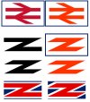
I think the blue red and white logo would look good on a lapel pin but the plane coloured logo should be used for signs posters and other wayfinding
And it's crap, whatever it is.
I think the blue red and white logo would look good on a lapel pin but the plane coloured logo should be used for signs posters and other wayfinding
Plain red is the defacto map symbol for a station, it'd be absolutely nuts to change it. I'm carefully trying not to be too cynical...
I dislike the clashing colours, and the poiliticalisation it implies. I and a great many other rail passengers are anti-unionist, this is off-putting to me, as I see the United Kingdom as corrupt and un-equal, "Great British Railways" is a perfect example as it will in reality only run English services but have great input from Wales, Scotland, and Northern Ireland which all have devolved transport which England lack similar powers over.
But if we have to go down the silly pro-union route, why not add heads of a lion, dragon, and unicorn on the forward facing side of the logo? The old British Rail "cycling" lion, and the Intercity Swallow added a bit of character, we all love animals.
As I have said that logo IS NOT the new-GBR logo it is from the 1980s
Earlier than that, was in the original 1964/65 design guide.
[...]
Really, what we should be promoting is the electric railway, as there are benefits to that outside of it's green credentials. Plus it would be focused on building infrastructure, and a focus on infrastructure in general will highly benefit future generations.
Well, that would probably be signified with an electric blue colour, or at least I hope so since I also love BR blue.

You could have linked their incredibly messy version of the Union Jack too.
Yes, he does. By all means use a (single) green version, but this is too busy by far, in my humble opinion.Mr Shapps and Co have revealed their intentions for an 'updated' version of the BR logo, in various shades of green. According to The Guardian, the logo's original designer isn't impressed.
British Rail logo designer appalled by green makeover ‘mess’
Gerry Barney says temporary branding update by rail industry group uses too many colourswww.theguardian.com
Does he have a point?


Ian Walmlsey has done a piece on this in the current Modern Railways. In it, he says that the Rail Delivery Group came up with a quote about how wonderful the new version was and asked Gerry Barney (designer of the original) to sign it. He refused, his comment on the new green version being "It's a load of old b******s."Why not a single colour (the dark green)?
It looks like a five-year old designed it and its crap, sacrilege even.
This is awful! Not only the hideous out of proportion double arrow (as mentioned above ad nauseum), but the wording on the poster.'Large Logo' billboard poster by the GWML (Haymill, Slough). Bonus London-bound binliner in the background.
View attachment 105216
But what's this logo in the bottom right corner...
View attachment 105217
Get on board??? Is NR now offering passenger rides on their Loram rail grinders, or maybe the New Measurement Train?