Pyewipecarshed
Member
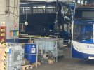
According to Bustimes Stagecoach Manchester 19335 (MX08 UCE) has been painted into the new livery at Oldham.

According to Bustimes Stagecoach Manchester 19335 (MX08 UCE) has been painted into the new livery at Oldham.
I do wonder if the ability apply adverts without disrupting the design too much might have been part of the thought process behind just choosing a solid colour with a few branding features. There's lots of blank space for bodyside adverts, and after an all-over vinyl wrap is removed it only requires one colour to touch up or repaint.Adverts invariably make most smart liveries look cheap and destroy the intended look.
Stagecoach gold managed to avoid that as I don’t think they applied ads to any of the gold branded buses. They used the space for route branding which makes much more sense from a passenger point of view than an advert for some terrible radio show or or a movie nobody is going to watch.
Let’s hope the new one includes route branding to advertise their own services rather than those of a third rate radio station.
Yep it was over the pits in Stockport today. Not the best picture…According to Bustimes Stagecoach Manchester 19335 (MX08 UCE) has been painted into the new livery at Oldham.
Oh dear!!!It appears that Stagecoach have trademarked a new slogan for themselves: “We’ve Got You”: https://trademarks.ipo.gov.uk/ipo-tmcase/page/Results/1/UK00004075738
There also appears to be a new branding submitted by them too, named ‘Chargd’, presumably for their electric fleet: https://trademarks.ipo.gov.uk/ipo-tmcase/page/Results/1/UK00004078487
Oh dear!!!
") that’ll be gone in 2 years
that’ll be gone in 2 yearsLess than that hopefully
Less than that hopefully

 www.flickr.com

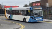
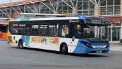
This super dark blue scheme seems to be an admission that it doesn't really matter what the bus looks like. And I guess in many ways it no longer does, with the onward match of re-regulation.
Someone holidaying from Scotland, or vice versa?Who in Devon cares that their bus is part of a group that also runs in Scotland?
Right now Stagecoach Manchester has a bus going round with "North Western Road Car Co." fleetname, another with "Greater Manchester Transport" and a third with "GMS Buses".Some very interesting comments above regarding the usefulness of livery and branding. I’d agree that it probably really doesn’t matter these days, with the widespread proliferation of differing liveries within fleets, and the architecture of modern buses themselves making it more and more difficult to apply an interesting livery in a consistent manner. Ultimately, the only people who probably really care about the ‘corporate message’ are the management! Stagecoach in particular are well behind the times in not offering tap on & off, and it’s things like this - along with, of course, reliability and punctuality of the service - which actually impact the punters, and where attention needs to be focused. Passengers really couldn’t care less which bus turns up or what colour it’s painted.
Very much agree with that!Right now Stagecoach Manchester has a bus going round with "North Western Road Car Co." fleetname, another with "Greater Manchester Transport" and a third with "GMS Buses".
The only one that even mentions Stagecoach on the bus (besides the legals) is the GMS one as the logo says "GMS Buses - A Stagecoach Subsidiary". Few bat an eyelid. People are used to buses with ads wrapped on them after all. As long as the route number is visible, and the destination, then it's fine.
Right now Stagecoach Manchester has a bus going round with "North Western Road Car Co." fleetname, another with "Greater Manchester Transport" and a third with "GMS Buses".
The only one that even mentions Stagecoach on the bus (besides the legals) is the GMS one as the logo says "GMS Buses - A Stagecoach Subsidiary". Few bat an eyelid. People are used to buses with ads wrapped on them after all. As long as the route number is visible, and the destination, then it's fine.
Yes the branding, not the legal fleetname. There are several North Western branded buses out at the minute - Hulleys of Baslow, D&G and Stagecoach in Chesterfield also have one.North Western Road Car Co Ltd is a company name that is/was used by Arriva. I suspect the bus has been transferred in from them but the lettering not updated - which is breaking the law, unless there's a different provision under the GM franchising laws or there's a clear "on hire" sign displayed with the actual operator shown.
Or do you mean the actual branding, not the legal lettering? There was a Southend Transport branded bus knocking around Milton Keynes for a while, though they've now debranded it.

 www.flickr.com
Attached are two examples of the local livery application of Enviro200 MMCs. (My photos) Stagecoach Yorkshire's 26021 that has had the black panel above the windows painted with the livery and Stagecoach East Midland's 26263 showing the less common application, leaving the panel black.It is notable that the ‘current’ livery chooses to paint over the large black are above the windows on the current shape E200 single decker, including this area as part of the livery rather than setting it aside as a styling detail of the vehicle.