• Our booking engine at tickets.railforums.co.uk (powered by TrainSplit) helps support the running of the forum with every ticket purchase! Find out more and ask any questions/give us feedback in this thread!

New rail logo for temporary advertising campaign

Status
Not open for further replies.

Towers

Established Member
Joined
30 Aug 2021
Messages
1,681
Location
UK
Mr Shapps and Co have revealed their intentions for an 'updated' version of the BR logo, in various shades of green. According to The Guardian, the logo's original designer isn't impressed.

The designer of the familiar British Rail logo has warned against government plans to revamp the symbol and dismissed a separate attempt to give it a temporary green makeover as a “load of old bollocks”.

“I think that’s rubbish,” he said. “I could understand it if they had just swapped red for green. But why on earth have they got that many colours? It’s a load of old bollocks. It’s just a mess.”


Does he have a point?
 
Last edited by a moderator:
Sponsor Post - registered members do not see these adverts; click here to register, or click here to log in
R

RailUK Forums

jw

Member
Joined
25 Jul 2010
Messages
167
I don't think it looks too bad. Unlike the original designer, I like the variety of green shades used. Let's hope the Government move beyond platitudes and unveil major investment in electrification shortly!

It's unclear if this is an secondary or temporary revamp to align with environmentally focused advertising, or a replacement of the original red. I'd imagine the former.
 

Attachments

  • WMG_logo-ff6eed8d.png
    WMG_logo-ff6eed8d.png
    33 KB · Views: 618
Last edited:

bengley

Established Member
Joined
18 May 2008
Messages
1,844
I don't think it looks too bad. It's unclear if this is an secondary or temporary revamp to align with environmentally focused advertising, or a replacement of the original red. I'd imagine the former.
Likewise - I think this is just to advertise the green benefits of the railway.

I hope so, anyway.
 

nlogax

Established Member
Joined
29 May 2011
Messages
5,374
Location
Mostly Glasgow-ish. Mostly.
Does he have a point?

Maybe. It's his original design after all.

My take is that the design in the article is just one version designed to highlight the relatively green nature of train travel versus other modes. The RA2 style guide by Spaceagency for Network Rail is very specific about the red version on station signs and the general usage of red-on-white and white-on-red.
 

AlterEgo

Veteran Member
Joined
30 Dec 2008
Messages
20,254
Location
No longer here
I like the concept but the top diagonal is so dark it looks bigger and longer than the other, lighter coloured diagonals.
 

jupiter

Member
Joined
9 May 2021
Messages
146
Location
Dorset
It just looks like a separate load of lines now. Has to be a temporary change surely?
 

LeeLivery

Established Member
Joined
13 Jul 2014
Messages
1,462
Location
London
'Britain runs on rail' just in green. I'm not a fan, would be better in one shade for the green campaign. Definitely should stick to red for corp branding.
 

LOL The Irony

On Moderation
Joined
29 Jul 2017
Messages
5,335
Location
Chinatown, New York

Trainfan2019

Member
Joined
9 Aug 2019
Messages
452
Would be better if the full logo and text would be in a single same shade of green.

I wish they'd settle for a decision of which rail alphabet version is going to be used. Wonder why this green lettering is in rail alphabet 1 but the new platform signs are in rail alphabet 2?
 

172007

Member
Joined
2 Jan 2021
Messages
737
Location
West Mids
#oldpersondoesnotlikechange is the headline. Yes this person was the designer bit it was decades ago; well done that person. But rail needs to move with the times and if it hints at its green credentials subliminally with green shades and it attracts a few extra passengers then it's a win. Looks quite fresh and modern.
 

quantinghome

Established Member
Joined
1 Jun 2013
Messages
2,265
#oldpersondoesnotlikechange is the headline. Yes this person was the designer bit it was decades ago; well done that person. But rail needs to move with the times and if it hints at its green credentials subliminally with green shades and it attracts a few extra passengers then it's a win. Looks quite fresh and modern.
There's no indication this is a proper new design rather than a one-off modification. Let's hope it's the latter because the multiple green shades look awful. It doesn't say 'moving with the times' at all. One shade of green would have worked much better. Great design is simple, as the longevity of the BR logo attests, having long outlived the company it was designed for.
 

Bletchleyite

Veteran Member
Joined
20 Oct 2014
Messages
97,901
Location
"Marston Vale mafia"
It isn't the new logo.

It is a specific campaign, of which there have been many with associated variants over the years.


Sorry for the bold but people seem to be ignoring this! :)
 

Domh245

Established Member
Joined
6 Apr 2013
Messages
8,426
Location
nowhere

The above page makes it sound like it is a temporary campaign, though (typically for RDG!) it's abundantly unclear

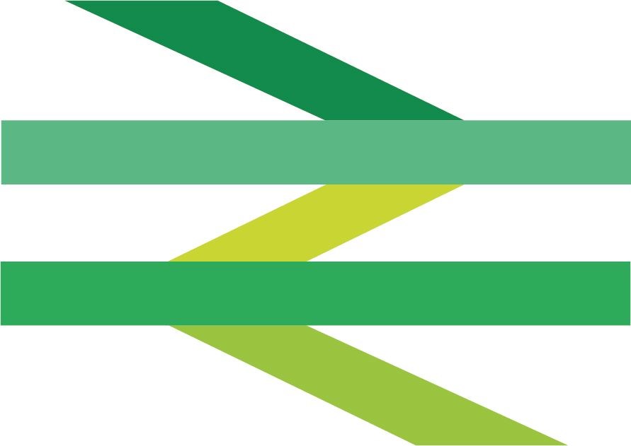
National Rail ‘double arrow’ logo goes green in new campaign ahead of COP26​

  • Rail industry launches ‘We Mean Green’ campaign to encourage people to take the train, and businesses to consider rail freight
  • On World Car Free Day, and in the run up to COP26, the classic double arrow rail logo is being given a green makeover to capture and convey the green benefits of train travel
  • One passenger train takes on average 500 cars off our roads and one freight train 76 lorries
Today on World Car Free Day (22 September), the rail industry has launched a new campaign – ‘We Mean Green’ – to encourage more people and businesses to choose greener trains over congested roads.
In a report published earlier this month, the Rail Delivery Group estimated that a 20% shift from rail to road would lead to an extra one million tonnes of CO2 emissions and 300 million hours stuck in traffic jams per year.
With only weeks until COP26, the UN climate summit (1 – 12 November 2021) in Glasgow, people will see the iconic British Rail double arrow logo go green as rail companies bring home the message of how getting people and goods onto trains and off roads will help in the fight against climate change. Posters will be at stations, on board trains and across digital channels.
Thousands of delegates are expected to arrive at the event by train and while in Glasgow they will have the opportunity to take a trip on zero emissions hydrogen and battery trains which are being exhibited at COP. Prior to the climate summit, from 18-24 October, community groups will also be putting on a series of events across the country encouraging people to try the train as part of ‘green travel week’, organised by the Community Rail Network.
The new ‘We Mean Green’ campaign highlights how:
  • A single train removes up to 500 cars off our roads
  • Every freight train removes on average 76 lorries from our roads
  • Leaving your car at home and taking the train cuts carbon emissions by two thirds
Andy Bagnall, Director General at the Rail Delivery Group, said:

“Train travel is more than a journey. By choosing to travel or transport goods by rail, people and businesses are on track to cut their carbon footprint so that together we achieve the net zero target. While rail accounts for 10% of journeys, it is responsible for just 1% of transport emissions. We want to work with government to reform the rail industry including making fares much simpler so that trains are the more attractive option to driving or flying.” 

Jenny Bates, transport campaigner at Friends of the Earth, said:

“Whether it’s personal travel or moving freight around, rail is preferable to flying or driving. Particularly with personal travel taking the train needs to be cheaper, or as cheap, as domestic or short haul flights. This means carbon-guzzling air travel needs to be taxed properly - and the cost of travelling by rail versus the cost of motoring also needs to be redressed. This would go a long way to address the disincentives people currently face travelling by rail and other public transport. This is in the public interest because it benefits people as well as the environment through reduced climate emissions and air pollution.”

Martin Tugwell, Chief Executive of Transport for the North, said:
“The transport industry has a crucial role to play in supporting wider climate change targets. We know that rail is the greenest form of transport, and by encouraging travellers across the North – whether commuters returning to the office or families going out on day trips – to choose the train, we have an opportunity to make a difference.
“We Mean Green is a really important initiative designed to promote the environmental benefits of rail travel and transport in an accessible way. With sustainability and the upcoming COP26 conference high on the national – and indeed global - agenda, this is more important than ever. We’re proud to be taking an evidence-led approach to our transport decarbonisation strategy to help create a cleaner, greener transport network of the future. We know we will only tackle this seismic challenge if we work with our industry partners and we are proud to champion this work from the Rail Delivery Group.”
 

Bletchleyite

Veteran Member
Joined
20 Oct 2014
Messages
97,901
Location
"Marston Vale mafia"

The above page makes it sound like it is a temporary campaign, though (typically for RDG!) it's abundantly unclear

Seems clear to me. But also rather hypocritical - how are those ageing freight locomotives and 1980s DMUs going again?
 

Domh245

Established Member
Joined
6 Apr 2013
Messages
8,426
Location
nowhere
Seems clear to me.

It could be clearer though, eg

"On World Car Free Day, and in the run up to COP26, the classic double arrow rail logo is being given a new green makeovercounterpart to capture and convey the green benefits of train travel"

Would leave it abundantly clear that this is a supplementary design for this campaign only. As it's written, it could be interpreted as a permanent makeover, though context means that's unlikely. This thread is evidence enough of people not realising that it's a temporary thing!
 

HarryL

Member
Joined
14 Sep 2020
Messages
241
Location
Leeds
The colours are for a single advertising campaign so he's mistaken to think it'll end up as GBRs version, but the big problem to me is that they've used the Rail Delivery Group redraw of the symbol with the longer 'stems' (for lack of a better word). Hopefully they've chosen this version of the symbol as an oversight rather than a rule.

The amount of variations the double arrow symbol has gone through over the years is rather annoying, so many official railway communications have used random versions they appear to have found online with incorrect proportions for so long, even on road signs and such.
 

stephen rp

Member
Joined
25 Jun 2016
Messages
190
Green? One of those colours looks distinctly as much green as Stroudley's Improved Engine Green.
 

30907

Veteran Member
Joined
30 Sep 2012
Messages
18,068
Location
Airedale
It isn't the new logo.

It is a specific campaign, of which there have been many with associated variants over the years.
And coincides with Great Big Green Week which also uses various shades of (wait for it...) green. Surprised the Guardian didn't know that.
 
Status
Not open for further replies.

Top