• Our new ticketing site is now live! Using either this or the original site (both powered by TrainSplit) helps support the running of the forum with every ticket purchase! Find out more and ask any questions/give us feedback in this thread!

Stations rebranded to Great British Railways design / Rail Alphabet 2

43096

On Moderation
Joined
23 Nov 2015
Messages
16,729
The old and new on one sign noted at Liskeard. New vinyl over the Regional Railways sign. Clearly this does not work. Interestingly the old FGW and Wessex stickers covering the old RR branding would have had to have been peeled off to put the new one on.
View attachment 117658
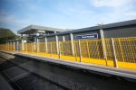
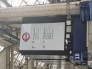
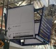
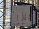
That’s very obviously GWR branding, not RA2.
 
Sponsor Post - registered members do not see these adverts; click here to register, or click here to log in
R

RailUK Forums

James H

Established Member
Joined
25 Jun 2014
Messages
1,296
Contrary to the planning document I posted earlier in this thread, the rail wayfinding signage at The Sidings (below the old Waterloo International) has been installed in the old white-on-blue Network Rail Brunel style.
 

Goldfish62

Veteran Member
Joined
14 Feb 2010
Messages
11,689
GWR used Glypha up until now. As serif faces go it's quite a nice one and it'll be a shame to see it go.
I passed the yet to open Reading Green Park this morning and the signage is all in GWR Glypha. An RA2-free zone!
 

Chiltern006

Member
Joined
3 Oct 2018
Messages
733
New Thanet Parkway has SE signs with RA2 font
 

Attachments

  • F5CCAE30-1D0F-4832-9994-5F8C0136A8E1.jpeg
    F5CCAE30-1D0F-4832-9994-5F8C0136A8E1.jpeg
    436.2 KB · Views: 315

HarryL

Member
Joined
14 Sep 2020
Messages
257
Location
Leeds

Goldfish62

Veteran Member
Joined
14 Feb 2010
Messages
11,689
The one and only RA2 sign at Waterloo so far. Looks kind of OK, but they need to make up their minds which way they want to direct passengers to the Jubilee and W&C lines from that end of the station!
 

Attachments

  • 20220906_131828.jpg
    20220906_131828.jpg
    2.3 MB · Views: 342

TT-ONR-NRN

Veteran Member
Joined
30 Dec 2016
Messages
11,556
Location
Salford Quays, Manchester
The one and only RA2 sign at Waterloo so far. Looks kind of OK, but they need to make up their minds which way they want to direct passengers to the Jubilee and W&C lines from that end of the station!
That’s very obviously not RA2. It’s the font Network Rail managed stations have used for the past ten years or so. And Stagecoach SWT & EMT.
 

Goldfish62

Veteran Member
Joined
14 Feb 2010
Messages
11,689
That’s very obviously not RA2. It’s the font Network Rail managed stations have used for the past ten years or so. And Stagecoach SWT & EMT.
"Very obviously"? Well, you're obviously an expert in such matters, but this mere mortal assumed that a sign done in the new style would use RA2 typeface.

So, the typeface is not RA2, but the layout, colours and arrow pictogram are certainly to the new style.
 

TT-ONR-NRN

Veteran Member
Joined
30 Dec 2016
Messages
11,556
Location
Salford Quays, Manchester
"Very obviously"? Well, you're obviously an expert in such matters, but this mere mortal assumed that a sign done in the new style would use RA2 typeface.

So, the typeface is not RA2, but the layout, colours and arrow pictogram are certainly to the new style.
You don’t need to be offended by my wording, which was simply to denote that there is a rather significant difference between it and RA2. I’m sorry if you were.

I am noticing more and more people are posting signage in here that is Helvetica or Calibri or whatever though. I’m wondering if people are struggling to recognise the RA2 font. Says a lot about how it stands as a recognisable typeface for a recognisable brand I guess.
 

Goldfish62

Veteran Member
Joined
14 Feb 2010
Messages
11,689
You don’t need to be offended by my wording, which was simply to denote that there is a rather significant difference between it and RA2. I’m sorry if you were.

I am noticing more and more people are posting signage in here that is Helvetica or Calibri or whatever though. I’m wondering if people are struggling to recognise the RA2 font. Says a lot about how it stands as a recognisable typeface for a recognisable brand I guess.
Why shouldn't I be offended? Your response came across as superior and condescending.

Anyway, back to the topic in question. I can't recall seeing any other example posted here of GBR-style signage, but with non-RA2 typeface unless I've missed it.
 

Devonian

Member
Joined
10 Sep 2019
Messages
205
Location
Totnes
As mentioned, this appears to be Helvetica rather than RA2. An interesting one nonetheless though as St Pancras has had it's own typeface called Barlow (can be seen on the Lift sign) which this has ignored.
It's ... old Rail Alphabet resurrected! The 'a' gives it away. This is, I think, the second example that has been posted of the old version returning alongside the new symbols.

a-a-a-a.png
 

nlogax

Established Member
Joined
29 May 2011
Messages
5,687
Location
Mostly Glasgow-ish. Mostly.
You don’t need to be offended by my wording, which was simply to denote that there is a rather significant difference between it and RA2. I’m sorry if you were.

Come on. That Waterloo sign has by far the closest resemblance to RA2 out of most of the non-RA2 photos on this thread. It really isn't much of a 'significant difference' for the likes of most of us, especially when seen from a distance and particularly as it features new RA2-style lightweight arrows and is black-on-white.. not the norm for NR Brunel signage.

Whatever. It's a very poor sign. No reason why it shouldn't have been TfL Johnston 100.
 

traji00

Member
Joined
17 Aug 2009
Messages
229
London Waterloo, by platform 4/5 and Exit 2 (for Waterloo Road). There appears to be another sign on the opposite side.
 

Attachments

  • CE7D9DF4-FCDF-4F8E-B048-861019F0E357.jpeg
    CE7D9DF4-FCDF-4F8E-B048-861019F0E357.jpeg
    436.6 KB · Views: 334

physics34

Established Member
Joined
1 Dec 2013
Messages
3,913
London Waterloo, by platform 4/5 and Exit 2 (for Waterloo Road). There appears to be another sign on the opposite side.
After another recent trip to switzerland (everything is clear white on blue signage), theyve got to go bold text (original RA) at a bare minimum.
 

HarryL

Member
Joined
14 Sep 2020
Messages
257
Location
Leeds
Presumably a temporary solution while they work on redoing it properly.

I don't think the scale is a problem here, the text is roughly the same size as on the old ones and the layout is a lot neater looking. I'd be interested in seeing the other side too as that one looks to have more information on it.
 

43096

On Moderation
Joined
23 Nov 2015
Messages
16,729
London Waterloo, by platform 4/5 and Exit 2 (for Waterloo Road). There appears to be another sign on the opposite side.
As @Bletchleyite says, do it properly or not at all. Whoever authorised that needs (re-)educating on what NR’s way finding project is about.
 
Last edited by a moderator:

barbette165

Member
Joined
15 Nov 2010
Messages
99
The lack of consistency is bizarre, why is the Jubilee line "via escalators and lift" but Lost Property is "via escalators & lift"?
 

Top