-
Our new ticketing site is now live! Using either this or the original site (both powered by TrainSplit) helps support the running of the forum with every ticket purchase! Find out more and ask any questions/give us feedback in this thread!
You are using an out of date browser. It may not display this or other websites correctly.
You should upgrade or use an alternative browser.
You should upgrade or use an alternative browser.
Tube Map of Britain
- Thread starter Sprigibax
- Start date
- Status
- Not open for further replies.
Sponsor Post - registered members do not see these adverts; click here to register, or click here to log in
R
RailUK Forums
Mcr Warrior
Veteran Member
- Joined
- 8 Jan 2009
- Messages
- 14,621
Well, it's certainly colourful.Please tell me what you think!
Quite a few place name typos. E.g..Ciranlarich, Kikcaldy, Glenoce, Anan.
Personally, would have shown the closed (or never opened) lines as intermittent pecked lines.
And having London as a random interchange station between Barnet and Sutton, and between Hounslow and Bromley, is certainly a novel approach.
Good fun, though.
Llanigraham
On Moderation
I think you need to have a very close look at what you have "drawn" in Wales, as currently it makes no sense what so ever.
And perhaps get the spelling correct!
And perhaps get the spelling correct!
peterblue
Member
Very inaccurate from a cursory glance. Some lines don't exist in real life - unless you are trying to include historic ones?
WizCastro197
Established Member
Guildford is spelt wrong!
Chris M
Member
Watchet and Ilfracombe but not Taunton or Plymouth being intermediate stations between Bridgwater and Penzance is, err, interesting.
pokemonsuper9
Established Member
I started jokingly writing about the lack of scale between Crewe and Warrington, then looked further down and to the right and realised how much it actually looks like the tube map!As part of a series of alternative tube maps I’ve been working on, I made a tube map of Britain. It’s not very geographically accurate (but, hey, it’s a tube map) and I’ve had to add a few branches, stations etc. Please tell me what you think!
I was thinking of criticizing some things but thinking of the compromises between accuracy to real life and accuracy to the tube map I think most trade offs were good.
Sly Old Fox
Member
I can see you worked hard on it but as it isn’t in the least bit accurate it has no use as a map.
Sprigibax
Member
It was just supposed to be a little bit of fun…
Deepgreen
Established Member
Really don't see the point of this as it is; a) riddled with spelling errors and, b) simply geographically and historically inaccurate to the point of just being a set of names against coloured lines. Just one example - Glencoe has never had any railway or station. Perhaps I am missing something...
ikcdab
Member
Technically you have made a good job of this. It looks good. I just wondered about the reason you did it, given the huge leaps in imagination on the lines. What was the reason why you didn't stick to reality?
InkyScrolls
On Moderation
Trying to follow the S&C was... 'interesting' to say the least.
Mcr Warrior
Veteran Member
- Joined
- 8 Jan 2009
- Messages
- 14,621
Would certainly allow some interesting (no changes required?) journey opportunities.Trying to follow the S&C was... 'interesting' to say the least.
Manchester, Rochdale, Burnley, Settle, Kirkby Stephen, Appleby, Alston, cross near here over the Bradford - Burnley line, Hexham, Hawick, Galashiels, Edinburgh.
ikcdab
Member
Minehead to Bridgend is an interesting one.....
cadder toad
Member
- Joined
- 2 May 2015
- Messages
- 122
I find it quite thought provoking. Its the London tube map but with names of stations across the whole uk replacing the familiar tube stations. What if a route map of uk rail services was drawn on a single rectangular sheet? For most of us, as the tube map recognises, geography is not critical. We want to know where to change and what service to take. (This has been said before by others on this forum.) There used to be an InterCity map of uk rail services but it was drawn into a roughly geographical shape. Well done!
Mcr Warrior
Veteran Member
- Joined
- 8 Jan 2009
- Messages
- 14,621
Something like this version from May 1982? Doesn't use too many colours, but nevertheless quite clearly set out.There used to be an InterCity map of uk rail services but it was drawn into a roughly geographical shape.
(Link to schematic map diagram of InterCity rail network, circa May 1982).
Alternative versions of Harry Beck's map, with different station names, have been around for a long time.
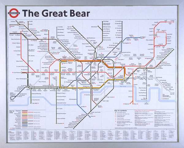
"The Great Bear" by Simon Patterson dates from 1992 and is part of the Tate Modern art collection, though, according to their website, it is not currently on display.
 www.tate.org.uk
The best alternative versions that I have seen are those where the real names of the station names are all translated into German and where the station names are all given as anagrams.
"The Great Bear" by Simon Patterson dates from 1992 and is part of the Tate Modern art collection, though, according to their website, it is not currently on display.
‘The Great Bear‘, Simon Patterson, 1992 | Tate
‘The Great Bear‘, Simon Patterson, 1992
The Great Bear is a four colour offset lithograph mounted in an anodised aluminium frame. It is an altered version of the map of the London Underground created by Henry (Harry) C. Beck (1903-74) in 1931. Patterson replaced the names of the underground stations with the names of engineers, philosophers, explorers, planets, journalists, footballers, musicians, film actors, saints, Italian artists, sinologues (Chinese scholars), comedians and 'Louis' (French kings).
The best alternative versions that I have seen are those where the real names of the station names are all translated into German and where the station names are all given as anagrams.
Something like this version from May 1982? Doesn't use too many colours, but nevertheless quite clearly set out.
(Link to schematic map diagram of InterCity rail network, circa May 1982).
Strange how to you could do London to Leeds slightly quicker 2hr 10min than you can do now. And New Pudsey on there for some reason, hardly a major destination!
Mcr Warrior
Veteran Member
- Joined
- 8 Jan 2009
- Messages
- 14,621
Believe that back in 1982, New Pudsey was occasionally served by through Inter City trains from Bradford Interchange to/from London Kings CrossAnd New Pudsey on there for some reason, hardly a major destination!
Sprigibax
Member
It was more based on Britain’s geography than rail lines - for example I would prioritise larger towns which don’t have a rail station than smaller ones which doJust one example - Glencoe has never had any railway or station.
YorksLad12
Established Member
A line through Wembley, with a football connection? It'll never catch on.Alternative versions of Harry Beck's map, with different station names, have been around for a long time.
"The Great Bear" by Simon Patterson dates from 1992 and is part of the Tate Modern art collection, though, according to their website, it is not currently on display.
‘The Great Bear‘, Simon Patterson, 1992 | Tate
‘The Great Bear‘, Simon Patterson, 1992
The best alternative versions that I have seen are those where the real names of the station names are all translated into German and where the station names are all given as anagrams.
Well, I never knew that the South Western, Brighton, Chatham and South Eastern main lines were once considered InterCity.Something like this version from May 1982? Doesn't use too many colours, but nevertheless quite clearly set out.
(Link to schematic map diagram of InterCity rail network, circa May 1982).
Mcr Warrior
Veteran Member
- Joined
- 8 Jan 2009
- Messages
- 14,621
If not "InterCity" branded as such, then perhaps 'Principal services'?Well, I never knew that the South Western, Brighton, Chatham and South Eastern main lines were once considered InterCity.
Previously discussed here...
https://www.railforums.co.uk/threads/intercity-in-the-southeast-during-the-1980s.203604/
InkyScrolls
On Moderation
So what's the rationale for Glencoe?It was more based on Britain’s geography than rail lines - for example I would prioritise larger towns which don’t have a rail station than smaller ones which do
Sprigibax
Member
It just seemed like a good place to put a station between Ciranlarich and Fort William, plus it was one of the first places to come up on Google mapsSo what's the rationale for Glencoe?
birchesgreen
Established Member
Thats nice, i do maps myself sometimes. One example is a WM rail map i did a few years ago (becoming out of date now though!)
InkyScrolls
On Moderation
I see... I would suggest that Google Maps is probably not a good place to start!It just seemed like a good place to put a station between Ciranlarich and Fort William, plus it was one of the first places to come up on Google maps
A few posters here seem to have had a sense of humour by-pass...
Personally, I love the idea of there being a non-HS1 Kent-Essex rail link, even if Basildon wouldn't be my first choice! It's a very nice attempt to get the geography vaguely right in connection with a slightly doctored tube... sorry, Underground map.
As others have said, I would work on correcting the spelling of places as the next step, then see what other improvements you could make.
- Status
- Not open for further replies.