LNW-GW Joint
Veteran Member
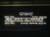
I was at Derby yesterday, and noticed that the individual platform PIS displays on the overbridge were of the colour graphics type, rather than the more normal monochrome dot-matrix type. (pic)
This seems like a significant upgrade. They are high-resolution, legible and attractive, everything the dot-matrix type isn't.
There is even a graphic analogue clock as well as the digital version. No doubt there are many other display variations in the software.
The displays on the platforms themselves, and the summary screens and those on the concourse, are all still dot-matrix.
NR and EMT must have worked together to implement this design.
I wonder if there is a plan to roll them out further?
The worst current displays are the summary ones which just aren't big enough or detailed enough without excessive scrolling.
By the time you have inserted eg "via Birmingham" lines you have only the capability to show a handful of trains.
The very worst are those which scroll over 3 screens (with the third showing only one train...).
And please, NR, find a way to show the operator on the summary screens.
Given that many tickets are now marked "XX ONLY" you should be told what XX is before it comes up on the platform PIS.
It's like showing destinations at an airport without the flight number.
There ARE big screens at some stations, but they appear to be for NR internal use, on a loop covering engineering work, bad weather and security warnings - they are never used for train information.
Anyway, it's a start.
Are these new graphics displays up at any other stations?