Bletchleyite
Veteran Member
Underwhelming, for sure.
The more RA2 I see - especially the inconsistent application across locations - the less enthused I am about it.
Why are they doing this!?I went to Coventry and Crewe last weekend. Coventry now has exterior wayfinding signage at it's new station building, but it doesn't look right to me. The arrow and font weight really don't compliment each other. Crewe has a surprising amount of "new" signage.
I don't really see what you've improved there to be honest. It's not worse, but I'm not sure changing the font makes any difference to the fact that just having text and arrows looks boring.feel like a design like this would have been better i can't lie. my own designs
RA2 is very dull and uninviting
I don't really see what you've improved there to be honest. It's not worse, but I'm not sure changing the font makes any difference to the fact that just having text and arrows looks boring.
Yes, I think the "dark theme" version of it, as I can't help but call it, looks nice - but Chiltern006's post suggested that Rail Alphabet 2 (which is the font) was the problem. I disagree that it is - though perhaps a bolder weight should be used.It is like what the back end of New St has and I think it looks very good. White just looks drab and gets dirty.
Yes, I think the "dark theme" version of it, as I can't help but call it, looks nice - but Chiltern006's post suggested that Rail Alphabet 2 (which is the font) was the problem. I disagree that it is - though perhaps a bolder weight should be used.
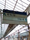
Going back to rail alphabet 2 at Crewe, there's still a little bit of original rail alphabet left in situ there...
But that amount of grime on any colour sign is going to look bad, it's not something particularly wrong with white. Any sign is going to get messy if left in a station for this long without being cleaned.That neatly demonstrates why white signage is a bad idea.

Probably need the geographical context but the direction of the arrows seem inconsistent. The coloured lines denoting the underground lines are definitely too thin, I didn't notice them at first as I was expecting something to the left of the line name.Couple more from Euston
View attachment 107505View attachment 107506Source: https://twitter.com/richardavsmith/status/1470481450474655756?s=21
The lines so thin that the colours are barely distinguishable.Probably need the geographical context but the direction of the arrows seem inconsistent. The coloured lines denoting the underground lines are definitely too thin, I didn't notice them at first as I was expecting something to the left of the line name.
I never noticed the lines - pointless as too weak and too far from the text. Lilly being gilded.The lines so thin that the colours are barely distinguishable.
It is like what the back end of New St has and I think it looks very good. White just looks drab and gets dirty.
I have photos. It looks very classy, much nicer than the white.
Photos show station direction signs in Rail Alphabet 2 font and a black board and white/yellow text colour scheme
Same with Bath Spa- there are tonnesat Crewe, there's still a little bit of original rail alphabet left in situ there...
Agreed. This whole project is a complete waste of time and money if there's no consistent standard. A lesson in how not to implement a new corporate identity.What a waste of money! Fonts and signage need to be consistent, and RA2 signage is anything but that.
such a shame if I’m honest with you