Chiltern006
Member
- Joined
- 3 Oct 2018
- Messages
- 658
100% agreed. However I’m not sure on the use of the blue on black at the bottom of the sign
Purpleblue
Double (G)BR / Travel South Yorkshire branding at Dore & Totley
View attachment 153418
Source: https://www.linkedin.com/posts/tran...ionindustry-activity-7168304733286289408-Trj3
I think they look far smarter than the outdated, worn looking Serco-Abellio Northern Rail signage elsewhere on the network. I think they're fine for a consistent national standard if only it'd be rolled out properly.Think these look pretty good and good to see the double arrow being used on the sign as intended. I can understand the complaint there's a bit too much white space but I guess the posts are existing and a sign has to be made to fit, it looks quite well proportioned to me.
The T logo is also fine and similar to what has been done in Manchester for stations there. Having a local transport operator logo which sits to the right of the name where applicable seems a good solution to me.
View attachment 153427
Source https://twitter.com/WorrallLea/status/1754921579555835943
I think it looks fantastic. Very smart.
Oops was a quick glance and assumed hahaPurple
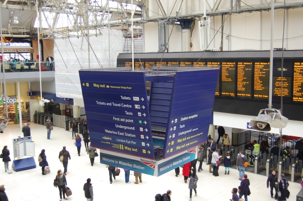
Interesting to see that they are still using the Railtrack station logo.RA2 starting to crop up at Victoria now
 thebeautyoftransport.com
I think this is good. One (incredibly rare) bit of genuine praise for Railtrack was there refurbs of the major terminis and these logos, so I'm glad they are being kept.Interesting to see that they are still using the Railtrack station logo.
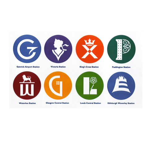
Virtuous Circles (Railtrack major station graphic identities, Lloyd Northover, UK)
A little while ago I wrote about British Railways’ totem signs, which are now highly collectible, as are many railway posters, carriage number plates from London Underground trains, old bus s…
 tdc.org