• Our booking engine at tickets.railforums.co.uk (powered by TrainSplit) helps support the running of the forum with every ticket purchase! Find out more and ask any questions/give us feedback in this thread!

Stations rebranded to Great British Railways design / Rail Alphabet 2

Bletchleyite

Veteran Member
Joined
20 Oct 2014
Messages
98,231
Location
"Marston Vale mafia"
Aren't WMT's signs - and indeed the rest of the branding package - specified Transport for the West Midlands anyway?

It appears to me that the same guy has done both those (including the "diamond" branding generally) and the LNR part of the franchise which is down to the franchisee. And I wouldn't say I'm a fan of either, really, particularly that hideous orange and purple livery.

He is I believe ex-Virgin Trains East Coast, which also makes him responsible for that hideous livery too, the nastiest thing I've ever seen to disgrace a Mk4 (and LNER's plan to paint over it can't come soon enough). He seems to use some of the design elements that Best Impressions do (indeed I originally thought that was a BI job, albeit not their best) but doesn't seem to use them as well.

The guy seems to quite like vertical elements on train liveries, which (while the doors are required) don't look great when overused - horizontal elements make a train look sleek and fast, which is what you want.

Edit: to give him some credit it seems he's also responsible for ScotRail which is one of the better branding packages, but I suspect was very tightly specified.
 
Last edited:
Sponsor Post - registered members do not see these adverts; click here to register, or click here to log in
R

RailUK Forums

R G NOW.

Member
Joined
25 Jan 2019
Messages
418
Location
gloucester
I am pleased these are being reintroduced as they remind me of the young days and feel part of the family silver.
 

Meerkat

Established Member
Joined
14 Jul 2018
Messages
7,657
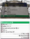
Meanwhile at EMR…

That’s terrible! I thought we had pretty much got standard pictograms right across Europe now but then EMR use those spindly, over complicated ones.
 

domcoop7

Member
Joined
15 Mar 2021
Messages
252
Location
Wigan
That’s terrible! I thought we had pretty much got standard pictograms right across Europe now but then EMR use those spindly, over complicated ones.
Came here to say just that! It's awful and precisely why a uniform system should be imposed. The EMR one is cluttered with dense text, and far too light pictograms. On the example above from Twitter, where do I go if I want to get to platforms 4,5,6,7? Why is the information for those platforms in two separate places in the list.

Screenshot from 2022-02-19 22-14-36.png

On the example here, which is from their website, the two "Way out" lines are in different places and the accompanying text is barely legible. The pictogram and text goes after the destination on some lines, but before it on others.

Now there may be some people who like this better than the GBR RA2 verison. But if every TOC decides to reinvent the wheel and create its own version it just ends up a mess, again. Someone up thread said the road sign system in the UK is good, which it is. But it isn't without its quirks. However, if those quirks are nationally consistent, then you learn how to read them and it doesn't matter. Imagine if every County Council, National Highways, devolved administration, TfL and Unitary Authority created their own sign system because they thought they could do better? In fact, Devon County Council did, I believe, and has non-standard non-compliant signs based on different colours of text with different colour borders. Does anybody outside of Devon (or most people within Devon who live in Plymouth and Exeter) know what that system is. or how to read it?
 

HarryL

Member
Joined
14 Sep 2020
Messages
243
Location
Leeds
The EMR signage is a good example of why a standardised system was commissioned and was much needed. For every TOC that gets it right, you get an example like this where its done very, very wrong and you can't guaruntee which a TOC will be.
 

Meerkat

Established Member
Joined
14 Jul 2018
Messages
7,657
The EMR signage is a good example of why a standardised system was commissioned and was much needed. For every TOC that gets it right, you get an example like this where its done very, very wrong and you can't guaruntee which a TOC will be.
Standard only needs to be the layout and pictograms. The colours (particularly borders) can vary without confusing people.
 

takno

Established Member
Joined
9 Jul 2016
Messages
5,114
Standard only needs to be the layout and pictograms. The colours (particularly borders) can vary without confusing people.
I think you can make small changes to colours on borders. The fundamental foreground and background colours need to be the same though, otherwise they become difficult to find for people with less than perfect eyesight.

I would agree that the pictograms should remain the same, but the Network Rail standard appears to have chosen really bad ones which deviate from international norms, so really they're best ignored
 

Trainfan2019

Member
Joined
9 Aug 2019
Messages
452
So if EMR are installing brand new signs at a range of their stations (this has already been done at Kidsgrove with the improvement works) does this mean there will be no Rail Alphabet 2 signs appearing at these stations in the future?
 

JaJaWa

Established Member
Joined
14 Feb 2013
Messages
1,705
Location
Came here to say just that! It's awful and precisely why a uniform system should be imposed. The EMR one is cluttered with dense text, and far too light pictograms. On the example above from Twitter, where do I go if I want to get to platforms 4,5,6,7? Why is the information for those platforms in two separate places in the list.

View attachment 110475

On the example here, which is from their website, the two "Way out" lines are in different places and the accompanying text is barely legible. The pictogram and text goes after the destination on some lines, but before it on others.

Now there may be some people who like this better than the GBR RA2 verison. But if every TOC decides to reinvent the wheel and create its own version it just ends up a mess, again. Someone up thread said the road sign system in the UK is good, which it is. But it isn't without its quirks. However, if those quirks are nationally consistent, then you learn how to read them and it doesn't matter. Imagine if every County Council, National Highways, devolved administration, TfL and Unitary Authority created their own sign system because they thought they could do better? In fact, Devon County Council did, I believe, and has non-standard non-compliant signs based on different colours of text with different colour borders. Does anybody outside of Devon (or most people within Devon who live in Plymouth and Exeter) know what that system is. or how to read it?

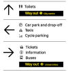
Here's what the above sign would (roughly) look like in GBR design, the arrows are much clearer than the other 2 versions.
Screenshot 2022-02-21 at 03.28.42.png

Also I found this https://www.roads.org.uk/blog/devon-help-us about the mentioned Devon signs.
 
Last edited:

py_megapixel

Established Member
Joined
5 Nov 2018
Messages
6,680
Location
Northern England
Here's what the above sign would (roughly) look like in GBR design, the arrows are much clearer than the other 2 versions.
View attachment 110521

That looks about right, and honestly I think it's very clear. Highlighting the "way out" sections in that matter is something specifically mentioned in the design guide IIRC, and it's a very good idea, as most people will be looking for the exit when they get off a train, and that's also where people will need to head in an evacuation - when they might be panicking or confused, so clear and direct information is of the upmost importance.
 

delt1c

Established Member
Joined
4 Apr 2008
Messages
2,125
Wow, how completely uninspiring.
Interesting reaction, however I don’t think the average traveler will decide not to alight because the Station name sign doesn’t appeal to them. It is there to inform them of the station the train has just arrived at.
 

birchesgreen

Established Member
Joined
16 Jun 2020
Messages
5,231
Location
Birmingham
Interesting reaction, however I don’t think the average traveler will decide not to alight because the Station name sign doesn’t appeal to them. It is there to inform them of the station the train has just arrived at.
But signage should catch the eye and not blend into the background, i'm not sure the new signage examples i've seen achieve that yet.
 

HYPODERMIC

Member
Joined
14 Feb 2011
Messages
87
Location
Chingford
Here's what the above sign would (roughly) look like in GBR design, the arrows are much clearer than the other 2 versions.
View attachment 110532

Also I found this https://www.roads.org.uk/blog/devon-help-us about the mentioned Devon signs.

While I still feel that GBR signage could use a splash/strip of colour - I still feel it looks a little too austere and 1970s at times - I do think it looks very smart and very clear in this example you've mocked up. This is a big improvement over most TOC signage/wayfinding, at least in terms of clarity/readability. This looks excellent.
 

Stadtbahn

Member
Joined
29 Jul 2021
Messages
23
Location
England

I just found this video on YouTube showing a visualisation of future RA2 signage at Paddington. Not sure who created this and if it's official but very interesting to look at.
 

takno

Established Member
Joined
9 Jul 2016
Messages
5,114

I just found this video on YouTube showing a visualisation of future RA2 signage at Paddington. Not sure who created this and if it's official but very interesting to look at.
Wow. That monochrome "no entry" sign above the underground entrance badly lacked urgency. If it wasn't placed exactly where I would, from experience, expect there to be a no entry sign, I really don't think I'd have registered it at all.
 

HarryL

Member
Joined
14 Sep 2020
Messages
243
Location
Leeds

I just found this video on YouTube showing a visualisation of future RA2 signage at Paddington. Not sure who created this and if it's official but very interesting to look at.
The totem sign with the dot matrix attached is a very nice detail, could possibly be further improved by using more modern screens rather than dot matrix though.
 

Horizon22

Established Member
Associate Staff
Jobs & Careers
Joined
8 Sep 2019
Messages
7,654
Location
London
Wow. That monochrome "no entry" sign above the underground entrance badly lacked urgency. If it wasn't placed exactly where I would, from experience, expect there to be a no entry sign, I really don't think I'd have registered it at all.

Certainly wouldn't be sending people to Platform 1-11 that way! It's not absoutely awful, but I'm not sure why yet I find the arrows a little creepy and spindly and there's excessive white space for my liking.
 

Peter Sarf

Established Member
Joined
12 Oct 2010
Messages
5,744
Location
Croydon
Meanwhile at EMR…

The above is a nice way of dealing with the arrows.

I get the two distinct list of platforms and arroews. One ncludes a lift the other does not.
Here's what the above sign would (roughly) look like in GBR design, the arrows are much clearer than the other 2 versions.
View attachment 110532

Also I found this https://www.roads.org.uk/blog/devon-help-us about the mentioned Devon signs.
And then I don't mind the arrows in this one !. Perhaps layout would suffer if the sign becomes too tall to fit above peoples heads but below the ceiling/canopy. Could then need the list to go across rather than down for each arrow.
 

plymothian

Member
Joined
26 Sep 2010
Messages
738
Location
Plymouth
Several mainline stations in Cornwall have now got GBR wayfinding signage. The station name boards are still in GWR brand, but everything else has gone over to GBR.
St Germans, Par and Hayle are 3 that have been converted.
 

rcsn319

Member
Joined
3 Jan 2022
Messages
29
Location
london
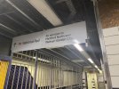
Surprisingly Moorgate of all places now has some GBR signage
 

Attachments

  • 49EB6C03-1EBD-4A47-9913-869937C64EF2.jpeg
    49EB6C03-1EBD-4A47-9913-869937C64EF2.jpeg
    3.2 MB · Views: 325

JaJaWa

Established Member
Joined
14 Feb 2013
Messages
1,705
Location
Several mainline stations in Cornwall have now got GBR wayfinding signage. The station name boards are still in GWR brand, but everything else has gone over to GBR.
St Germans, Par and Hayle are 3 that have been converted.
Do upload pics if you are able to
 

TT-ONR-NRN

Established Member
Joined
30 Dec 2016
Messages
10,531
Location
Farnham
Surprisingly Moorgate of all places now has some GBR signage
It just looks so temporary.
I hope New Johnston is kept entirely on London Underground and Elizabeth Line areas while Rail Alphabet 2 is kept entirely on National Rail areas as there’ll be a sore, messy sight what with the clashing of fonts.

Also, if almost all National Rail services are to be branded Great British Railways I don’t see why they can’t just have a sign saying that instead of National Rail.
 

jon0844

Veteran Member
Joined
1 Feb 2009
Messages
28,085
Location
UK
National Rail on signs makes more sense than even British Rail, let alone GREAT British Rail. Of course you can use BR or GBR on websites, and elsewhere, but for signage it makes sense to have national rail, international rail, underground, bus, coach, taxi etc.

The only 'grey area' is perhaps Overground, which is of course still national rail - but it can get a pass given the strong branding in its own right, and it operating on services that are all within Greater London (yes, some extend out a bit - but they're still services that run into and around the capital). Although I don't think TfL is in any position to do so, we already know that some other metro services into London could become part of Overground in the future.
 

jon0844

Veteran Member
Joined
1 Feb 2009
Messages
28,085
Location
UK

I think this has been discussed elsewhere many times, but the key one will be the GN Inners to Moorgate, which hase been considered prime conversion material pretty much ever since LO was created.
 

Skimble19

Established Member
Joined
12 Dec 2009
Messages
1,489
Location
London
I think this has been discussed elsewhere many times, but the key one will be the GN Inners to Moorgate, which hase been considered prime conversion material pretty much ever since LO was created.
That moment has well and truly passed. It’s highly unlikely to ever happen now, and certainly not any time soon.
 

Top