Peter Sarf
Established Member
There was talk about the North Kent lines iirc.Such as?
That is my take on it as well.That moment has well and truly passed. It’s highly unlikely to ever happen now, and certainly not any time soon.
There was talk about the North Kent lines iirc.Such as?
That is my take on it as well.That moment has well and truly passed. It’s highly unlikely to ever happen now, and certainly not any time soon.
Yes.I have been in London recently and I noticed the station signs at Romford have changed, blue with white text. Is that crossrail related?
Indeed. In the event of TfL actually getting a long-term settlement it's most unlikely there will be anything in there for further rail devolution.That is my take on it as well.
The “new signage”? And you’re not referring to the Helvetica signs there as installed by Arriva Rail North?I noticed something odd at Manchester Victoria the other day... the new signage above the entrance to Platforms A-D (Metrolink) has the arrows point to places the wrong way. For example it shows an arrow pointing towards Platform A but with the text "Ticket Hall". Sorry I didn't get chance to grab a photo.
Bishopton (ScotRail) or Bishopstone (GTR Southern)? Pics always appreciated!Bishopston now has RA2 signage. I have to say, after seeing it in person up close it seems a lot better than it did on a screen.
Do you have any pictures? I would be very interested in seeing the old NSE signs.And they even exposed a section of the old "Thank you for travelling with Network SouthEast"
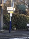
Shows how much notice I've been taking given the number of times I've passed through Richmond Station in the last couple of weeks. Not picked up on any of that!Richmond Station, recently. For an unknown reason they seem to have replaced most of the signage, and the very strange thing is that the new signs, even if still in SWR style, seem to contain much less information than the old. And they even exposed a section of the old "Thank you for travelling with Network SouthEast" sign, hinting it might be a work in progress.
I have a suspect the new signs might be temporary, and below them they could hide the new style.
Neither, I meant Bedminster! Apologies.Bishopton (ScotRail) or Bishopstone (GTR Southern)? Pics always appreciated!
As has Hayle.Truro has also been converted into the new signing (with GWR branding), though strangely the two station name boards on platform 3 nearsest the signal box haven't been updated yet (will upload a picture of both types of station board present when i get the chance to do so).
Is this guy on Twitter?It appears to me that the same guy has done both those (including the "diamond" branding generally) and the LNR part of the franchise which is down to the franchisee. And I wouldn't say I'm a fan of either, really, particularly that hideous orange and purple livery.
He is I believe ex-Virgin Trains East Coast, which also makes him responsible for that hideous livery too, the nastiest thing I've ever seen to disgrace a Mk4 (and LNER's plan to paint over it can't come soon enough). He seems to use some of the design elements that Best Impressions do (indeed I originally thought that was a BI job, albeit not their best) but doesn't seem to use them as well.
The guy seems to quite like vertical elements on train liveries, which (while the doors are required) don't look great when overused - horizontal elements make a train look sleek and fast, which is what you want.
Edit: to give him some credit it seems he's also responsible for ScotRail which is one of the better branding packages, but I suspect was very tightly specified.
Bruton and Frome both have the new branding. I think it looks clean and fresh! They also have the way out signs in yellow font on the black background (not pictured)
Apart from the typeface that isn't GBR (Or even NR as GBR doesn't exist yet) branding ie GWR green stripe and the other logo.Bruton and Frome both have the new branding. I think it looks clean and fresh! They also have the way out signs in yellow font on the black background (not pictured)
None of these stations have received the new signage yet, and neither has Castle Cary.I wonder if Westbury, Trowbridge, Melksham and Chippenham have all been rebranded too? It wasn't that lonmg ago since they were GWR'd.
Is this guy on Twitter?


As far as I can see those photos are the closest to the styleguide I've seen so far. The only inconsistency is that there appears to be a single sign which hasn't been changed at all and is still in broadly traditional BR styleThe attempt at Coventry (uses more than one arrow per direction, inconsistent sizing / arrows / line thickness, wrong order of destinations, some symbols are shown without text)
The first sign on the footbridge doesn’t say where the Lift goes to? You have to guess is it for Platform 1?
I would put the ‘Platform 1’ sign above the Lift sign for that platform as standard, and include after Lift ‘(Platform 1)’. In that way, you are announcing the Platform’s main entrance and underneath it the Platform’s alternative access.
Also, should ‘Lift’ on the first sign be ‘Lifts’ plural if there is more than one to more than one platform.