Firstly I think that RTT has been a great project from the outset and all kudos to Tom for all the work he has and does put into it.
I've been a regular user of the detailed version on my phone for a while now and apart from the odd occasion has always been easy to use and pretty reliable.
I've used it a few times this afternoon/evening and a couple of things have been apparent and I'm afraid they may be seen as criticism...
1) having the stations text that a train was booked to call at in bold blue and everything else in a grey in the old version was a lot easier to contrast and view than the revamped one.
2) in the older version, 'RT' '2E' and 1L for whether the train was running on time etc seem a lot clearer to view at a glance than the new set up not showing rt and using +/- instead.
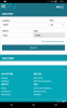
3) in the detailed version, the screen , especially the right hand side , seems really cramped and 'busy' whereas the older version was just easier to view. Maybe on a big screen or desktop it looks ok, but I've been finding it awkward to view today.

4) the extra information section at the top , which used to be hidden could be better at the bottom as most of the stuff in there isn't really relevant to the real time running of the train.
I'm not a techy so don't know about the under the hood stuff that may have changed but , yes it's partly familiarity with the old version but right now I find the old version easier to use.
")