Yes, I'd have noticed - but I'd have thought someone was trying, and failing, to add a 3-dimensional quality to it. It will work badly (i.e. it won't!) for any actual 3-dimensional double arrow sign, and there are lots and lots of them about already.
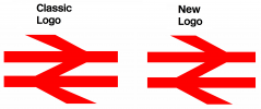
The revised version of the logo has the proportions and some of the angles changed slightly, and there are no longer two different versions depending on whether it's dark on light or vice versa.
I didn't know it had changed until I read about it - I couldn't see the difference.
Are some people misinterpreting the drawings on Twitter in red, black and white showing the new version overlaid on the old one as if that was the new logo itself? (Which would be pretty terrible if it was).
On the double arrow: if you hadn't been told it had been changed, would you have noticed? Apart from the colours, the RDG version already has slightly altered dimensions.
This interview with the designer of the double arrow might be interesting to some: https://www.creativereview.co.uk/british-rail-logo/
The changes to the dimensions in the RDG version are considerably less subtle, and I could see the difference on that one (never mind the colours) without having it pointed out to me.
Yes that interview is very interesting - thanks for the link.
Last edited:

")