221101 Voyager
Established Member
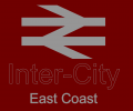
How about this for branding on the InterCity trains?
Based on the 5 regions outlined for GBR


Based on the 5 regions outlined for GBR
In principle they're nice... but the nature of an inter-city service is that it's probably going to pass through multiple of those regions, so I'm not sure branding the trains like that is a good idea!How about this for branding on the InterCity trains?
Based on the 5 regions outlined for GBR
View attachment 96827
I never said it was a *good* idea... It was more a case of if you walk up to the train and can make out the stripe then you know that it will lead to a door if you follow it.I'm afraid I think that's rather missing the point of contrasting doors, which is to indicate the door, not indicate the direction it's in. It was intended to help people with poor longer range detail. It's unfortunate that so many liveries are designed without apparent thought into what they are actually for.
But if those 5 regions are what they want to split them up into, then that's their problem isn't it?In principle they're nice... but the nature of an inter-city service is that it's probably going to pass through multiple of those regions, so I'm not sure branding the trains like that is a good idea!


Hate to be bearer of bad news but apparently they are going tonstick with region specific colours, so no doubt the western will be stuck with dark green on all services for all eternity.Having read about the proposals, I'm excited to see the new identity being gradually rolled out.
It will be nice to have a consistant brand and appearance. Especially seeing the double arrows on trains again!
Hopefully the simplified ticketing will make travel easier. Pity it won't be cheaper though!
I shall make up some more livery proposals and see what you guys think!")
Well, here you go!Hate to be bearer of bad news but apparently they are going to stick with region specific colours, so no doubt the western will be stuck with dark green on all services for all eternity.
A big shame, I personally favour a livery that would be as uniform in Newcastle as it is in Plymouth.
I'm fine with it, something slightly more interesting to look at while waiting for the right train. NSE at Exeter never stopped being amusing though.Hate to be bearer of bad news but apparently they are going tonstick with region specific colours, so no doubt the western will be stuck with dark green on all services for all eternity.
A big shame, I personally favour a livery that would be as uniform in Newcastle as it is in Plymouth.
Hate to be bearer of bad news but apparently they are going tonstick with region specific colours, so no doubt the western will be stuck with dark green on all services for all eternity.
A big shame, I personally favour a livery that would be as uniform in Newcastle as it is in Plymouth.
Southern in GreenHow about this for branding on the InterCity trains?
Based on the 5 regions outlined for GBR
View attachment 96827
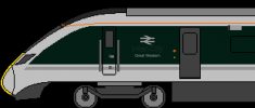
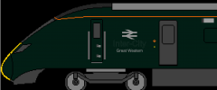
View attachment 96826View attachment 96828
View attachment 96830View attachment 96831View attachment 96832
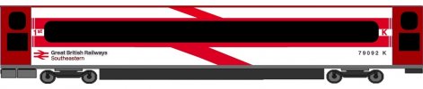
Malachite? Brunswick? Hither Green? Green 354?Southern in Green
Conservative party green?Malachite? Brunswick? Hither Green? Green 354?

Can the doors be different contrasting colours
under accessibility guidelines or do they have to be the same?
I get what you're saying, but as we all know, something that looks trendy now will look dated in a few years, but if you pick something simple, it can age better.I can't help but think all of these designs look a little bit 80s, and not really suitable for modern stock line 390s and 800s. Here's my attempt at a simplistic and modern livery based on the arrow logo. Yes, it's white - but white is smart, and that's the reality of it. It doesn't look like ICE so doesn't look like a knock off. Anyway, I hope you like it.
I don't know why I put Southeastern on a 390, but it's an example of how they could brand the trains. Perhaps pretend it says West Coast.
I don't know why I put Southeastern on a 390, but it's an example of how they could brand the trains. Perhaps pretend it says West Coast.
I don't see what's overdone. He's essentially used a couple of diagonal lines (again, similar to what I did).
Yes probably!I find it amusing that people keep harking back to things like InterCity Swallow or Network SouthEast toothpaste or similar. Don't get me wrong Swallow is an excellent livery (don't think the 225s have ever worn anything better!) and LNER better paint one of the 225s into it before they're finally withdrawn (whenever that is) but it amuses me that people bring up these liveries now (even in slightly re-imagined forms) as if BR wouldn't have moved on from them many years ago itself. Swallow was introduced in what? 1987ish? And Swallow itself of course was basically a slightly revamped version of Executive which dates form the late 70s or early 80s? Does anyone honestly think that in 2021, if BR still existed, it would still be using a livery that is over thirty years old? InterCity itself would probably still be a thing but I'd be stunned if the trains were still in Swallow!
Spot onI find it amusing that people keep harking back to things like InterCity Swallow or Network SouthEast toothpaste or similar. Don't get me wrong Swallow is an excellent livery (don't think the 225s have ever worn anything better!) and LNER better paint one of the 225s into it before they're finally withdrawn (whenever that is) but it amuses me that people bring up these liveries now (even in slightly re-imagined forms) as if BR wouldn't have moved on from them many years ago itself. Swallow was introduced in what? 1987ish? And Swallow itself of course was basically a slightly revamped version of Executive which dates form the late 70s or early 80s? Does anyone honestly think that in 2021, if BR still existed, it would still be using a livery that is over thirty years old? InterCity itself would probably still be a thing but I'd be stunned if the trains were still in Swallow!
Yes probably!
DB have had the same livery on their ICE intercity trains since 1985!
So what's to say we would not have kept the swallow since 1987 too?

Yes probably!
DB have had the same livery on their ICE intercity trains since 1985!
So what's to say we would not have kept the swallow since 1987 too?
It's overbranded, like many FirstGroup brands or LNR. You only want the logo to be on the vehicle once.
Also way too much red and no blue, and I doubt those doors are compliant.
Absolutely. Interestingly, the TOC which came in for probably the most stick for over-branding had possibly the most subtly branded livery of recent times - Virgin's original Pendolino/Voyager livery. Just a Virgin logo on each driving car, and that was it.