-
Our new ticketing site is now live! Using either this or the original site (both powered by TrainSplit) helps support the running of the forum with every ticket purchase! Find out more and ask any questions/give us feedback in this thread!
You are using an out of date browser. It may not display this or other websites correctly.
You should upgrade or use an alternative browser.
You should upgrade or use an alternative browser.
Great British Railways: Livery, branding and appearance?
- Thread starter Bletchleyite
- Start date
- Status
- Not open for further replies.
Sponsor Post - registered members do not see these adverts; click here to register, or click here to log in
R
RailUK Forums
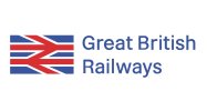
In all truth it's quite a clever bit of design for that very reason - noting as well that the uneven white spacing between the red arms not only emphasises the form of the double arrow but also apes the uneven spacing on the Union flag. I will confess though that I had to check another source to be sure that that was deliberate, rather than an accidental misregistration of the lithograph plates.Edit: thanks @XAM2175 - looks like it was used for BR's international purposes, no doubt with the blue representing the Scottish part of the Union Flag but also the sea.
GBR's modifications however weaken it - by extending the blue patches (presumably to reinforce the flag association) they've ruined the balance, and then further ruined it by making the whole symbol far too large in comparison to the wordmark. BR's Identity Manual specifically forbade such an overpowering combination: http://doublearrow.co.uk/manual/1_15.1968-01.gif
GBR's single-colour variant is also worse - all they've done is convert it to greyscale, which leaves the double arrow washed out by the darker 'blue' field. Here it is extracted from the listing. Compare it with the single-colour variant in the original BR design.
Did you just recently change your picture? It looks really good, and they should have used that design over the other one.I’ll be sending them the bill
Bletchleyite
Veteran Member
Did you just recently change your picture? It looks really good, and they should have used that design over the other one.
It does to me look better done "regular" than the very 1990s (I know it's really 1960s) abstract design.
Bletchleyite
Veteran Member
Should have charged for that! 
Your version with the regular logo and lighter version of the font looks better. Theirs looks straight out of about 1992, though I'm sure a certain top-hatted front-bencher would approve of that.

Your version with the regular logo and lighter version of the font looks better. Theirs looks straight out of about 1992, though I'm sure a certain top-hatted front-bencher would approve of that.
Theirs looks straight out of about 1992, though I'm sure a certain top-hatted front-bencher would approve of that.
Fits in with the as-designed signage though, sadly
Yours is better.... at least the BR logo fits equally within the blue.... looks neater than the 'union' flag versionCame up with it before the name was officially announced and sent it to the ‘Young Rail Professionals’ group at that time
View attachment 109985
Mrwerdna1
Member
As others have pointed out, that looks much nicer! Might be incredibly petty, but any chance of perhaps contacting Network Rail regarding this? Maybe they could consider using your version instead of theirs! Subtle alterations perhaps, but they make all the difference. Honestly, if they're going to plaster that logo everywhere, it might as well be your version, since I greatly prefer it to the ones that were trademarked (and I don't seem to be the only one)...Came up with it before the name was officially announced and sent it to the ‘Young Rail Professionals’ group at that time
Last edited:
Do I detect skewed arms on the arrows, though?Came up with it before the name was officially announced and sent it to the ‘Young Rail Professionals’ group at that time
Mrwerdna1
Member
Quick question. What will this logo exactly be used for? Many stations are currently already being rebranded using the traditional double arrow, both on smaller signes (to the platforms for instance) and the larger pole-signs outside. Not to mention that it's already present at many stations, on road signs etc. Are those all going to be replaced again, once the GBR design is finalised? If not, will the "new" logo simply be used for the website (tickets/timetables), on tickets and perhaps on train liveries in England? I have to say, it would be sad to see the old double arrow go, since it (unlike its alterations) is a true design classic!
Last edited:
I would guess they had seen mine before they created their’s – the time I created a fictional “LSWR” logo when SWT were losing the franchise, it was revealed in internal presentations as the new brandAs others have pointed out, that looks much nicer! Might be incredibly petty, but any chance of perhaps contacting Network Rail regarding this? Maybe they could consider using your version instead of theirs! Subtle alterations perhaps, but they make all the difference. Honestly, if they're going to plaster that logo everywhere, it might as well be your version, since I greatly prefer it to the ones that were trademarked (and I don't seem to be the only one)...
Gareth
Established Member
- Joined
- 10 Mar 2011
- Messages
- 1,505
I'm not. The concept just doesn't work for me. If they must reference the Union Jack in the corporate branding, there are other ways of doing it. Leave the symbol alone.
birchesgreen
Established Member
Oh did you do that? Loved that! Great workI would guess they had seen mine before they created their’s – the time I created a fictional “LSWR” logo when SWT were losing the franchise, it was revealed in internal presentations as the new brand
Mrwerdna1
Member
Agreed, but again, what exactly is the plan? Do they intend to replace all the existing double arrow symbols with the new design (seems pretty counterproductive seeing that they're already in the process of replacing signage with designs that include the old symbol) or will it co-exist with the traditional BR one?But the thing that's kept it going beyond privatisation is its simplicity and recognisability. This is too much of a change beyond the original to be of use.
Last edited:
Agreed, but again, what exactly is the plan? Do they intend to replace all the existing double arrow symbols with the new design (seems pretty counterproductive seeing that they're already in the process of replacing signage with designs that include the old symbol) or will it co-exist with the traditional BR one?
Just my thinking but I can see GBR being the ‘operator’ so will be used on trains, in marketing and the booking website/app but stations will stick with the classic double arrow.
Mrwerdna1
Member
I hope you're right. The thinking would be (quite rightly so, I suppose) that despite several attempts to make the public aware of the existence of Network Rail and the TOC / Network Rail split in terms of responsibilities, many commuters still don't have a clue as to who does what and whenever they do blame someone for coming late or a train being cancelled, it is (or was) always directed at the most visible brand, i.e. the operator.
As such, considering the GBR symbol is simply an alteration of the double arrow, it should not be too hard for customers to make the mental link between the two and understand that (as indeed will be the case) everything as far as the customer is concerned will fall under the responsiblity of a single overarching entity: GBR.
Therefore, NR/GBR don't need to replace the double arrow symbol on stations with the new logo, nor indeed should they.
Last edited:
Chiltern006
Member
- Joined
- 3 Oct 2018
- Messages
- 735
Bletchleyite
Veteran Member
Looks good with a colour stripe.
Love these!had a quick dabble of the signs, opinions?
felt some colour was needed
Chiltern006
Member
- Joined
- 3 Oct 2018
- Messages
- 735
thanks peeps. just shows what a bit of colour can do
Mrwerdna1
Member
Very nice indeed! To keep things simple and consistent (the original aim, after all) the colour stripe could perhaps be GBR region specific and consistent within a single region. For example, green could be used for Southern, red for Eastern etc.had a quick dabble of the signs, opinions?
felt some colour was needed
Chiltern006
Member
- Joined
- 3 Oct 2018
- Messages
- 735
yeah, i just did certain individual toc colours for simplicity but i’ll try that at some point
Steddenm
Member
It kind of makes sense that each region should have its own identity.
West & South West - Dark Green (GWR style)
Wales - Red (TfW style)
South & South East - Light Green (SR style)
East & Anglia - Light Blue ("One" style)
Midlands - Cyan (TfWM style)
North West - Yellow (Metrolink style)
North East - Purple (EMR style)
Scotland - Saltire Blue (flag)
West & South West - Dark Green (GWR style)
Wales - Red (TfW style)
South & South East - Light Green (SR style)
East & Anglia - Light Blue ("One" style)
Midlands - Cyan (TfWM style)
North West - Yellow (Metrolink style)
North East - Purple (EMR style)
Scotland - Saltire Blue (flag)
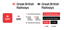
I said this on another thread, but this is definitely a more appropriate one. I'm working on building a GBR brand from the ground up for the next few days (my calendar is completely empty), starting with a logo.
Here's what I came up with. As you can see - many different variations, that would eventually be used for different scenarios (e.g. the sides of vehicles, posters, websites, app icons etc.) - but the two at the top are the primary ones. Thoughts?

Here's what I came up with. As you can see - many different variations, that would eventually be used for different scenarios (e.g. the sides of vehicles, posters, websites, app icons etc.) - but the two at the top are the primary ones. Thoughts?

Gareth
Established Member
- Joined
- 10 Mar 2011
- Messages
- 1,505
That's quite neat.
That's quite neat.
I wanted to go for something modern yet flexible. I could see those different types of logos being used across scenarios. I might take an example railway station (I'm thinking Rugby) and design signage made for that specific station, to see how things could look practically...
Grumpy Git
On Moderation
I said this on another thread, but this is definitely a more appropriate one. I'm working on building a GBR brand from the ground up for the next few days (my calendar is completely empty), starting with a logo.
Here's what I came up with. As you can see - many different variations, that would eventually be used for different scenarios (e.g. the sides of vehicles, posters, websites, app icons etc.) - but the two at the top are the primary ones. Thoughts?
View attachment 112438
As above, it looks good (I detest the name), therefore has no chance of being used.
- Status
- Not open for further replies.


