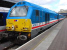
221101 Voyager
Established Member
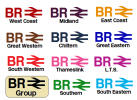
Here is some cheaper and quicker to apply forms of branding
Where GWR, LNER, EMR, Greater Anglia, Avanti logos etc are.
Replace them with something like this, but with the appropriate regional name underneath
The beauty of this is that train liveries need no altering, therefore introducing a recognisable standardised, yet classy brand across the board, with minimal cost.


For services in the south east...

Just pop this logo on and job done!
of course!")
Regional and non-south east, non-intercity services in the rest of England.

Just pop this logo on and job done!
of course!
There you go, here is a cheap and easy way to have standard brands across England!
Where GWR, LNER, EMR, Greater Anglia, Avanti logos etc are.
Replace them with something like this, but with the appropriate regional name underneath
The beauty of this is that train liveries need no altering, therefore introducing a recognisable standardised, yet classy brand across the board, with minimal cost.
For services in the south east...
Just pop this logo on and job done!
of course!
Regional and non-south east, non-intercity services in the rest of England.
Just pop this logo on and job done!
of course!
There you go, here is a cheap and easy way to have standard brands across England!