With the exception of Manchester's horrible custard-and-grey trams!
I get the "bee" thing but the use of yellow always feels like Merseyrail envy to me. I liked the old turquoise, black and white, and of course there's the traditional orange too.
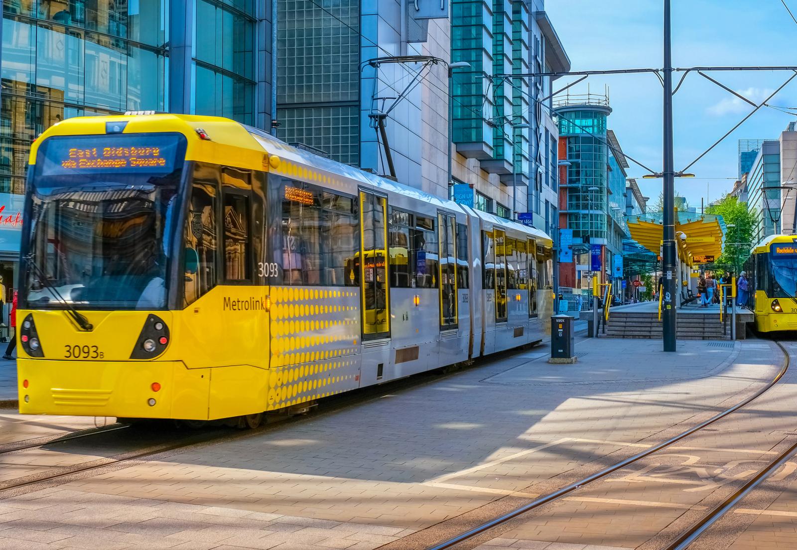
I really like the yellow trams! To my eyes, the current livery looks bright, upbeat, and modern. I vaguely recall reading that the designers chose yellow because they believed it would add a splash of colour that would bright up a city stereotypically associated with gloomy clouds and red bricks; and
I think it works perfectly. My perception is liable to be skewed because I have spent more time in Manchester than other regional cities, but I think the yellow/silver livery looks significantly more appealing and memorable (ie something which I feel is iconic of that city and likely to be remembered/associated with it) than the various bus liveries that have been seen on Sheffield Supertrams (eurgh) or the dark-blue/dark-red combo that previously featured on WM Metro trams (bland). The yellow station signage also pops against busy backgrounds, and looks bright and welcoming. For a street running system, yellow also has the important advantage of being highly visible for people with restricted visual acuity.
Whereas to my eyes the 1992-era white, black and turquoise livery looks very dated and gave off
a grey vibe on a rainy day! To me it evokes the most damaging connotations of public transport - a dull, sterile, undesirable, unattractive public service. Public transport can and should look and feel like a cool, modern, attractive product.