Just not sure whether it's a hint at a long overdue refurbishment, or just some random seats they found cheap for filming this ad.
Aren’t the LNER 80Xs less than five years old?
Just not sure whether it's a hint at a long overdue refurbishment, or just some random seats they found cheap for filming this ad.
Yes, but they're awful.Aren’t the LNER 80Xs less than five years old?
Matches another LNER press pic from 2019...It's definitely not the same. The armrest is differently shaped, the cushion is more rounded, and the seatback has a groove.


I’m glad you appreciated itJust spotted this. As one liners go, it’s a good one! And uncannily accurate.
That's not what the ones in the ads look like.Matches another LNER press pic from 2019...
View attachment 149911
Seems to match this pic on RailSmartr too
View attachment 149913
Genuinely look the same as the seats on the Azumas to me.
Yes, but they're awful.
At what point will they have gotten it right so should be allowed to advertise it? They must be one of the best thought of train operators in the UK. OK, there's issues, things like the seating are subjective, but generally speaking they are what other operators aim for.
Was it once loved? None of us were around when the original LNER was. I think a lot of people just love to romanticise the past, and there’s nothing wrong with that, but it’s often not based on own experience.LNER reminds me of British Airways, A once-loved British brand that still trades on its name and past reputation....
Thanks to him, I can never look at a window again without hearing “Don’t strike it in the middle, as the glass will just flex.”Let's just say we are not the target market; if we were they'd make something like a Class 800 Azuma faults and failures video with Paul Tyreman (which I would welcome).
British Airways was a very well liked company before your time, but then again most airlines were. It was quite a bit more glamorous in the 80s and 90s! This is a company which flew Concorde.Was it once loved? None of us were around when the original LNER was. I think a lot of people just love to romanticise the past, and there’s nothing wrong with that, but it’s often not based on own experience.
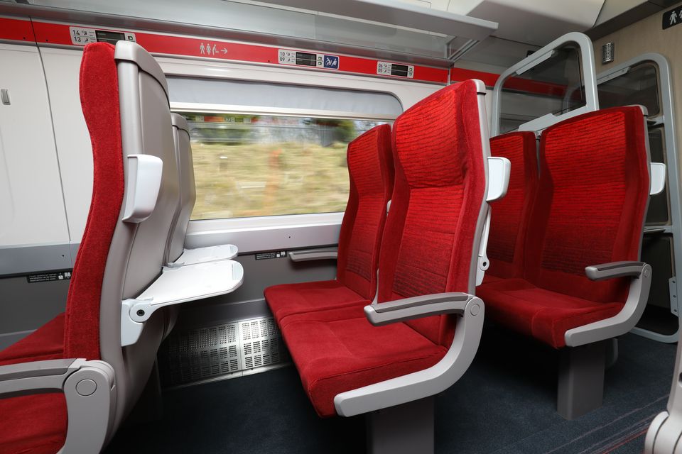
Looks the same, definitely an 800/801 with the heater location. The seats look about right though there is an odd grey lump on the back.
The CAF order wouldn't be progressed enough to have a interior mockup yet.


In reality do you really think Joe Public who the advert is aimed at are going to notice the slight offence in the seat in the advert to what’s actually on the Azuma? I reckon not.View attachment 149932View attachment 149933
Just looking closer at these the seats are certainly different. Just some differences:
- The backs of the seats seem a darker grey
- The top part of the seat back is more pronounced and squarer in shape with a notable join just above the seat tray. It's almost as they part has been added to the existing seat.
- Borth the arm rest and tray have a different hinge design
In reality do you really think Joe Public who the advert is aimed at are going to notice the slight offence in the seat in the advert to what’s actually on the Azuma? I reckon not.
No. It's more curiosity as to why the seat's are different. Is there a train somewhere with updated versions being tested for example?
I mean LNER, not BA.British Airways was a very well liked company before your time, but then again most airlines were. It was quite a bit more glamorous in the 80s and 90s! This is a company which flew Concorde.
I mean LNER, not BA.
I noticed this too. I think it's probably designed because they know the more upright, cheaper seat with thinner cushions which is actually on their trains is much less appealing for those features. These look like they'll be more comfortable - and after all the central claim here is that train travel is better because it's convenient and pleasant. This marketing campaign is primarily about quality, not low prices, so they need to embellish a bit. It's not new for LNER to do this either - in the past the marketing team have used the IC225 seats inside a digital clone of an Azuma to focus on quality.Noticed this advert features different seats to what we normally see on LNER trains. Sign of things to come, or editorial decision?
I've attached a few pics showing what I mean, which clearly depict a different model of seat.


There's nothing wrong with cost-effective, honest marketing.LNER had been running the ‘I am…doing it all on an LNER train’ ad campaign with the lady in a seat transitioning through different scenarios for most of the previous year or two. This didn’t seem to attract half as much criticism as demonstrated in this thread. Is this just because this campaign attempts at a bit of fun?
The senior management at LNER are still firmly in Virgin mode. I'd hoped that the company would have been run more like East Coast, but only two years of Virgin brainwashing was all it took.
The mascot is pretty inoffensive, but if they were serious about getting their brand out there, then they could make a start by applying the LNER logo to each and every one of their anonymous white carriages.
Disappointed with @LNER's new mascot, Eleanor. Portraying a white girl with an afro & culturally significant black jewelry is insensitive and a clear case of cultural appropriation.
Some people have managed to get offended by it, as this tweet shows.
They do look poor in reality, and that's partly because they are. If they had the same cushions on them that Transport for Wales bought they'd have fewer "hard" areas and more rounded lines, just like the ones in the set for the ad do, although those frames are clearly differently-shaped.Perhaps they thought the actual seats looked as uncomfortable as they are.....
Some people have managed to get offended by it, as this tweet shows.
")