Andy Pacer
Established Member
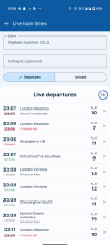
I do like the ability to see the number of carriages on some services, particularly those operators not on Know Your Train (e.g. Southeastern).
10.3.1
If there's one thing I've found with these glorified web-apps, they'll find a way to make it require updates to both somehowIf the app is now more or less just a web container, surely any UI bugs fixes and UX changes will be done remotely and you will just see the changes without the need for further updates?
Given the complaints about the website for so long, strong questions should be asked about how they decided to roll it out to app users before fixing the issues.
But they tested the app and people liked it. They said so.If the app is now more or less just a web container, surely any UI bugs fixes and UX changes will be done remotely and you will just see the changes without the need for further updates?
Given the complaints about the website for so long, strong questions should be asked about how they decided to roll it out to app users before fixing the issues.
But they tested the app and people liked it. They said so.
Turning my phone off and on cured the problem. Cheers.If the app is now more or less just a web container, surely any UI bugs fixes and UX changes will be done remotely and you will just see the changes without the need for further updates?
I completed the survey that often appears on the app. I thought I’d have my say and point out its failures but upon completion the app froze. Says it all really.

Does anyone know of other apps where user testing was done but the app was still rubbish?
This new version is absolutely appalling - and I write as an experienced software developer.The latest version of the National Rail App is infuriating. There are loads of circumstances where you are now locked out from looking at journey details. It is any situation where the app decides it can’t offer you a ticket for that service.
What on earth is going on. This is primarily an information app not a ticket portal. How am I meant to check where I am meant to change, the timings of change etc if I happen to be on a service that has fake ‘sold out’. Are you not entitled to that information any more. Are you just meant to miss your change and end up somewhere else?
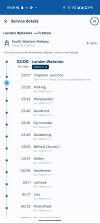
Now I have found another version of the problem. Where no through ticket is available. The attached is the journey from Sheffield to East Midlands Airport. I can’t click in to the journey to check the nature, location and timing of the change.
Who on earth signed off on this design. It simply does not work. It is absolutely ridiculous for a supposedly serious organisation whose whole purpose is to provide information about National rail journeys.
It appears they don't or someone with power higher up doesn't and they have no choice.This new version is absolutely appalling - and I write as an experienced software developer.
The old App was excellent - it did everything that was needed: it worked fast, was intuitive and user friendly and worked well on a mobile phone screen. The new app does none of the above - it is an attempt to make it look fancy with lots of confusing colours, boxes and backgrounds - it takes several taps (executed with some difficulty as the on-screen keyboard interferes with the drop list) to see the departures at my local station which are visible one train at a time and only after I scroll down.
Do the developers not understand that what is needed is something that resembles the departure boards at stations, not the BBC News Site?
Something like the excellent FlightBoard iPhone app or...the old National Rail app!!!
From the vibes I get on here, a cheaper and better option would have been to do nothing to the app at all!My guess (past nightmare project) is:
1) A 'user experience' type got involved with the web site.
2) Marketing were so impressed that his/her ideas overruled what actual users needed.
3) 'Responsive design solves everything' but without real use cases to decide what goes at each size.
4) It's so fantastic that the app must be identical to the web site (actually, the cheapest solution won).
Anyone on the inside?
Not on the inside, but 3 & 4 make sense given a project I am involved with. The theory is that by having responsive design and the right technology mix, you can develop an “omnichannel” experience that means the company can develop online functionality once m without needing to do things separately for different devices.My guess (past nightmare project) is:
1) A 'user experience' type got involved with the web site.
2) Marketing were so impressed that his/her ideas overruled what actual users needed.
3) 'Responsive design solves everything' but without real use cases to decide what goes at each size.
4) It's so fantastic that the app must be identical to the web site (actually, the cheapest solution won).
Anyone on the inside?
100% correct if you design it right and make sure the design is followed in future ...... you can develop an “omnichannel” experience that means the company can develop online functionality once m without needing to do things separately for different devices.
Very few private sector organisations will offer a white labelled version with indefinite protections against cost escalation. Transferring between white labelled products can be difficult and the risk of vendor lock in to an organisation who can name their price will make anyone in control of public money nervous. Trainline may be happy to provide portals for TOCs, National Rail itself seems more likely to cannibalise their own revenue and have a much bigger price tag as a result.A core part of the problem is one seen in other parts of the public sector (recognising rail's more complex status in this regard) of, no matter if there apps and platforms in the private sector which deliver all of the functionality and security required, not even developing a white label relationship with them, but instead developing a separate product that isn't as good.