starrymarkb
Established Member
Two rather controversial liveries have recently debuted...
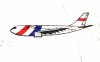
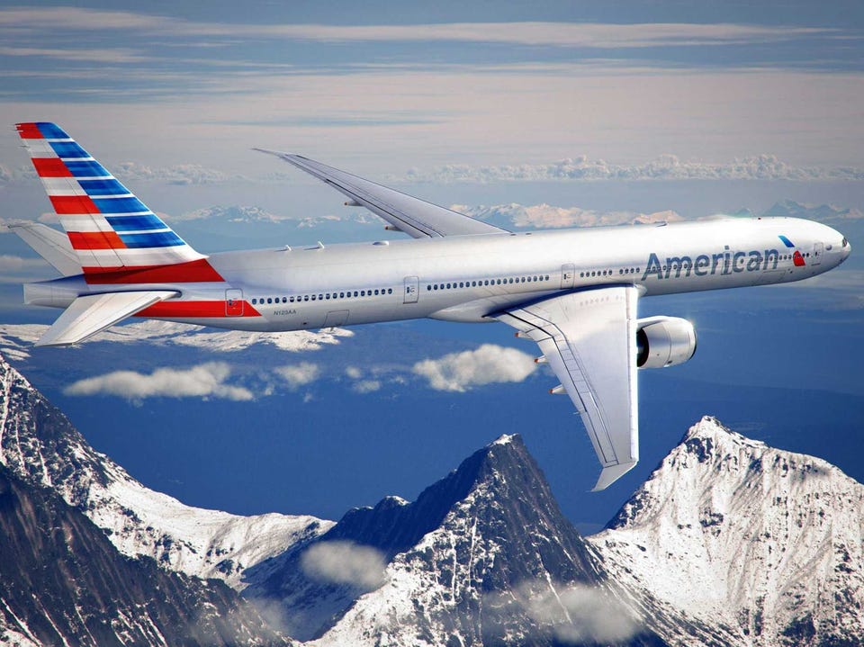
Firstly American Airlines have launched their first re-branding in almost 40 years with them swapping unpainted metal for grey with a stylised US flag on the tail.
Old

New
Real 737 -http://www.airlinereporter.com/wp-content/uploads/2013/01/DSC_0112.jpg
CGI 773
Secondly Air France are bringing all their regional operations under the name HOP!
Impression of the Livery- http://corporate.airfrance.com/uploads/tx_templavoila/Embraer170-Hop_01.jpg
From the Press Release (Bovid Manure)
Firstly American Airlines have launched their first re-branding in almost 40 years with them swapping unpainted metal for grey with a stylised US flag on the tail.
Old
New
Real 737 -http://www.airlinereporter.com/wp-content/uploads/2013/01/DSC_0112.jpg
CGI 773
Secondly Air France are bringing all their regional operations under the name HOP!
Impression of the Livery- http://corporate.airfrance.com/uploads/tx_templavoila/Embraer170-Hop_01.jpg
From the Press Release (Bovid Manure)
A SIMPLE AND EFFICIENT NAME, SYNONYMOUS WITH MOBILITY AND ACTION
The name “HOP!“ evokes rapidity and the ease with which travelers can get from point A to B. Synonymous with agility, HOP! illustrates its capacity to bounce back and adapt to customers’ needs. The simple typography and red colouring featured in the HOP! logo illustrates the Company’s flexibility in a creative and playful manner. Positioned alongside a slanted exclamation mark, symbolizing an aircraft’s take-off, HOP! illustrates an ambition for reactivity and mobility.