-
Our new ticketing site is now live! Using either this or the original site (both powered by TrainSplit) helps support the running of the forum with every ticket purchase! Find out more and ask any questions/give us feedback in this thread!
You are using an out of date browser. It may not display this or other websites correctly.
You should upgrade or use an alternative browser.
You should upgrade or use an alternative browser.
New Overground line names progress?
- Thread starter renegademaster
- Start date

Sponsor Post - registered members do not see these adverts; click here to register, or click here to log in
R
RailUK Forums
Blackpool boy
On Moderation
I would bet good money on londoners and people from the counties that surround it use the infrastructure way more than any tourists will. If they dont like the lines having names then tough tittyNames may be easier to remember for native speakers, but they aren't for tourists and London is a tourist city.
Lewisham2221
Established Member
What isn't?
birchesgreen
Established Member
Most services are good, whats wrong with that?This isn’t great is it
Blackpool boy
On Moderation
I would reckon that the vast majority of tourists to london are there for the oxford street/Buck Palace/Camden Market/West end shows. They probably dont care as long as they can get to those placesJust had this information from TfL
I understand the names have already been revealed, and in some cases seen on signage.
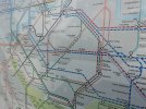
Having just looked at the maps, then the standalone Overground map is OK. However, once combined with the Tube map, does it seem confusing for visitors to London trying to navigate their way by public transport?
wanderingriver
Member
Getting an end of year update. As far as I’m aware they are also adding more to TfL Go apart from just the new lines so I’m guessing for they are waiting for that update to be done sillily enough.Im surprised TFL Go app hasnt been updated yet.
Edit: After some digging on the TfL website, here is the update I’m on about: https://board.tfl.gov.uk/documents/s20331/csopp-20230712-item07-TfL-Go-Update.pdf
Last edited:
boiledbeans2
Member
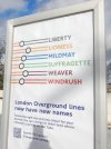
Elizabeth, Lioness, Weaver, etc. are all missing "line" at the end!
What isn't?
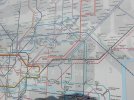
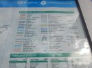
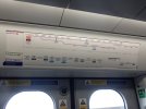
I thought that would be obvious. It's a riot of almost similar colours. Or in the case of Mildmay and Central the same colours, at least they look that way to me. Just glance at the above at it looks like there's issues on the Central line for example. To say one of the main reasons for was to give better status updates for Overground lines you've now lost what was previously a clear, colour coded system.
The Overground lines need separating or some kind of visual key added to easily differentiate them.
Lewisham2221
Established Member
What's obvious is that there is disruption on the Elizabeth, Windrush and Metropolitan lines and everything else - including all the other bits of the Overground - is operating a good service. Previously it would've shown "Severe delays" for the Overground, when in actual fact, much of the system was operating normally.I thought that would be obvious. It's a riot of almost similar colours. Or in the case of Mildmay and Central the same colours, at least they look that way to me. Just glance at the above at it looks like there's issues on the Central line. To say one of the main reasons for was to give better status updates for Overground lines you've now lost what was previously a clear, colour coded system.
The Overground lines need separating or some kind of visual key added to easily differentiate them.
What's obvious is that there is disruption on the Elizabeth, Windrush and Metropolitan lines and everything else - including all the other bits of the Overground - is operating a good service. Previously it would've shown "Severe delays" for the Overground, when in actual fact, much of the system was operating normally.
I don't think it is at all, as I said in the previous message from a quick glance which is the purpose of using a colour coded system this looks like there are issues on the Central line.
I'l point you in the direction of this thread on Reddit where they are discussing the same thing and the consensus seems to be it's a mess
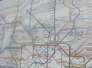
Edit: I couldn't help but have a quick play around and try tidy it up. To me at least this is much clearer.

Last edited:
Mikey C
Established Member
- Joined
- 11 Feb 2013
- Messages
- 7,639
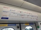
Weird how all the lines and categories are just jumbled up like that, rather than separating out Underground, Overground, Elizabeth Line, DLR and Tramlink. Especially when it will take time for people to learn the names, which aren't geographical.
There are pairs of colours used that might be confused if the viewer isn't too careful, i.e.: Central/Windrush, Metropolitain/Weaver, Circle/Lioness, DLR/Suffragette, Jubilee/Liberty, Mildmay/Victoria, - the majority of those reading it will either be regulars just checking for disruption, or tourists/leisure travellers who generally take a bit more care when checking status.I don't think it is at all, as I said in the previous message from a quick glance which is the purpose of using a colour coded system this looks like there are issues on the Central line.
I'l point you in the direction of this thread on Reddit where they are discussing the same thing and the consensus seems to be it's a mess
Except it's not *just* the colour that's giving the information in these cases, is it? The line name is also present in all settings. Otherwise people would be constantly confusing the DLR and W&C, or the Piccadilly and Victoria lines, or the Metropolitan line and Elizabeth line line.
I'm not saying that they shouldn't be displaying them (e.g.) with a white background and a double stripe as they do on the signage. Clearly they should. But even someone without knowledge of English, or even the Latin alphabet, is probably going to notice the shape of the word "Windrush" is different to "Central."
I'm not saying that they shouldn't be displaying them (e.g.) with a white background and a double stripe as they do on the signage. Clearly they should. But even someone without knowledge of English, or even the Latin alphabet, is probably going to notice the shape of the word "Windrush" is different to "Central."
The map has the overground lines with white sandwiched between the colour. That service chart has room to do the same. Bit amateurish.I thought that would be obvious. It's a riot of almost similar colours. Or in the case of Mildmay and Central the same colours, at least they look that way to me. Just glance at the above at it looks like there's issues on the Central line for example. To say one of the main reasons for was to give better status updates for Overground lines you've now lost what was previously a clear, colour coded system.
The Overground lines need separating or some kind of visual key added to easily differentiate them.
I’m very supportive of TfL giving the Overground lines their own identity, but it is frustrating to see what often seem to be obvious mistakes crop up here and there. I happened to be looking at the timetables page on the TfL website earlier and spotted at least three errors in the published PDFs:
I know it’s a lot of things to get changed all at once and there’s always the chance of human error, but it feels like these sorts of errors crop up a lot more than they used to.
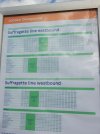
- The Mildmay line timetable states in the footnotes that ‘frequent Bakerloo line services run’ between stations marked with the TfL roundel on the timetable. The three stations with such a marking on this particular line are Richmond, Kew Gardens and Gunnersbury, none of which the Bakerloo goes anywhere near! The text has clearly been copy/pasted from the Lioness line timetable, and the internal proofreading process has failed to pick up that it should refer to the District line instead.
- The line diagram on the Suffragette line timetable lists different walking distances for the same station. For example, the distance from Walthamstow Queen’s Road to Walthamstow Central is said to be 320m for the Victoria line, but 350m to the Weaver line. You have to pass along the Weaver line platforms to get to the Victoria line, so it’s not possible for them to be further away! The interchange distances between South Tottenham and Seven Sisters are similarly inconsistent - it’s apparently only 350m to the Victoria line but 560m to the Weaver line/National Rail.
- On the Mildmay line timetable line diagram, the text in the interchange box for West Hampstead is left-aligned, but on every other interchange box the text is centred.
Errors appear everywhere these days as proofreading seems to be considered some ancient, obsolete, skill thanks to the ability to edit your mistakes with such ease.
I often post on here and notice errors after (usually autocorrect going rogue) and it's a nice simple edit to fix. You see errors on websites, including big news sites, all the time because it's easy to fix.
It's just as easy to fix a PDF and replace it when you notice an error, or let someone else notice it and tell you.
It's also pretty obvious these days where a news story has been edited by a sub-editor, or just self-published by the writer directly. Look at any article from a Reach site and you'll see glaring errors that usually don't even get fixed because these days nobody even seems to care.
Sadly, I can't imagine any scenario where this is going to change. Just hope that if you got a printed pocket map with an error, you might be able to get a few quid for it in future years!
Some pictures from yesterday (a trip from Leytonstone HR to Wanstead Park and back):
== Doublepost prevention - post automatically merged: ==
== Doublepost prevention - post automatically merged: ==
Attachments
-
 DSCN0939.JPG418.3 KB · Views: 100
 -
 DSCN0935.JPG415.9 KB · Views: 79
 -
 DSCN0936.JPG406.6 KB · Views: 72
 -
 DSCN0937.JPG377.4 KB · Views: 74
 -
 DSCN0942.JPG297.7 KB · Views: 79
 -
 DSCN0934.JPG250.8 KB · Views: 80
 -
 DSCN0932.JPG308.2 KB · Views: 81
 -
 DSCN0944.JPG268.8 KB · Views: 78
 -
 DSCN0950.JPG225.5 KB · Views: 91
 -
 DSCN0979.JPG316.1 KB · Views: 100
Last edited:
No inconsistency there (though I haven't checked the distances) given there's direct access to the Victoria Line from the High Road but direct access to the NR station is from Seven Sisters Road.
- The interchange distances between South Tottenham and Seven Sisters are similarly inconsistent - it’s apparently only 350m to the Victoria line but 560m to the Weaver line/National Rail.
Warrior2852
Member
- Joined
- 27 Oct 2018
- Messages
- 179
They absolutely need some way of differentiating between Tube and Overground, this is an ease-of-use nightmare, particularly for the ones with identical colours (looking at you Windrush and Metropolitan/Weaver). Either create separate sections for the different modes, or use something that isn't a block colour for non-tube lines.
This looks so much better than what TfL have done!Edit: I couldn't help but have a quick play around and try tidy it up. To me at least this is much clearer.
View attachment 170017


Although it looks like they’ve missed ‘line’ for Mildmay as well as the correct iconCityMapper has been updated today. I quite like what they've done.
View attachment 170057
View attachment 170056
Attachments

Although it looks like they’ve missed ‘line’ for Mildmay as well as the correct icon
Same for Windrush in your screenshot.
They seem to have followed TfL in not putting 'line' after the Overground names, only 'Elizabeth line' gets 'line'.
TfL really need to sort that out, it seems weird and I know the whole thing with modes vs lines but perhaps a little more pragmatism in the name of consistency is in order.
Looks like they've borrowed the alphabetical sorting algorithm from the TfL Single Fare Finder pageWeird how all the lines and categories are just jumbled up like that, rather than separating out Underground, Overground, Elizabeth Line, DLR and Tramlink. Especially when it will take time for people to learn the names, which aren't geographical.
The list isn't jumbled up; it's the case that the line(s)/mode(s) with the most severe disruption will appear at the top.Weird how all the lines and categories are just jumbled up like that, rather than separating out Underground, Overground, Elizabeth Line, DLR and Tramlink. Especially when it will take time for people to learn the names, which aren't geographical.
That is much better. Although having them in mode order as well would be even betterI don't think it is at all, as I said in the previous message from a quick glance which is the purpose of using a colour coded system this looks like there are issues on the Central line.
I'l point you in the direction of this thread on Reddit where they are discussing the same thing and the consensus seems to be it's a mess
Edit: I couldn't help but have a quick play around and try tidy it up. To me at least this is much clearer.
View attachment 170017
Meanwhile, over on the NRE service disruption page , we still have:
Disruption to London Overground services through Norwood Junction expected until the end of the day
Meanwhile, over on the NRE service disruption page , we still have:
I doubt that will change, since that page always just lists disruption under each operator.
Unless GBR decide to start giving the national lines names as well...