-
Our booking engine at tickets.railforums.co.uk (powered by TrainSplit) helps support the running of the forum with every ticket purchase! Find out more and ask any questions/give us feedback in this thread!
You are using an out of date browser. It may not display this or other websites correctly.
You should upgrade or use an alternative browser.
You should upgrade or use an alternative browser.
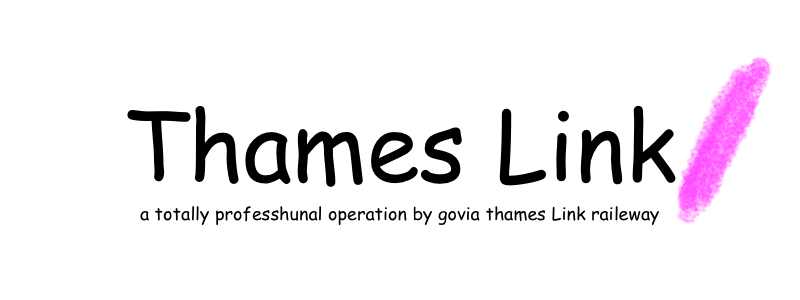
New Thameslink logo
- Thread starter Dann
- Start date
- Status
- Not open for further replies.
Sponsor Post - registered members do not see these adverts; click here to register, or click here to log in
R
RailUK Forums
Bletchleyite
Veteran Member
I agree with others who have said this is a missed opportunity to create unified branding showing each separate route all as part of the same train company.
Also agreed. I liked the family of brands, and hoped they'd do a red version for GatEx and a green version for Southern. But I do quite like "families of brands" of that kind generally.
That said, I spotted a GatEx unit on test at Crewe today, and the livery really does look smart - mind you I've always liked DB Regio Verkehrsrot (always had a bit of a secret hope they'd rebrand Arriva to those colours, looking unlikely now though), and it's near enough that!
Amusingly the PIS was set up as a service to Wembley Central calling at Dover Priory, Ramsgate, Bletchley, Leighton Buzzard and then all stations to Wembley Central. A few very confused looking onlookers
")
--- old post above --- --- new post below ---
Plus the new logo is terrible and is basically a forward slash at the end of a word.
With apologies to MJ Hibbett singing about Midland Mainline: "Gents will be forward-slash with backslash the new name for the ladies'..."
I was hoping Southern might adopt a GTR logo with a green bit underneath, but they've instead gone in completely the opposite direction.
Yes, me too. The Southern livery is looking a little dated to me, but I think would be improved with the quite friendly "riband" logo even if the actual livery was left as it is.
Last edited:
Plus the new logo is terrible and is basically a forward slash at the end of a word.
with a horrible capitalized L in the middle for some terrible reason.
That said, I spotted a GatEx unit on test at Crewe today, and the livery really does look smart - mind you I've always liked DB Regio Verkehrsrot (always had a bit of a secret hope they'd rebrand Arriva to those colours, looking unlikely now though), and it's near enough that!
.
I saw the new GatEx livery and branding on a service at Vic the other day and the white lettering is bloody awful. I couldve done better with someone elses crayons.
I can't see any reason why they've rebranded so soon...
It was probably a franchise commitment.
DelayRepay
Established Member
- Joined
- 21 May 2011
- Messages
- 2,929
It was probably a franchise commitment.
...like employing enough staff to operate the train service and maintaining the trains so they don't break down? (having suffered breakdowns in the core during the morning peak on Tuesday and yesterday, and a breakdown at Radlett yesterday evening)...?
As ever. When are they going to be required to put a manned standby locomotive on a siding at Farringdon in the peaks to cover such issues.having suffered breakdowns in the core during the morning peak on Tuesday and yesterday
swt_passenger
Veteran Member
- Joined
- 7 Apr 2010
- Messages
- 31,496
It was probably a franchise commitment.
It wasn't in the public version of the ITT. The only specific thing was that Gatwick Express had to have its own branding. Any decision about the other 3 sub-brands appears to have been GTR's own.
Deepgreen
Established Member
I'm not a big fan of the Gatwick Express logo. The Southern one looks dated, but isn't as annoying as the GatEx one.
The Southern one was designed to look dated as it was supposed to be reminiscent of the heyday of the Southern Railway - oh, how Herbert Walker must be spinning in his grave!
I saw the new GatEx livery and branding on a service at Vic the other day and the white lettering is bloody awful. I couldve done better with someone elses crayons.
anyone couldve cooked that up in 10 mins. A shambles. Everything is so half hearted now. Would like an "aeroplane" symbol as part of the livery in some way.
Mutant Lemming
Established Member
it sums them up well though - cheap and ineffective
AlexNL
Established Member
- Joined
- 19 Dec 2014
- Messages
- 1,684
with a horrible capitalized L in the middle for some terrible reason.
The only thing I can think of is so they can work the National Rail abbreviations into their logo and livery. 3 out of 4 TSGN companies now have it: there's the huge GX on GatEx, GN is in the Great Northern logo and on TL they simply abbreviated the L.
The only thing left is to tweak the Southern logo a bit, by shrinking the 'outher' part of it. Or, I dunno... making the S and the N italic.
Bletchleyite
Veteran Member
anyone couldve cooked that up in 10 mins. A shambles. Everything is so half hearted now. Would like an "aeroplane" symbol as part of the livery in some way.
I dunno, I like it. It's classy, modern and bold, all at the same time.
But as I said I'm a fan of DB Verkehrsrot, which is a very similar scheme.
anyone couldve cooked that up in 10 mins. A shambles. Everything is so half hearted now. Would like an "aeroplane" symbol as part of the livery in some way.
When they paid for the Thameslink/ logo, I think they got the GX one for free.
Steveman
Member
- Joined
- 24 Feb 2016
- Messages
- 405
Don't like it.
43096
On Moderation
- Joined
- 23 Nov 2015
- Messages
- 15,364
The only thing left is to tweak the Southern logo a bit, by shrinking the 'outher' part of it. Or, I dunno... making the S and the N italic.
Or change it to SoutherN?
gtitr
~ɹʇƃ~

phoenixcronin
Member

SprinterMan
Established Member
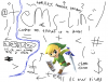
If we're playing this game
Charles Horton, if you're reading, I accept payment in cheque, cash, and Nectar points.
I have also made a lovely logo for GTR

Attachments
DelayRepay
Established Member
- Joined
- 21 May 2011
- Messages
- 2,929
Th me ink /
"We are sorry the 08:07 to Sevenoaks is cancelled. This is due to a shortage of letters. Please remember to claim Delay Repay."
"We are sorry the 08:07 to Sevenoaks is cancelled. This is due to a shortage of letters. Please remember to claim Delay Repay."
- Status
- Not open for further replies.