• Our booking engine at tickets.railforums.co.uk (powered by TrainSplit) helps support the running of the forum with every ticket purchase! Find out more and ask any questions/give us feedback in this thread!

What makes a good livery?

Status
Not open for further replies.

Goldfish62

Established Member
Joined
14 Feb 2010
Messages
10,119
Oh, I know, but it is still bad. I hate those repeating Brandenburg Gates on the Berlin stock - I assume that is a "lesser of two evils" thing to discourage window scratching which is endemic in Germany and did seem to happen here for a bit but now seems to have gone away, mercifully.
The reason window etching is so bad in Germany is due to privacy laws. Use of CCTV for surveillance is highly restricted.
 
Sponsor Post - registered members do not see these adverts; click here to register, or click here to log in
R

RailUK Forums

Bletchleyite

Veteran Member
Joined
20 Oct 2014
Messages
98,009
Location
"Marston Vale mafia"
The reason window etching is so bad in Germany is due to privacy laws. Use of CCTV for surveillance is highly restricted.

I'd not say that that was the only reason. Germany has a huge graffiti problem/culture compared with the UK, largely due to the urban US influence on its youth culture, this is just a manifestation of that.
 

61653 HTAFC

Veteran Member
Joined
18 Dec 2012
Messages
17,691
Location
Another planet...
I'd not say that that was the only reason. Germany has a huge graffiti problem/culture compared with the UK, largely due to the urban US influence on its youth culture, this is just a manifestation of that.
Graffiti aren't viewed in the same way as window etching though. Etching is more unpleasant to be around, whilst some graffiti can be quite cool-looking if you disregard the illegal aspect. I'm pretty sure nobody is ever going to be branded "The Banksy of Window Scratching"! :lol:
 

Sorcerer

Member
Joined
20 May 2022
Messages
806
Location
Liverpool
In regards to disabled access areas I feel like a distinctive line above the area on the coaches in a similar manner to first class sections highlighted by a yellow line would be probably be just as effective as a disabled sticker. I don't have a particular colour in mind, just one that's distinctive enough from the base colour of the livery to stand out in an appropriate fashion.
 

Bletchleyite

Veteran Member
Joined
20 Oct 2014
Messages
98,009
Location
"Marston Vale mafia"
In regards to disabled access areas I feel like a distinctive line above the area on the coaches in a similar manner to first class sections highlighted by a yellow line would be probably be just as effective as a disabled sticker. I don't have a particular colour in mind, just one that's distinctive enough from the base colour of the livery to stand out in an appropriate fashion.

Traditionally you had red for catering and yellow for 1st, so perhaps green or blue? If the livery was based on one of those colours it could just be a stripe with an outline.

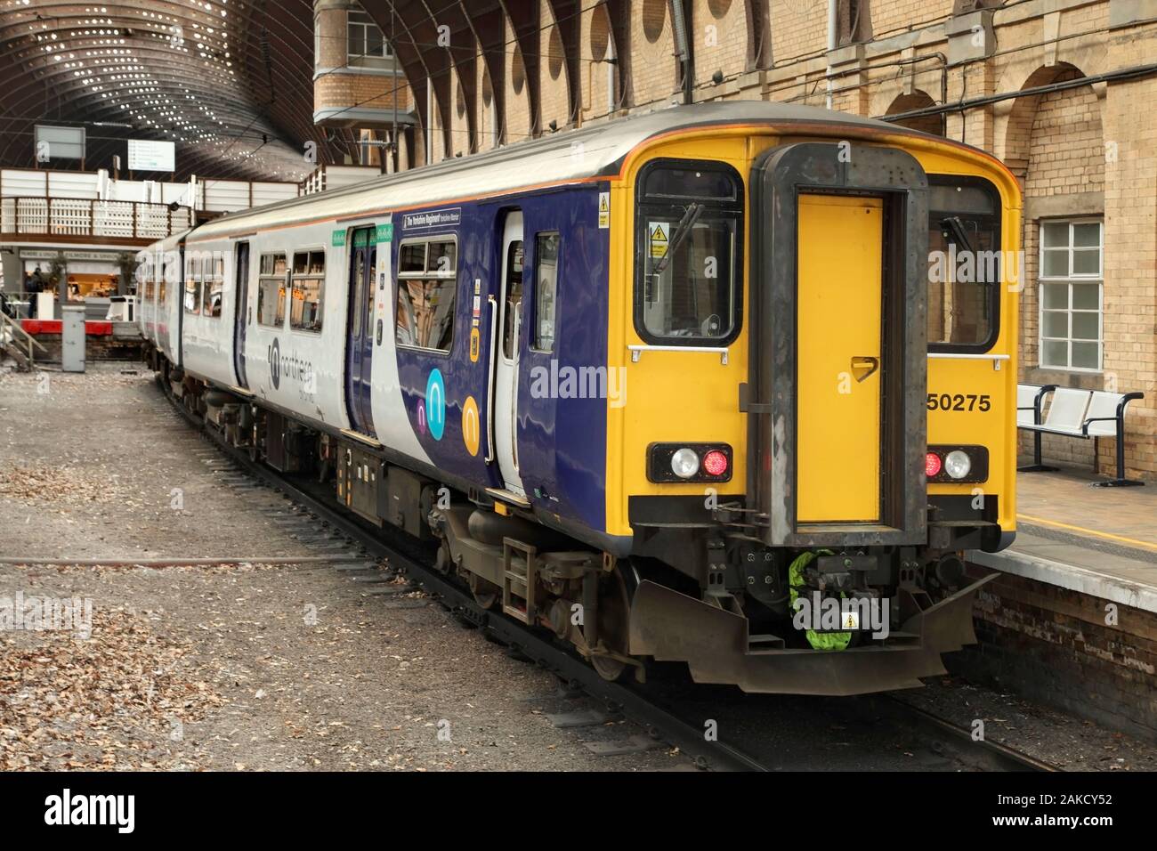
I quite like the way Northern do it - you can see it above the first door on this pic:

(image not embedded as I believe the stock photo companies dislike you doing this and have a habit of sueing websites for doing it)
 

Sorcerer

Member
Joined
20 May 2022
Messages
806
Location
Liverpool
Traditionally you had red for catering and yellow for 1st, so perhaps green or blue? If the livery was based on one of those colours it could just be a stripe with an outline.
I'm initially inclined towards blue just because that's the same colour as the disabled badges and thus seems like the most natural choice, but several operators such as Northern, and especially ScotRail, have it in prominent use on their liveries, so green seems like the best choice here. As long as it contrasts enough with the livery itself though that will be fine, and perhaps part of what makes a good livery is being able to adapt these measures appropriately.
 

Mikey C

Established Member
Joined
11 Feb 2013
Messages
6,870
Graffiti aren't viewed in the same way as window etching though. Etching is more unpleasant to be around, whilst some graffiti can be quite cool-looking if you disregard the illegal aspect. I'm pretty sure nobody is ever going to be branded "The Banksy of Window Scratching"! :lol:
Except that I've never ever seen any train graffiti anywhere near the quality and creativity of Banksy
 

61653 HTAFC

Veteran Member
Joined
18 Dec 2012
Messages
17,691
Location
Another planet...
Except that I've never ever seen any train graffiti anywhere near the quality and creativity of Banksy
I suppose artistic merit is in the eye of the beholder. Again disregarding the legality for a moment, I've seen many interesting and colourful splashes by unknown people which in my opinion absolutely wipe the floor with the formulaic monochrome stencils of the nation's self-appointed "authorised dissent" guru. You've seen one Banksy, you've basically seen them all.
 

43096

On Moderation
Joined
23 Nov 2015
Messages
15,355
Traditionally you had red for catering and yellow for 1st, so perhaps green or blue? If the livery was based on one of those colours it could just be a stripe with an outline.
I would go yellow for first, red for catering, blue for wheelchair space and green for bike space.
 

Mordac

Established Member
Joined
5 Mar 2016
Messages
2,309
Location
Birmingham
I suppose artistic merit is in the eye of the beholder. Again disregarding the legality for a moment, I've seen many interesting and colourful splashes by unknown people which in my opinion absolutely wipe the floor with the formulaic monochrome stencils of the nation's self-appointed "authorised dissent" guru. You've seen one Banksy, you've basically seen them all.
Belfast has some amazing street art, almost worth visiting just for that if it's something you're into.
 

321over360

Member
Joined
17 Jul 2015
Messages
199
I would have to say any livery that isn't mostly white is good as unless the train goes through the wash regularly, the train starts turning a dirty brown like the tfl rail livery on the 315s did. Same with the GA white on the 321s and 317s did
 

tomglazed

Member
Joined
3 Apr 2018
Messages
38
For me, I think a good livery feels like it actually flows with the architecture of the train. Else, it just looks like it's been cut and paste onto it with very little thought.
 

Deepgreen

Established Member
Joined
12 Jun 2013
Messages
6,407
Location
Betchworth, Surrey
I would go yellow for first, red for catering, blue for wheelchair space and green for bike space.
So would I. However, the BR standards have been almost fatally eroded by privatisation. A yellow stripe for first and red for catering was excellent. However, the number of fixed-area catering vehicles has fallen hugely now and some TOCs have adopted (deep) red for wheelchair spaces (e.g. SouthEastern). They also have light blue doors on a dark blue background so blue for wheelchairs wouldn't work. A set of standards like that can only really work with a standard livery or a prescriptive livery palette.
 

Bletchleyite

Veteran Member
Joined
20 Oct 2014
Messages
98,009
Location
"Marston Vale mafia"
So would I. However, the BR standards have been almost fatally eroded by privatisation. A yellow stripe for first and red for catering was excellent. However, the number of fixed-area catering vehicles has fallen hugely now and some TOCs have adopted (deep) red for wheelchair spaces (e.g. SouthEastern). They also have light blue doors on a dark blue background so blue for wheelchairs wouldn't work. A set of standards like that can only really work with a standard livery or a prescriptive livery palette.

Northern use light blue/light green for wheelchairs/bikes (I forget which way round), and that is on a blue base livery. Light blue contrasts quite well with dark blue. Only Lumo have a (horrid, in my view) overall light blue base livery, though it's a small component of the TPE livery it'd still contrast.
 

Deepgreen

Established Member
Joined
12 Jun 2013
Messages
6,407
Location
Betchworth, Surrey
I suppose artistic merit is in the eye of the beholder. Again disregarding the legality for a moment, I've seen many interesting and colourful splashes by unknown people which in my opinion absolutely wipe the floor with the formulaic monochrome stencils of the nation's self-appointed "authorised dissent" guru. You've seen one Banksy, you've basically seen them all.
There may be 'better' graffiti producers than Bansky, but as each one of his is tailored to the location or a theme, 'seen one, seen them all' is certainly not the case. While I detest graffiti and vandalism in general I have to admit to being on the fence (wall?!) about Banksy and his ilk where at least some societal thought has been applied.

Northern use light blue/light green for wheelchairs/bikes (I forget which way round), and that is on a blue base livery. Light blue contrasts quite well with dark blue. Only Lumo have a (horrid, in my view) overall light blue base livery, though it's a small component of the TPE livery it'd still contrast.
Yes, some liveries would work with the four denotational colours, but there then is also the requirement for contrasting doors and bodysides - that's a lot of colour/tone requirements to fit into a bespoke livery.
 
Last edited:

61653 HTAFC

Veteran Member
Joined
18 Dec 2012
Messages
17,691
Location
Another planet...
There may be 'better' graffiti producers than Bansky, but as each one of his is tailored to the location or a theme, 'seen one, seen them all' is certainly not the case. While I detest graffiti and vandalism in general I have to admit to being on the fence (wall?!) about Banksy and his ilk where at least some societal thought has been applied.
Without wishing to divert the topic any further after this post, Banksy's work often conforms to a very basic formula of 'wholesome thing' + 'dark/creepy thing' + 'short snappy slogan' = "genius". It was clever 20 years ago, now they're just glorified bumper-stickers.
 

Sorcerer

Member
Joined
20 May 2022
Messages
806
Location
Liverpool
I've seen some here argue that a good livery should be able to match the build of the trains they're applied to, but I would just like to personally argue further that a good livery would also be flexible enough to be adapted to different stock without much need for change. It's easy to say for example that the old Virgin livery was good because it suited the build of the Pendolinos, but Virgin had the benefit of operating a small streamlined fleet of intercity trains. But if you were trying to brand a franchise such as Great Western Railway which operates both regional and intercity trains you have a bit more constraints. You need a livery that matches all the stock and that's why I think GWR's livery is so good because of it being appropriately applicable to a variety of rolling stock.

If you're going for a variety of liveries based on different services like South West Trains did then you'd have a lot more room to play with, but I still think some trains are better suited to certain liveries than others. I certainly think the Class 444 wears the white Stagecoach livery better than the 442 and 158/159's did. That's not to say they're bad, I just think the 444s wore them better. CrossCountry does a decent job of applying a single livery to the Turbostars, HST and Voyagers, but again, it's kind of easier to work with a less varied fleet. I'm open to further discussion about this of course but I think a certain degree of brand unity is good for a train operating company, at least in some situations.
 

Recessio

Member
Joined
4 Aug 2019
Messages
671
Southern have a particularly easy job here.
You say this, but to be fair there was one slam-door unit that received the Southern livery, and it looks pretty good there too (couldn't get the image embed working, sorry):

Class 423 in Southern livery, Wikipedia image

So being on a slam-door as well as the 455/456, 319, and Electrostar/Turbostar units, I'd suggest it's actually a surprisingly versatile livery.

Some of Southern's stations also look fantastic, the colours are very neutral and comfortable. Lewes station springs to mind.
 
Status
Not open for further replies.

Top