• Our booking engine at tickets.railforums.co.uk (powered by TrainSplit) helps support the running of the forum with every ticket purchase! Find out more and ask any questions/give us feedback in this thread!

Euston departure board to be moved

Bletchleyite

Veteran Member
Joined
20 Oct 2014
Messages
98,302
Location
"Marston Vale mafia"
I'd personally reserve Yellow/Amber for delays, with Red for cancellations. Please wait would be Blue or even just no highlight. (And yes, I'd agree with @Bletchleyite that 'Please Wait' is better than just 'Wait'). The 'Boarding expected at XX.xx' works fairly well imho.

Your suggestion I think is what it's actually doing, though I've not seen it with a delay showing yet to confirm yellow would be used for that, the south WCML is generally fairly punctual if it's working at all.
 
Sponsor Post - registered members do not see these adverts; click here to register, or click here to log in
R

RailUK Forums

Ediswan

Established Member
Joined
15 Nov 2012
Messages
2,869
Location
Stevenage
Obviously I can ignore red flags on firing ranges, because they are green and don't have 'Red' or 'Green' written on them! The presence, or absence, of a flag should be the warning rather than its colour.
As far as I am aware, the is how firing ranges work. The presence of a flag indicates danger, it happens to be a red flag.
 

Bald Rick

Veteran Member
Joined
28 Sep 2010
Messages
29,266
It appears the old board has now been turned off, according to a friend's FB post. I wonder how well it's working?

it was working fine when I went through at 1230, 1300, 1630 and 1800. The concourse seemed much clearer than ‘normal’ on all 4 occasions.
 

high camera

Member
Joined
16 Jan 2013
Messages
126
In my mind this is nothing to do with customer convenience it’s all about advertising revenue, the old space will be covered with more digital advertising screens that generate thousands from advertising campaigns. It wouldn’t surprise me if the media companies have paid for the departure screens to be moved.
 

ARIC

Member
Joined
7 Mar 2019
Messages
51
In my mind this is nothing to do with customer convenience it’s all about advertising revenue, the old space will be covered with more digital advertising screens that generate thousands from advertising campaigns. It wouldn’t surprise me if the media companies have paid for the departure screens to be moved.

I doubt they'd feel the need to go into such a detailed explanation of why they're doing it if it was just to do with making cash.

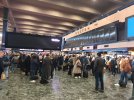
The problem they're trying to find a solution for seems really obvious to me, I'm surprised people are struggling to recognise it here - a ten-person deep, impenetrable wall of humans all facing the same way, all across the "mouth" of the platform entrances, at a station notorious for short notice boarding notifications and platform changes.

I think an effort to try 4 'walls' of people standing perpendicular to the entrances makes a lot of sense.
 

Bald Rick

Veteran Member
Joined
28 Sep 2010
Messages
29,266
Did you bump into the project team on the concourse :E

If I did, they were going to the West Midlands!

One mentioned that they really liked the new feature showing how full the coaches were. I didn’t like to point out that that has been on the main board for a while!

(on the new board, the pictograms Coaches are also colour coded green / yellow / red fro ‘fullness’, as well as being blocked out to different levels).
 

Nippy

Member
Joined
13 Aug 2013
Messages
650
it was working fine when I went through at 1230, 1300, 1630 and 1800. The concourse seemed much clearer than ‘normal’ on all 4 occasions.
The old board was switched off when I passed through at 23:00 last night (1st). I admit I’m not a fan of them in their current spot. I would prefer them to have been placed where the old board was.
 

TT-ONR-NRN

Established Member
Joined
30 Dec 2016
Messages
10,543
Location
Farnham
The grating colour of the new displays is what bugs me, more than the position. I have very good eyesight and even so its not easy to read the white on fluorescent colours, especially as the letters aren't that defined like the LEDs were.

The main problem I have with these is the huge bright colour bands. Firstly they are ugly. Secondly the use of the "fire exit" icon is just silly, though I hope the fact it's on a screen will avoid confusion with actual fire exits. "Wait" seems overly bossy, even slightly rude.
Maybe someone at TfL has noticed this, as the Overground section uses the slightly more polite "please wait" instead, but it would be friendlier to phrase as a piece of information rather than an imperative (I'd probably go for "Not ready for boarding" and "Ready for boarding at platform X").

I also don't like the font. It looks like a default which nobody's bothered changing. What happened to Rail Alphabet 2 being used as standard for Network Rail stations?

The overall look does not look suitable for the departure board at a busy station. It's almost like some sort of internal monitoring interface which has accidentally been displayed to the public. And fittingly, based on where people appear to be looking in those photos, the public are ignoring them and looking at the old boards instead!
Agreed. They hurt my eyes to look at.
 

HSTEd

Veteran Member
Joined
14 Jul 2011
Messages
16,831
It is difficult to have displays be both bright enough to read in daylight and avoid serious glare.

One of the reasons I am hopeful that ePaper technology will eventually filter down to these sorts of displays.

Much easier if the displays are merely reflecting other light.
 

100andthirty

Member
Joined
5 Mar 2012
Messages
545
Location
Milton Keynes
I had my first brush with the new signs yesterday. They are very clear, but..........
On arrival in platform 7 at 11:45, and making my way directly to the Underground the way was almost completely blocked by people looking at the new signs. With the central screen people tended to congregate in the middle of the concourse and with the new screens people were spread all the way across it. They seem to achieve the opposite of what was intended.
 

Trackman

Established Member
Joined
28 Feb 2013
Messages
3,035
Location
Lewisham
I had my first brush with the new signs yesterday. They are very clear, but..........
On arrival in platform 7 at 11:45, and making my way directly to the Underground the way was almost completely blocked by people looking at the new signs. With the central screen people tended to congregate in the middle of the concourse and with the new screens people were spread all the way across it. They seem to achieve the opposite of what was intended.
Yep.
As I've said up thread 'If it's not broke, don't fix it'.
 

Bletchleyite

Veteran Member
Joined
20 Oct 2014
Messages
98,302
Location
"Marston Vale mafia"
I had my first brush with the new signs yesterday. They are very clear, but..........
On arrival in platform 7 at 11:45, and making my way directly to the Underground the way was almost completely blocked by people looking at the new signs. With the central screen people tended to congregate in the middle of the concourse and with the new screens people were spread all the way across it. They seem to achieve the opposite of what was intended.

I am at Euston and have observed the same - when it gets busy people are backed up so they block the way through to the tunnel from the Tube. The screen on that side is way too far back, and a hatched area needs adding to keep a clear path there (even if they revert to the old board).

It might even be better with only one of the new boards instead of two, as very few people were stood between them. So maybe they should try moving one outside and having only one roughly on the centreline?

They are also too narrow with too few panels. There seems to be space to widen them. I think I remain of the view that 10-15 LED tellies would have done the job better.

Finally the right hand panel is a waste of space. Fit a clock underneath, add one more train panel and only put up a special notices panel if there actually are any special notices.
 

Scotrail314209

Established Member
Joined
1 Feb 2017
Messages
2,358
Location
Edinburgh
I like the new boards, especially the colour coded coach loadings.

I just don’t like the position, on arrival into Euston at about 12:40 on Thursday, it felt more crowded than usual.
 

yorkie

Forum Staff
Staff Member
Administrator
Joined
6 Jun 2005
Messages
68,164
Location
Yorkshire
... It is an unusual situation almost identical to Gatwick Airport where there are dedicated tickets for both TOCs including the faresetter ...
It's absolutely not comparable; your post also contains information that is demonstrably incorrect, but this isn't the thread for it. Feel free to create a new one if you wish to debate this further
 

Bletchleyite

Veteran Member
Joined
20 Oct 2014
Messages
98,302
Location
"Marston Vale mafia"
They now seem to be suppressing Overground platform numbers which is just downright stupid (and everyone is ignoring). It physically can't be anything other than 9 or 10 so there is no sense in clogging the concourse up with those people, they may well go to 9 or 10 as per the next expected platform, and in the unlikely event of it changing walk round to the other when they see it arriving.

Furthermore the Overground part of the board is hard to read - a bright white background doesn't work well on a very pixelated display (I'm surprised they aren't higher definition).

I like the new boards, especially the colour coded coach loadings.

I just don’t like the position, on arrival into Euston at about 12:40 on Thursday, it felt more crowded than usual.

It appears to me (having seen it very busy tonight) that almost nobody stands in the middle between the two boards. This would be fairly useful if the station actually had an entrance there as it would leave a corridor in the middle...but it doesn't, the entrances and exits are at the corners. The effect of this is to crowd the sides where the entrances/exits actually are. One board would I think work better than the two as a result. You would probably want it slightly offset towards the ticket office side as more people appear to enter on the other side because of where the Tube access is.
 
Last edited:

Bald Rick

Veteran Member
Joined
28 Sep 2010
Messages
29,266
I wonder if it would look better if the signs were attached to the ceiling, rather than on poles like that.

it might look better for about 10 seconds, then it would look rather messy when the boards and some of the roof were in a pile on the floor.
 

Sheridan

Member
Joined
11 Jan 2012
Messages
393
it might look better for about 10 seconds, then it would look rather messy when the boards and some of the roof were in a pile on the floor.

Euston’s ceiling and floor are its two redeeming features - why not take out both at once?!
 

RooseWithAZed

Member
Joined
2 Oct 2022
Messages
14
Location
SE London/Furness Peninsula
I like the colour coded displays from an "ooh it looks nice" standpoint, but I imagine it will end up much like the experience in the P13/14 lounge at Piccadilly (insult to injury to come from a place served by trains on that platform), I can't really say it helps to calm my anxiety about getting on the platform and actually getting on the train.

If one were to suggest ways to improve the existing board rather than have these things in the middle, I propose that you could change the called-at stations to one scrolling line, then make the destination and TOC names bigger and finally put a massive platform number up in the middle. I don't know about other people but generally I already know that, for example, if its going to Glasgow or Edinburgh or Blackpool then it will call at Lancaster or Preston, so that's my train. Of course this won't help you if you have no idea which of those routes has your stop on it, but then again these are big long distance trains that you don't exactly walk up to and get a ticket on a whim, so you could just find some way of making it clear on ticket purchase which train you're getting on.

Euston’s ceiling and floor are its two redeeming features - why not take out both at once?!
Euston's ceiling is certainly not a redeeming feature, I think its one of the reasons I hate the station, the platforms are extremely gloomy and generally the entire place makes me want to run out the door as soon as possible so I can get some light and some air (and have a smoke.)

I think the other bit about it is that there's so much distance to cover getting anywhere in the station. Getting from the platform from the concourse to the exit, going to the loo. While I don't tend to travel up or down when its at its very busiest I can't help think that it would be a great improvement if you could move from platform to platform easily without going up to concourse level. Then you could shorten the length from front to back of the concourse and get people onto the back of the platform level. Also why is there never anywhere to sit? Lime Street has benches, Piccadilly has that screen and bench flower thingy, but I can't seem to remember seeing any seats at Euston.

To top it off, I hate the plaza as well, it is a pain in the arse to get up and down from street level especially with luggage and makes the surrounding area more difficult and hostile to navigate. Sorry if this rant is out of place but man it would be great if the west coast had a nicer London station.
 

hick

Member
Joined
10 Aug 2009
Messages
96
They now seem to be suppressing Overground platform numbers which is just downright stupid (and everyone is ignoring). It physically can't be anything other than 9 or 10 so there is no sense in clogging the concourse up with those people, they may well go to 9 or 10 as per the next expected platform, and in the unlikely event of it changing walk round to the other when they see it arriving.

Furthermore the Overground part of the board is hard to read - a bright white background doesn't work well on a very pixelated display (I'm surprised they aren't higher definition).


It appears to me (having seen it very busy tonight) that almost nobody stands in the middle between the two boards. This would be fairly useful if the station actually had an entrance there as it would leave a corridor in the middle...but it doesn't, the entrances and exits are at the corners. The effect of this is to crowd the sides where the entrances/exits actually are. One board would I think work better than the two as a result. You would probably want it slightly offset towards the ticket office side as more people appear to enter on the other side because of where the Tube access is.

Whilst Overground typically runs from 9/10. They can and do depart from any platform. All the DC stock is dual voltage.
 

brewer85

Member
Joined
30 Jun 2021
Messages
29
Location
UK
Also why is there never anywhere to sit? Lime Street has benches, Piccadilly has that screen and bench flower thingy, but I can't seem to remember seeing any seats at Euston.
There's a bunch of seats at the top of the ramp by the suburban platforms (where WHSmith used to be) and more under the balcony by the wall separating the concourse from the underground entrance.
 

Bletchleyite

Veteran Member
Joined
20 Oct 2014
Messages
98,302
Location
"Marston Vale mafia"
There's a bunch of seats at the top of the ramp by the suburban platforms (where WHSmith used to be) and more under the balcony by the wall separating the concourse from the underground entrance.

And some upstairs at the ends.

If one were to suggest ways to improve the existing board rather than have these things in the middle, I propose that you could change the called-at stations to one scrolling line, then make the destination and TOC names bigger and finally put a massive platform number up in the middle. I don't know about other people but generally I already know that, for example, if its going to Glasgow or Edinburgh or Blackpool then it will call at Lancaster or Preston, so that's my train. Of course this won't help you if you have no idea which of those routes has your stop on it, but then again these are big long distance trains that you don't exactly walk up to and get a ticket on a whim, so you could just find some way of making it clear on ticket purchase which train you're getting on.

You are forgetting the LNR services, which operate multiple stopping patterns and far more trains per hour than Avanti at the moment. I can very quickly scan for Bletchley and compare the arrival times before pulling out my phone and finding out the platform long before they bother telling me.

So no, I would REALLY not like it to be like that.

You could I suppose argue for different layouts for the two types of service, but that's just more confusing.
 

dosxuk

Established Member
Joined
2 Jan 2011
Messages
1,790
The second banks of screens - behind the one pictured - also appears to be working.
 

Top