Bletchleyite
Veteran Member
I like that GWR design - it looks much better than the various other attempts which have been made.
Shows how good it looks with a splash of colour, as I have said all along.
I like that GWR design - it looks much better than the various other attempts which have been made.
The design manual obviously isn't written very well if it can be so open to interpretation.Proof if you needed it that it's the TOCs interpreting the design manual. It won't need replacing, a strip of black vinyl over the green would suffice.
There's nothing to say that GWR won't survive with suitable GBR branding applied.
The design manual obviously isn't written very well if it can be so open to interpretation.
Design manuals often need amending once they hit the real world.
Yes, that's correct.The GWR efforts are nothing like the Design Manual envisages. I'd read @Non Multi's comment as saying that it proves the individual TOCs are behind the signage changes we've already seen, rather than a central office working from the manual.
You'll never convince me to be a fan of yellow text on a grey background.")
Its probably a good idea for some field tests in the real world though to iron out any problems with the designs.
Looks much better with a bit of weight to it.
No one has said it will need redoing. No one knows what GBR will do with local branding.
EMR are still repainting and rebranding stations at a pace now. It was always meant to be the same brand regardless of who won the franchise.
My understanding was that it was already decided. There will surely be, if there's not already, a Design Manual that will set out EVERYTHING.I think weve all jumped the gun on this a bit. The signs at northern stations and Coventry and Euston could easily just be interim signs.
No official announcement about the signs has been made apart from in GBR leaflet published earlier in the year.
Basically, lets be patient
That wasn't a serious mock-up. It was just somebody having a bit of fun by showing what a 55-year old heritage livery would look like on a Pendolino.And regarding the 'mock up' blue and grey with red large double-arrow logo, will there not be need to 'highlight' doors as at present and yellow stripe returning for 1st Class?
…which is also, tacky old fashioned branding!From what I can see on the GWR network, no attempt at using the double arrow anywhere sadly. It seems down here we will need to keep the tacky old fashioned branding and miss out on the excellent application of double arrows occurring throughout the rest of the country .....
The signage guidelines are out and are official, albeit through Network Rail at the moment as it is a project they initiated and GBR will simply inherit. The only proper applications of the signage so far have been in Coventry and Euston. This will be the standard going forward and GBR won't be changing it, though they will eventually have to go through and redo Northerns attempts and this single GWR attempt as neither match the guidelines.I think weve all jumped the gun on this a bit. The signs at northern stations and Coventry and Euston could easily just be interim signs.
No official announcement about the signs has been made apart from in GBR leaflet published earlier in the year.
Basically, lets be patient
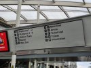
That's been discussed already - it isn't RA2, just Arial.New signage at Manchester Victoria.
That’s very clearly not RA2 - Northern by Arriva introduced Arial signage to replace some Northern Serco Abellio signs at some stations, as well as at stations that opened during their franchise.New signage at Manchester Victoria.
Ah, I thought it looked OK, so as you say obviously not RA2! Silly me for thinking otherwise.That's been discussed already - it isn't RA2, just Arial.
Has the other entrance to the Arena been closed off now?New signage at Manchester Victoria.
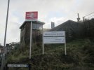
I think that all looks rather spiffing myself!The exterior of Okehampton
The exterior of Okehampton
The new metal posts make it more presentable too. Slapping a new sticker on a damaged sign with fading paint on the posts doesn't make the same good impression.I think that all looks rather spiffing myself!