• Our booking engine at tickets.railforums.co.uk (powered by TrainSplit) helps support the running of the forum with every ticket purchase! Find out more and ask any questions/give us feedback in this thread!

Train Ticket Redesign 2018 [note: unofficial]

Status
Not open for further replies.

Dopamine429

New Member
Joined
6 Jan 2018
Messages
3
Hello people,

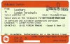
Guess who spent the Christmas redesigning train tickets?

I know I'm new to here and my voice probably won't weight much, just wanna put some cool ideas on paper and have them validated by the pros (that means you guys).

It's frustrating to see many of existing redesign ideas are not 'down to earth', even the NR2014 makeover was somehow impractical which might just be the reason it didn't become a huge success.

Gallery 1.jpg

Gallery 2.jpg

Gallery 3B.jpg

Redesign showcase 1.jpg
Redesign showcase 2.jpg
Stakeholders.jpg
Recode_adjusted.jpg

TL;DR:
In the NR2014 redesign, different ticket issuing systems do not agree to a standard format and print as they will, which made the whole update pointless. We aimed to propose a design solution that has multiple mechanisms to reduce inconsistency among different systems, it also features numerous measures to appeal different audience groups.

You can find the full rationale in my blog post:
http://sadhedgehog.com/2018/01/07/practically-redesigned-british-train-ticket/

Not looking for like/sub/fav/thumbs, but it would be great to know what you think of them. Will be happy to discuss the thoughts on designing details and how they might or might not work.

P.S. Couldn't find a forum that fits this post perfectly, sorry if it doesn't sit well here.
 
Last edited:
Sponsor Post - registered members do not see these adverts; click here to register, or click here to log in
R

RailUK Forums

BluePenguin

On Moderation
Joined
26 Sep 2016
Messages
1,605
Location
Kent
I really like the designs and find them very impressed. This is much clearer and easier on the eye and can be read than squinting.
 

najaB

Veteran Member
Joined
28 Aug 2011
Messages
30,840
Location
Scotland
The design is simple and clear. Pretty much guaranteed not to survive first contact with a TVM printer.
 

takno

Established Member
Joined
9 Jul 2016
Messages
5,071
The coach and seat numbers need to be bigger. A *lot* bigger. I had to help two people read that info from their tickets on my last trip, and I was struggling myself.

I would also have the date a bigger and located on one of the Orange bits. That way you could miss it off each of the reservation lines to give yourself a bit more space
 

roversfan2001

Established Member
Joined
19 Feb 2016
Messages
1,666
Location
Lancashire
Those are really, really good. Which means they'll never be used. :lol: But seriously, they're so much clearer than the current design(s).
 

Bletchleyite

Veteran Member
Joined
20 Oct 2014
Messages
97,895
Location
"Marston Vale mafia"
One small thing worth mentioning - the odd month names are deliberate and reduce the chance of someone changing one month to another by ensuring little commonality. So those may have to stay.
 

Mojo

Forum Staff
Staff Member
Administrator
Joined
7 Aug 2005
Messages
20,398
Location
0035
Just wondering, if it's a 2 part return then why does the arrow point both ways? Surely it should just point one way like on the single.
 

najaB

Veteran Member
Joined
28 Aug 2011
Messages
30,840
Location
Scotland
Just wondering, if it's a 2 part return then why does the arrow point both ways? Surely it should just point one way like on the single.
I'm guessing to make the difference between single and return tickets clear at a moment's glance.
 

Allwinter_Kit

Member
Joined
12 Jul 2017
Messages
147
These are superb. A vast improvement on the current mess.

One small thing worth mentioning - the odd month names are deliberate and reduce the chance of someone changing one month to another by ensuring little commonality. So those may have to stay.

As he says in the blog post,

"Some of the features that used to prevent fraudulent alternation are discarded in the NR2014 design, such as the asterisk (*) that used to end station names is no longer printed, even when there is space and possible station for the destination to be changed.

"We had honoured this move and took a step further by changing back the unconventional month abbreviations (JNR, FBY, MCH, JLY, DMR) since the purpose of using them was also to prevent alteration, non-standard abbreviations could be even more confusing than over-abbreviated terms.

"Plus, fare dodgers these days don’t even touch the real ticket, everyone has access to the internet and a perfectly functioning printer. It’s time to throw away the concept from the 70s and embrace the dark future."

I doubt you're going to get many folk with a pen painstakingly filling in spaces to change the month - certainly not well enough to fool any one (or a computer reading the mag stripe...)
 

DynamicSpirit

Established Member
Joined
12 Apr 2012
Messages
8,161
Location
SE London
My impression is a little more mixed than other people's... What I think is superb is the photography in several of those images. Whoever took the pictures certainly knows how to arrange objects to make them look very attractive. And I suspect a pretty good quality camera at work too. Someone has a career as a photographer waiting for them... :)

As for the tickets... On the plus side, these designs do a much better job than current designs of emphasising the information that is important to the passenger - most obviously the origin and destination. However, I also see a problem... On my PC screen those tickets are much bigger in the photos than real tickets are. Shrink them down to actual ticket size and I'm fairly sure you'll quickly find that some of the information in these designs will become very hard to read for a lot of people. You need much bigger fonts: I'd say tickets are simply not big enough to have stuff like 'via Virgin West Coast trains and any connecting services' printed all on one line in a font that's large enough to be comfortable for a high proportion of the population to read. I'd also have a bit of a concern about the white-text-on-black-background used for the origin and destination. Sure, they stand out and look very attractive in the photos, but scale down to actual ticket size and any slight fuzziness in the printing of the background (due for example to a ticket printing machine not being in absolute tip-top condition) will probably render the text illegible, where printing black-on-white with slight fuzziness would not be a problem. You're also using a lot more ink - I'm not sure if that would have implications for cost or maintenance of printing machines.

Overall I like what you're doing, but if you're looking at them as actual contenders for designs, then you'd need to think more about usability and maintainability given the actual size of tickets.
 

Dopamine429

New Member
Joined
6 Jan 2018
Messages
3
The coach and seat numbers need to be bigger. A *lot* bigger. I had to help two people read that info from their tickets on my last trip, and I was struggling myself.

I would also have the date a bigger and located on one of the Orange bits. That way you could miss it off each of the reservation lines to give yourself a bit more space
My impression is a little more mixed than other people's... What I think is superb is the photography in several of those images. Whoever took the pictures certainly knows how to arrange objects to make them look very attractive. And I suspect a pretty good quality camera at work too. Someone has a career as a photographer waiting for them... :)

As for the tickets... On the plus side, these designs do a much better job than current designs of emphasising the information that is important to the passenger - most obviously the origin and destination. However, I also see a problem... On my PC screen those tickets are much bigger in the photos than real tickets are. Shrink them down to actual ticket size and I'm fairly sure you'll quickly find that some of the information in these designs will become very hard to read for a lot of people. You need much bigger fonts: I'd say tickets are simply not big enough to have stuff like 'via Virgin West Coast trains and any connecting services' printed all on one line in a font that's large enough to be comfortable for a high proportion of the population to read. I'd also have a bit of a concern about the white-text-on-black-background used for the origin and destination. Sure, they stand out and look very attractive in the photos, but scale down to actual ticket size and any slight fuzziness in the printing of the background (due for example to a ticket printing machine not being in absolute tip-top condition) will probably render the text illegible, where printing black-on-white with slight fuzziness would not be a problem. You're also using a lot more ink - I'm not sure if that would have implications for cost or maintenance of printing machines.

Overall I like what you're doing, but if you're looking at them as actual contenders for designs, then you'd need to think more about usability and maintainability given the actual size of tickets.

I'm truly flattered by that comment on gallery photos, they are actually all synthesised and enhanced in Photoshop, the only camera I had is a crappy old iPhone, no actual ticket has been printed (except for the thermal printing prototype below).

I know the size and inverted text can be a major concern to the thermal printer, that's why I've gone through actually printed the design on thermal paper with Brother QL570 thermal printer on lowest quality setting to simulate TVM.

Thermal printed comparison.jpg

As you can see, the small line of text is, in fact, larger than those on the current design, they are much clearer to read and shows an overall better legibility, so are the inverted texts.
Bear in mind that this demo is printed in the same way TVMs do, and it's at the lowest quality setting, side-to-side comparison with an actual ticket.

Inverted text can be seen on some of previous APTIS format tickets, they have since been discarded in the NR2014 makeover, but it doesn't change the fact that TVMs can handle inverted texts, and from this demo you can tell, they are nailing it.
 
Last edited:

Dopamine429

New Member
Joined
6 Jan 2018
Messages
3
Just wondering, if it's a 2 part return then why does the arrow point both ways? Surely it should just point one way like on the single.

Thanks for pointing out.
I've messed up that one, accidentally showed the layer '2 PARTS RETURN' instead of 'SINGLE-PORTION RETURN', it's now fixed.

However, the design *does* show the two-way arrow for ALL return tickets, single-portion or not.
This arrow indicator has replaced the 'Return' / 'Single' header on the orange band on the current design, gives a more intuitive sign for its journey type.
 

jon0844

Veteran Member
Joined
1 Feb 2009
Messages
28,058
Location
UK
I like these a lot but agree that some legacy printers would likely struggle with white on black text. Perhaps something for a later tweak, when the industry has upgraded its ticketing facilities as is slowly happening now.

Making the origin/destination as clear as possible is very important. I think the new style tickets seem to make somewhat harder than before, not helped by odd line spacing and the risk of overlap. On the new tickets, perhaps the white spacing is a little too much and bigger text would be a nicer outcome (perhaps a thinner typeface to account for the increased height).

For checking tickets, the top line showing 1st/std clearly and if any railcard is required is great, and a way to easily see if it's a peak/off peak/super off peak ticket or open etc. There's quite a bit of space on that line if used well - and the way these tickets are designed are exactly that.

There also needs to be some thought as to how to include Aztec codes and the seat reservations could perhaps be made a little clearer - perhaps in bold type as when people are stressing on a train, they need something to draw their attention to this and don't need to be confused by the other information. Hopefully at this point they ARE on the correct train.

Usability testing would be good to see how ordinary people look at things. I have no idea if RDG ever did this, but getting a wide group of people from all different backgrounds (including those who aren't rail users) and using eye tracking and similar to monitor how they read information would be very useful. I think by and large these designs are certainly going to do well from any such testing, and perhaps represent the best effort yet at making tickets easier to read for the public and staff.
 

Hassocks5489

Member
Joined
2 Feb 2014
Messages
244
Location
Hove, Sunny Sussex by the Sea
Interesting designs. I have been following the "new layout" fun and games avidly since 2014, and I could probably illustrate over a hundred examples of flawed design, errors and other daft things just from my own collection. I will send a link to the blog to various colleagues in the collecting fraternity to see what they think.

One thing that troubles me with these suggested redesigns is that the date, arguably the most important data field, is isolated from the other fundamental details - down in the bottom left corner - on walk-up ticket types; and on the Advance tickets (e.g. the University-London Terminals) it is only shown in small print as part of the reservation details. Was a second, more prominent date field intended on Advance tickets? (Of course, "new layout" Advance tickets from certain systems do currently have an extremely small date field, as shown on the attachment [which also has an excellent example of text overlapping]. That problem definitely needs to be addressed.)
 

Attachments

  • S&B (Leuchars-London Terminals).jpg
    S&B (Leuchars-London Terminals).jpg
    240.6 KB · Views: 92

Solent&Wessex

Established Member
Joined
9 Jul 2009
Messages
2,685
As someone who checks many hundreds of tickets each day:

a) Printing anything important, especially in small text, on the Orange strips is a bad idea. Many printers do not print clearly in this area, and this area seems to be the first to fail.

b) Printing inverted, i.e. white on black, isn't a good idea either for the same reason - many printers don't print this type of text clearly either.
 

mildertduck

Member
Joined
9 Nov 2010
Messages
246
One think I'm continually surprised by is how many people check their seat numbers when on the train. I always check mine prior to getting to the platform, so that I am stood in the correct place when the doors open. When I purchase my ticket online, the reservation has an ics file, which adds the booking automatically to my diary, so 5 minutes before my train departs, it's information - including my seat number - pops up on my phone screen.

Perhaps we should add into on-platform announcements "please check now, before your train arrives, the seat and coach you are booked on, and proceed to the correct portion of the platform". This could be done like "see it-say it-sorted" has been, and would serve as a reminder to most travellers.

That said, how about adding a box like this:

ticket_box.png

to identify the reservation more clearly?

Also, @jon0844 's comment about Aztec codes stands, have a look at a VTEC-only ticket (there must be one scanned on here somewhere!) and you'll see what I mean.

They are still a huge improvement, though!
 

bunnahabhain

Established Member
Joined
8 Jun 2005
Messages
2,070
Elgar ticket stock is a much more ideal type for a ticket with reservations, you can get them all in large font size, and now we're getting barcode scanners everywhere they shouldn't pose too much of an issue when it comes to ticket barriers.
 

Bletchleyite

Veteran Member
Joined
20 Oct 2014
Messages
97,895
Location
"Marston Vale mafia"
Elgar ticket stock is a much more ideal type for a ticket with reservations, you can get them all in large font size, and now we're getting barcode scanners everywhere they shouldn't pose too much of an issue when it comes to ticket barriers.

With the same context, it wouldn't be entirely silly to start printing them on A4 when issued from ticket offices. DB now do this - the printer is just a laser with an A4-size pre-printed ticket stock in it - the actual ticket (ELGAR size) is torn off from the bottom if you want.

The advantage of printing on A4 would be the ability to provide lots more validity information, such as the restrictions written out in full.
 

ainsworth74

Forum Staff
Staff Member
Global Moderator
Joined
16 Nov 2009
Messages
27,686
Location
Redcar
Must admit those are great! I much prefer them to what we've currently got (I still can't get over that they allowed companies to come up with their own interpretations).

I just fear that the printers wouldn't be up to the task of printing the tickets!

Elgar ticket stock is a much more ideal type for a ticket with reservations, you can get them all in large font size, and now we're getting barcode scanners everywhere they shouldn't pose too much of an issue when it comes to ticket barriers.
Though I would assume that all the printers at this point have been scrapped.

I like Bletchleyite's idea though of just printing them on A4 with a tear off bit that's the actual ticket (if you want to tear it off).
 

Mathew S

Established Member
Joined
7 Aug 2017
Messages
2,167
One think I'm continually surprised by is how many people check their seat numbers when on the train. I always check mine prior to getting to the platform, so that I am stood in the correct place when the doors open. When I purchase my ticket online, the reservation has an ics file, which adds the booking automatically to my diary, so 5 minutes before my train departs, it's information - including my seat number - pops up on my phone screen.

Perhaps we should add into on-platform announcements "please check now, before your train arrives, the seat and coach you are booked on, and proceed to the correct portion of the platform". This could be done like "see it-say it-sorted" has been, and would serve as a reminder to most travellers.
Only works if you know which way around your train is going to be when it arrives, something that Transpennine seem unable to manage; otherwise you're likely to be moving through the train looking for your seat, in which case being able to refer to it on the ticket is something I find useful... especially when I have to turf someone out of my reserved seat.
 

saxsux

Member
Joined
21 Dec 2011
Messages
59
These are really excellent. Well done! You've clearly put some thought into it, and I very much the attention you'd given to edge cases (the Thurso to Penzance ticket was very well done).

A couple of bits of feedback.

It might be worth thinking about how 2-part returns would be handled; I notice you've mocked up a return printed on a single ticket. While printing a single ticket for a return journey saves on paper (and allows for the rather elegant <-> symbol in the header) it does have some disadvantages. This ticket will need to be checked by staff and go through ticket barriers twice as much as a single ticket. After a complex journey with multiple trains, I find my outbound ticket often looks quite scruffy! A single coupon would do for a day return, but it might be better to print a standard return (which can be valid up to a month after the outbound journey) on two separate coupons.

Given that advance tickets are very severely restricted, it might be worth flagging their status more clearly - at a glance there's not much difference between the advance/anytime designs. Did you give any thought to putting an "ADV" flag at the top of the ticket (similar to the "OP" flag on the Off Peak ticket).

I notice you've only included seat reservations on your advance tickets, but seat reservations are available for all tickets - you can reserve seats when buying an anytime/off-peak ticket if you wish, but your ticket will not be restricted to those reservations if you choose to travel at another time. So the presence of seat reservations on a ticket doesn't necessarily mean the ticket is restricted to only those trains - hence the suggestion of printing a ADV flag.
 

A Challenge

Established Member
Joined
24 Sep 2016
Messages
2,823
I really like this idea, please introduce it :lol:, although I rarely get the current new tickets for some reason (I think the ticket machines I buy from normally can't print them or something!)
 

hi2u_uk

Member
Joined
26 Apr 2014
Messages
182
very good, i dont understand why there are now machines now issuing tickets that look like they have an essay squashed into one ticket
 

MG11

Member
Joined
4 Nov 2017
Messages
638
Generally a good design, perhaps First Class and Standard Class should be included in the main text though.
 
Status
Not open for further replies.

Top